
Case Study: Rebuilding the Click Foundry Website for Better Engagement and Conversion
Client: Click Foundry
Release Date: February 2023
Introduction
After noticing a spike in bounce rate and no conversions from a promising ad campaign, I decided to audit and redesign the Click Foundry website from the ground up. This case study breaks down what I found, what I changed, and what I learned by turning the lens inward on my own business. This provides a glimpse of how we approach custom website design.
I built out my previous site in 2019 and at the time I just wanted to stand out. I had looked at my competition and saw very generic sites built on plug and play engines or really outdated layouts. So I went with something colorful and over the years, I changed more and more things until it got a bit busy and out of control. November 2022, I ran some ads for the business. They got some pretty high click through, but zilch in the way of conversion. So it was time to investigate.

Problem: The website has a high bounce rate, which means users aren’t finding the content relevant or engaging.
Research and Analysis
Analytics:
So myReviewing my analytics, I saw a 100% bounce rate in November. Which wasn’t very helpful, so I did analysis for the past two years and I noticed that people landed on the homepage with a 60% bounce rate and then the next two pages in terms of traffic were the web design page and the about page.
These pages are most prominent in the footer and the header menus and the bounce rate on the about page was 90%.
User interviews:
I had a few one on ones with clients and friends and asked them to use the site around me. The big takeaways were that people often couldn’t tell where my project examples were and people rarely got to the bottom of the page. Aside from thinking some of the photos were fun, there weren’t any big moments for the design of the site. I saw eyes glaze over in the about page and people rarely went to any of the other services other than the first item in the drop down menu.
Design Process
As a freelancer/ sole business owner, a lot of my value comes from being warm and friendly while providing context and collecting feedback from my client. So that needed to be communicated.
I did have a page for work in my previous site, but it wasn’t in the header and it was running off a portfolio plugin that limited the presentation of the work. In my day to day, I’m often asked about previous work. So I had to do a better job highlighting that.
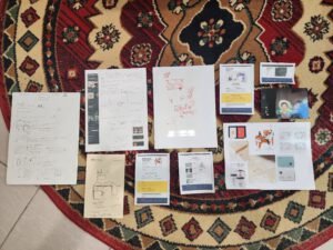
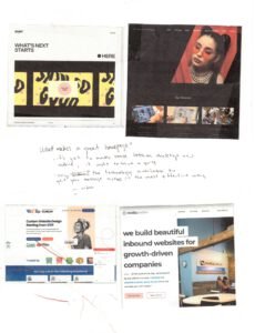
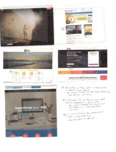

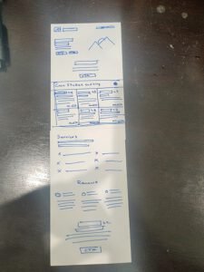
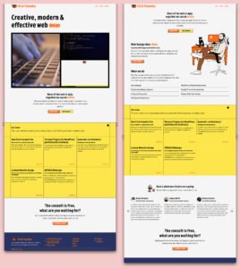
Along with all of the info I took from analytics and conversations with people about the site, I looked around for ideas and inspirations. I audited my site, taking notes about what worked and what didn’t and looked at competitors as well as agencies that were way out of my league. The final image is about where I landed prior to revisions.
Design Solution
Well you’re here. You see the site, but let me walk through some key decisions.
minimal menu: there are only two links on the header menu: work and contact.
There’s no service drop down or even a service page. I had coded both a homepage, a web design page and was well into laying out a digital advertising page. Instead, I opted to make the homepage and the web design service page one and the same. I figure since web is the core of my business and visitors weren’t bothering to drop down and check out the other pages, there was little incentive to give them something they weren’t going to use.
In the original homepage design I used a full width video as a point of visual interest underneath an oversized headline. After getting some initial feedback, the image I created got compliments and the video forced the user to quickly scroll past the headline. So after some feedback, I went with this:
Case Study Post Type
For this site I created a custom post type within the theme (custom theme using _S as the base). I allowed the post to be able to use all of the Gutenberg features as well as added two custom fields for client and release date for the project.
Evaluation
I’ll post analytics at the end of January after running another ad campaign.
Conclusion
So far, I’m happy with the way it’s come out and I’ll have more to share after a round of analytics and interviews.