Introduction
When you’re in the creative field, you almost always have to lead with your work. Intension Design builds high-end residential work as an architect-led contractor working in Los Angeles. The upside is that they had hundreds of photos, the downside is that they didn’t have a very good way of showing them off.
Research and Analysis
The first step in designing a website for a high-end real estate contractor is to conduct research and analysis to understand the target audience, the market competition, and the unique value proposition of the contractor. In this case, my research indicated that the target audience for the website are architect and individuals looking for luxury remodels and builds. The market competition is fierce, with many high-end real estate contractors offering similar services and amenities. However, our client’s unique value proposition is that they are led by architects adding credibility to their attention to detail, commitment to quality work and more technical organizational knowledge.

Design Process
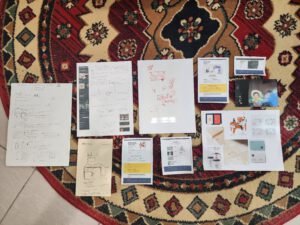
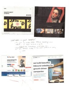
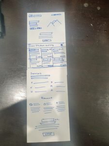
The next step in designing the website is to develop a design process that takes into account the research and analysis. In this case, we started with some open discussions about design, provided mood-boards to the client and moved on to wireframing pages.

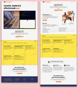
We then moved on to the visual design phase, where we integrated their color scheme and updated their typography and layout to conveys the client’s sense of luxury and exclusivity. We used high-quality images and minimalist graphics to showcase the client’s properties and modern aesthetic.
the purpose page shows off the brand’s color scheme, layout and typography
Design Solution
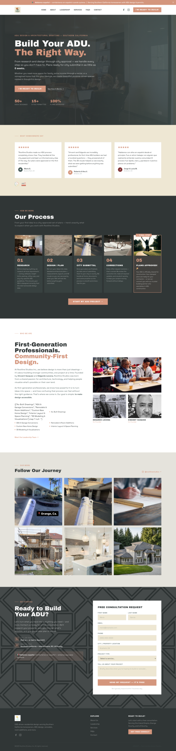
After the design process was complete, we presented the client with a website that met all of their requirements and exceeded their expectations. The website features a responsive design that adapts to all screen sizes and devices, and it a custom built portfolio item custom-post-type and a robust portfolio page with AJAX filtering features.
Individual portfolio pages are using a stylish slider that breaks out of the page layout on desktop and adjusts beautifully on mobile. I also integrated lightbox in the portfolio gallery section for easier viewing.
I added scroll listener animations on a purpose page and a logo load screen feature on the homepage. The company wanted a minimal portfolio page with the images as the main focus and opted out of longer form text. Regardless, we added meta descriptions, keywords and OG images on each page.
Evaluation
We aren’t handling analytics for the client. Their presence on search remains at two (due to a consumer product with the same name), but they now have extensions for key pages as well as images of their past projects on their search results. They are ranked #1 if you search for them and add pertinent search information like “contractor,” or “Los Angeles.” I can’t say much about engagement and bounce rates, but I do know they are happy with the site as they’ve used us to adopt pages from the site into their print materials.