Gullywasher
Client: Gullywasher
Release Date: Dec 2021
Introduction
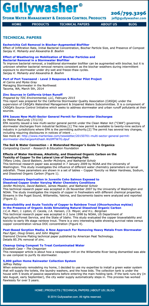
Gullywasher creates unique stormwater treatment systems in order to help companies stay compliant with state and federal water regulations. They’re a highly resourceful and knowledgeable team always looking forward and pioneering new water remediation techniques. That said, their website was stuck in the dark ages.
Research and Analysis
The first step in designing a website for an engineering firm offering stormwater compliance systems and consulting is to conduct research and analysis to understand the target audience, the market competition, and the unique value proposition of the firm. In this case, our research indicated that the target audience for the website is primarily engineering professionals, builders, developers, and municipalities. The market competition is moderate, with less than twenty major players offering similar services in the United States. Our client’s unique value proposition is their focus on innovative stormwater compliance solutions with a focus on their modular filtration systems that can be adjusted to meet the specific needs of their clients.


Design Process
The next step in designing the website is to develop a design process that takes into account the research and analysis. In this case, I started with a style guide, sitemap and some wireframes to create a clear and intuitive navigation structure that prioritizes the most important information and features.

We created a design that integrated the client’s brand and conveyed a sense of professionalism and expertise. We used high-quality images and graphics to showcase the client’s variety of products, and we used a clean and modern layout to make the site easy to navigate and use.
Pain Points: Navigation and Forms
There were usability issues faced by users with the navigation bars and forms in the previous iteration of the product. As a result, we made improving the navigation and form functionality a top priority in the updated version of the product.
Design Solution
We went through some rounds of revisions to dial in the site prior to building it. The website features a responsive design that adapts to all screen sizes and devices, and includes a case studies page, performance reports and industry news. We used a color scheme and typography that are consistent with the client’s brand and we made sure that the site is easy to use and navigate.
Navigation: A place for everything and everything in its place.


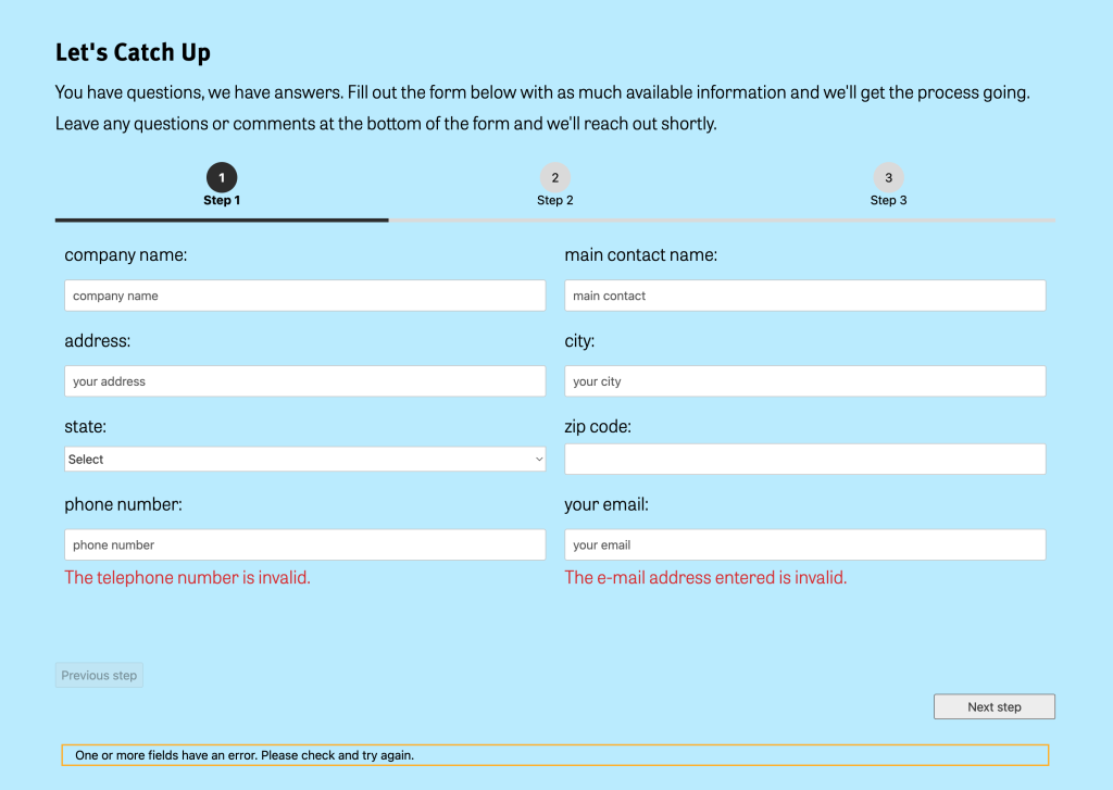
A new form

Visually, we had to break away from having the form look like it would take forever. In the previous incarnation there were tons of text inputs and radio buttons that weren’t always necessary. I used some contact form add ons to add conditional functionality and database support rather than it rerouting form information via javascript to the admin email. This means the form is only as long as it needs to be and the sales team had a place for all of their leads information.
We also optimized the site for search engine rankings on each page and posts that were recycled from the previous site incarnation.
Evaluation
After the website was launched, we checked in to measure its effectiveness and impact. We used website analytics follow ups with the client to make any necessary improvements. Gullwasher.com is performing well, with high user engagement, low bounce rates, and a healthy conversion rate on the forms. Overall, the website has helped the client establish their online presence and generate more leads for their stormwater compliance systems and consulting services.


