When I put together Click Foundry’s new custom WordPress theme after the hack, I knew it would be a process to get the site back up on it feet during off hours or when I could sneak it in. I’ve added a good deal of features and there is more to come. Today, though we’re going to focus on the details. This is the kind of refinement work in web design that rarely gets talked about but makes the difference between a site that feels clunky and one that just works. The desktop menu felt jerky and the mobile behavior was off. At a glance it wasn’t noticeable, but the difference could be felt. Here’s what changed and why it matters.
The Problem
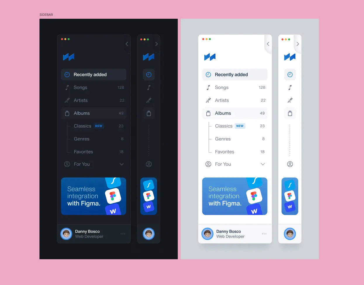
Our original menu implementation had some issues that needed addressing. The desktop menu felt jerky when switching between collapsed and expanded states, and both desktop and mobile versions were using the same JavaScript logic—which didn’t make sense for their different use cases.
Desktop Menu Changes
The main issue was the transition between collapsed and expanded sidebar states. The fix came down to adjusting how the main div responded:
What we changed:
- Added easing transitions to the main div’s margins and width, creating one fluid action instead of a jerky switch
- Modified the JavaScript behavior so clicking outside the menu no longer collapses it on desktop (you have plenty of space for both the menu and main content)
- Now you can open the menu and scroll through the main div freely—it stays open while you navigate
Mobile Menu Changes
We kept the click-outside-to-collapse behavior for mobile, but completely reworked the styling approach:
What we changed:
- The main div now stays at 100% of the mobile device width instead of adjusting responsively
- When the menu activates, the main div gets pushed over and we hide the overflow—making it feel inaccessible
- Clicking within the main div collapses the menu again
Visual Improvements (Both Platforms)
- Brightened the menu color for better distinction
- Added a subtle border line and box shadow to create visual separation
The Result
These detail pieces—the smooth transitions, the smarter behavior logic, and the refined styling—all come together to make the nav feel significantly better on both platforms.