I uploaded the old version of my site here. And I think
So, I know what I’m going to keep. Today I had Claude whip up four outlines for my services section. They sound nothing like me, but that’s hardly the point for now. I just need some services page for my home page to link to.
The services I offer are:
Custom WordPress Website Design & Development
SEO Strategy & Search Optimization
Digital Marketing Systems & Automation
Site Optimization & Performance Enhancement
Other thing things I decided on were some fun elements like building a camera feed element to my homepage, I remember 10 years ago there was a company that had a video of their workspace. The camera must have been in the rafters, but I thought it was an interesting idea. I’m not even sure it was live, but the idea of creating a digital panopticon for my workspace seems fascinating. More on that later.
I was also on webby and I saw this list of links and I just really like what they have going on: https://www.pantheonmedia.com/about-us
I don’t really like the massive fluid container size. I’m not a fan specifically when it’s free floating text, so I’m not really going to use that, but I do like love that gradient list of links. So I’m definitely goinng to try to incorporate that.
Color! I’ve decided to embrace my inner child on this one. It’s going to be the color scheme of nightwing.
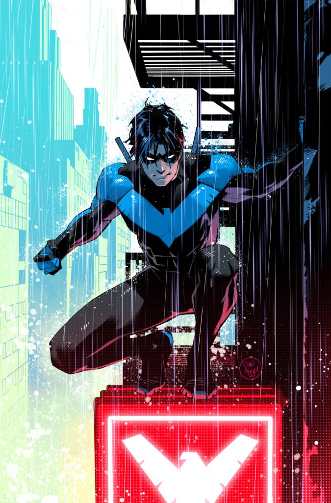
I loved comics as a kid and the grown up robin, aka Nightwing, was my absolute favorite. So, that it the color scheme for clickfoundry 2025, leaning into blacks, greys, with an accent of blue, celtic blue.
buttons! I really like these button They move a little more than what I would like them to, but I can make those adjustments on my site and maybe incorporate some of my color.
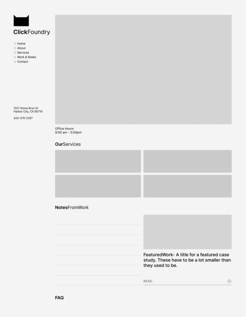
And I’ve sorted out the flow of the homepage
ABOVE THE FOLD
nav, tagline, location data, video feed, office hours, cta buttons,
BELOW THE FOLD
services, featured work (link gradient idea), notes and FAQ
Sidea, which is a sidenote and an idea. what if we made it look like a generative text app. sidebar on the left content in the center, this would force everything into neat cards, while creating visual distinction by not looking like other website.
“Dispelling one trick pony myths, isn’t he?”- earl