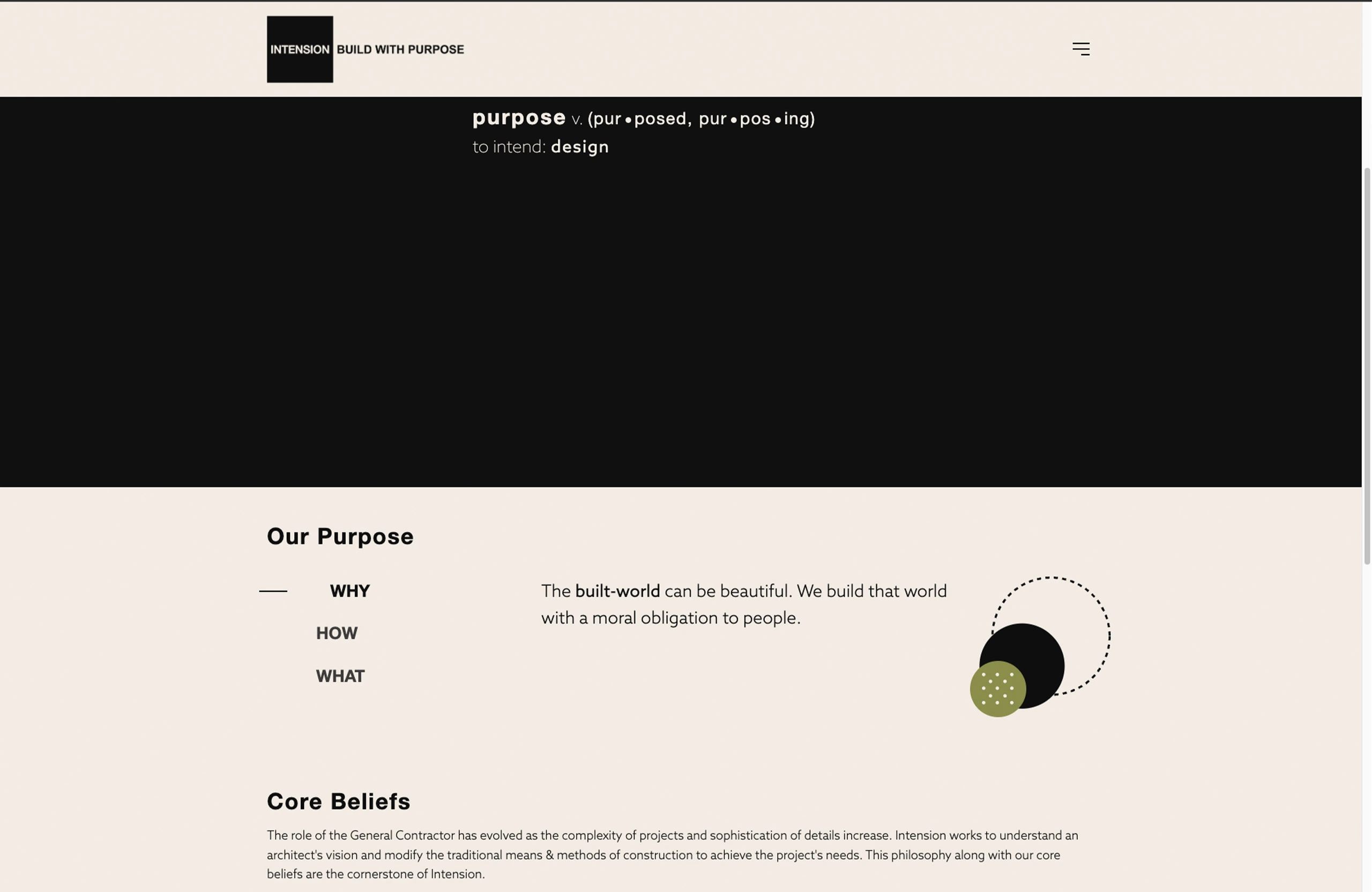
the web design process for small to mid-size businesses
the first step is to do an intake and get a feel for each other. We’ll talk about the challenges facing your business and what’s behind the push to redesign or create a website. That brings us to goals and from there we’ll have a framework for the amount and type of pages you’ll need.
My price range is between $2,500 to $6,000 for a website. I create a custom theme with your name on it, the design may pick from other sites, but it will be custom coded.
After the initial intake where we trade some information about aesthetics and competitors comes the research. Along with my research this is a perfect time to send me all of your visual and text assets. My goal is take some interesting features from around the web and bring them to our shared project. Here’s an example of a mood board.
video moodboard for a website design
Once I get your feedback. I’ll start on creating a sitemap and some mockups for main pages.
Visual Mock-ups
I usually create mockups in photoshop and illustrator and send them off to you for review, but if you’re a bit tech savvy, I can also send them as Figma files. The goal here is provide an aesthetic representation of the most important pages and collect feedback from you. There is usually around three revisions during this phase.
Web Design
I’ll build out your site on WordPress most like with custom page templates. I’ll create an unindexed site where you can see a copy live and click around.
Do you come off poorly when you present your work to potential clients in person? Probably not.
You probably dress up, put on your nice shoes, spend a little extra time on your hair and face and most importantly bring your portfolio with you. And if you’re looking to land a client cold, that portfolio is looking stellar.
Why should it be any different online? I’ve seen a lot of architecture websites and they’re pretty awful.
the filter option is nice when you have a lot of work of a type of category. Not so much here.
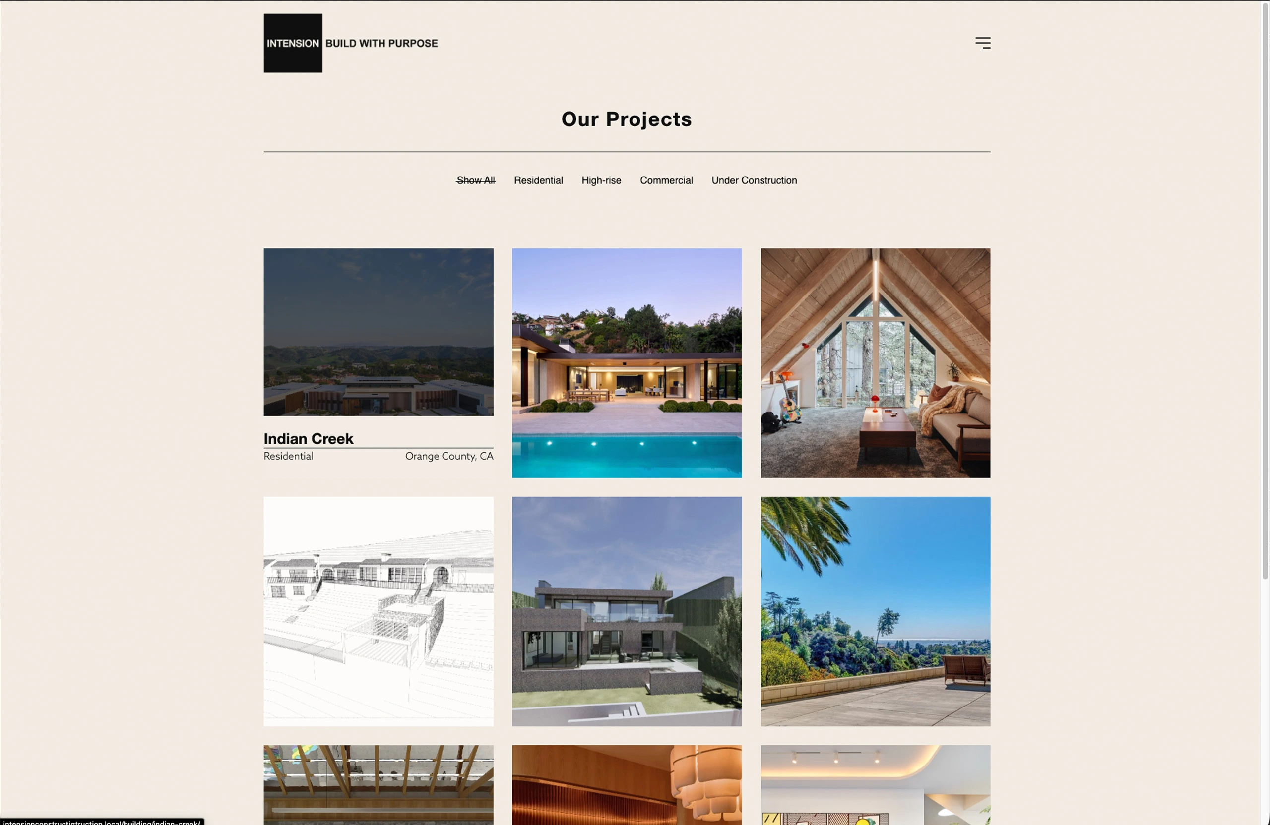
The biggest design pain point for architecture websites is portfolios that don’t change size depending on the screen width.
The other is a lack of function in the portfolio grid. It’s just an equal height and width grid of boxes. The user clicks on it and a gallery slider pops up and displays some images.
It’s impossible to show your work off in a well-designed way with a standard WordPress setup.
What you need is something called a custom post type (CPT) and a way to display the CPT. A custom post type is a collection of data. For architects that means photos of the space, dates about the build, a description, and other information.
Website development layout sketch drawing
If hiring someone to build out a Custom Post Type that blends in seamlessly into your website is outside of your budget finding flexible plugins to manage your portfolio is the next best thing. Here are my top five plugins for Architects.
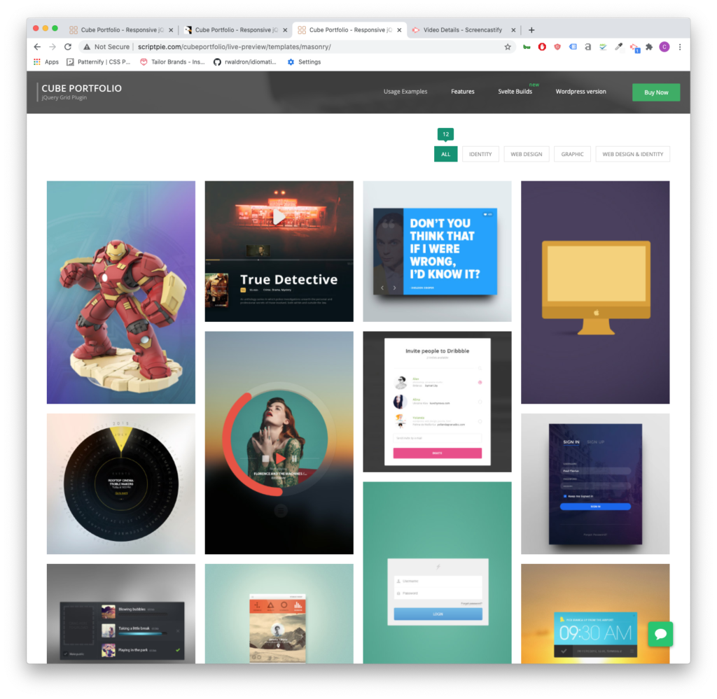
Cube Portfolio
So, I used Cube Portfolio as a free piece of code on a project I was working on a few years ago. Then, I thought that it looked great. So when it came time to build out my own site, I was gearing up to integrate the code from scratch, and then I found out they had a plugin for WordPress. It’s light and easy to use.
At $19 for the plugin, it’s totally worth the money. The grids it creates are responsive and look good on all screens. So displaying your latest residential or commercial projects will look great on desktop, tablet, and phone.
Cube Portfolio is dynamic on hover and has some of the coolest pop-up displays. It also gives you the option to open a new page when the user clicks on one of your portfolio tiles. Which is very useful when you’re tracking user data.
It’s a very versatile plugin. You can have it display image galleries, videos, and customized layout with descriptions, key information about your project. Cube Portfolio also comes with a lot of documentation. If you choose to hire out a developer, this is a plugin that is very open to professional customization and integration.
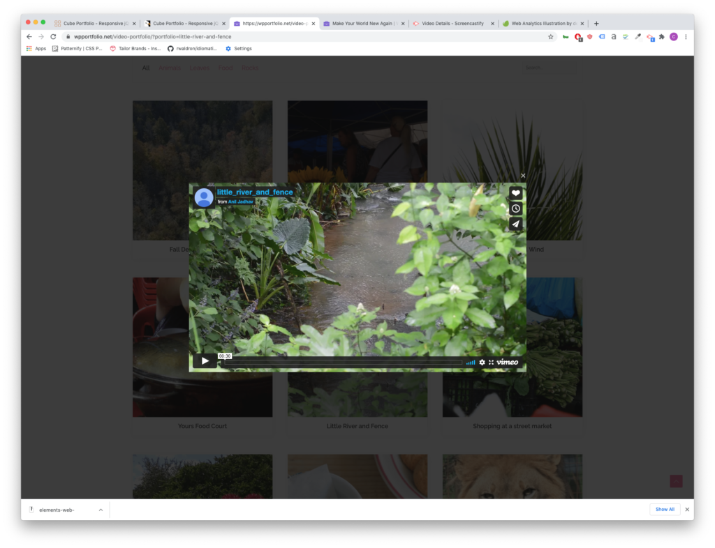
WP Portfolio
WP Portfolio comes with 4 different post types: Image, Website, Video and Single Page. If you’re using page builders like Elementor or WP Bakery, WP Portfolio is the right plugin for you. It integrates with these page builders and since you can copy and paste the page builder shortcode, creating a cohesive look for your latest residential and commercial projects will be easy.
Video Player for your portfolio grid can be useful if you film walk-throughs of your work.
This plugin has also been around for a while and comes from a very well-established development company. The support team is very responsive and updates their product often.
WP Portfolio is $39 for the year for its beginner package.
GO Portfolio
GO Portfolio brings the best of Cube Portfolio and makes it more accessible by providing more starter templates and simple color customizations. It is also responsive for mobile, tablet and desktop layouts and has plenty of interactive hover functions.
Unlike WP Portfolio, GO Portfolio doesn’t integrate with as many page builders, but it does integrate with Visual Composer (one of the most popular page builder plugins).
GO Portfolio is only $26
Essential Grid
Essential Grid is a very design heavy and modern plugin and also integrates with Visual Bakery. It offers a wide range of hover functions.
One of the best and unique features of Essential grid is its demo data because of its design focus.
Much like WP Portfolio, the parent company for this plugin is also an established company, with the widely used (although, often misused in my opinion), Revolution Slider under its belt. That means that there is robust documentation on how to set up Essential Grid. It also means you can depend on responsive support staff in case you come across an issue.
The starter package begins at $34 for the year.
WP Softs: GridKit
WP Softs Grid Kit delivers grids in 3 different styles: masonry (that staggered varying heights style), gallery and puzzle. It is also responsive and offers a lot of hovering styles.
It also has some pretty interesting features that aren’t often highlighted in other plugins like share features and google map embeds.
It only costs $26 for a lifetime purchase of the plugin and has everything you need to show off new home projects.
I’ve been making websites for about 5 years now. For the most part, I create custom landing pages and fix broken websites on WordPress or Shopify. I also create websites from scratch and offer a variety of marketing services.
Websites
When I build something out, I like to figure out how my client’s ideal candidate will use the site. Then I reverse engineer what that client to see to buy.
It’s easier said than done. That’s why I install analytics on all my sites.
For most businesses, I would recommend building websites on top of a “CMS.” CMS is short for “content management system.” It’s a way of saying that there is an area that allows you to edit posts, pages and do some minimal customization. My CMS of preference is WordPress. This website uses WordPress.
If it’s up to me, I’ll build a site with WordPress. It’s free to install. There is a large community of developers that build tools for it. And I’m good at customizing this framework.
WordPress is good for all types of sites, but most clients are a service company or a goods company. WordPress is ideal for either category.
Services
I charge around $3,000 for a simple 5-7 page website built on top of a Content Management System. We’ll have a chat about your ideal audience and previous marketing material. We will also discuss your goals for the year.
We’ll determine the number of pages needed and how to connect them to one another. Linking pages will create a flow for your web visitors. Along this flow, we’ll use imagery, video and words to achieve your goals.
I will also add necessary features to your website to keep it competitive and secure. This includes tracking, analytics, SEO and security software.
Some businesses need booking software or other enhanced features built into the website. Pricing will vary depending on the complexity of the site and its features.
Online Store
Online stores come in a variety of forms. For single item products, I would build out something very simple on WordPress or Shopify. My starting pricing for an online storefront like that would be around $1,500.
Stores with multiple products might need several “landing pages.” Landing Pages are persuasive pages that sell a product. Online stores also need data entry and photography to create a robust website. This will also affect the price. As always, I add necessary software for the site to stay up to date. I also offer retail-specific analytics and tracking options.
Analytics and Tracking
My standard setup is Google Analytics and a Facebook pixel. If you would like to add other tracking scripts like Hot Jar, let me know and I can get it up and running.
For the uninitiated, tracking and analytics are very powerful marketing tools because they can tell you important numbers about your website. For instance, you can find out how many people visit your site and how long people stay on a page on average. This becomes useful when you start marketing.
My favorite use of analytics is monitoring people interacting with a web page. Let’s say that I create a landing page for my web design services. In the middle of the page, I add a link to an article detailing what goes into my custom websites. I can track how many people click on that link. I can also track how long someone stays on the article page.
In this thought exercise, you’ve scrolled to the middle of the page and expressed interest in learning more. Presumably, you’re interested in a custom website. If my analytics tell me that this happens often, then my marketing activities along with my “landing page” are successful. If this doesn’t happen often, then I have to make some adjustments. Outside of analytics, websites with a “tracking script” allow businesses to reach out to visitors. For instance, if you don’t reach out yourself, I can add you to a series of advertisings across social media channels.
This can be powerful for businesses looking to compete online.
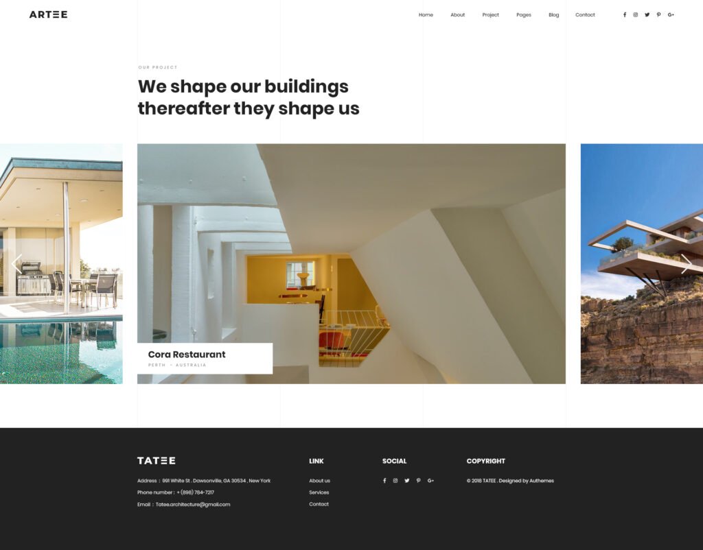
All the architecture websites I’ve seen have at least those components. The home page is often just a slider with some very nice images of homes. It’s a bit of a shame because websites for architects can be so much more.
The Problem with websites for architects
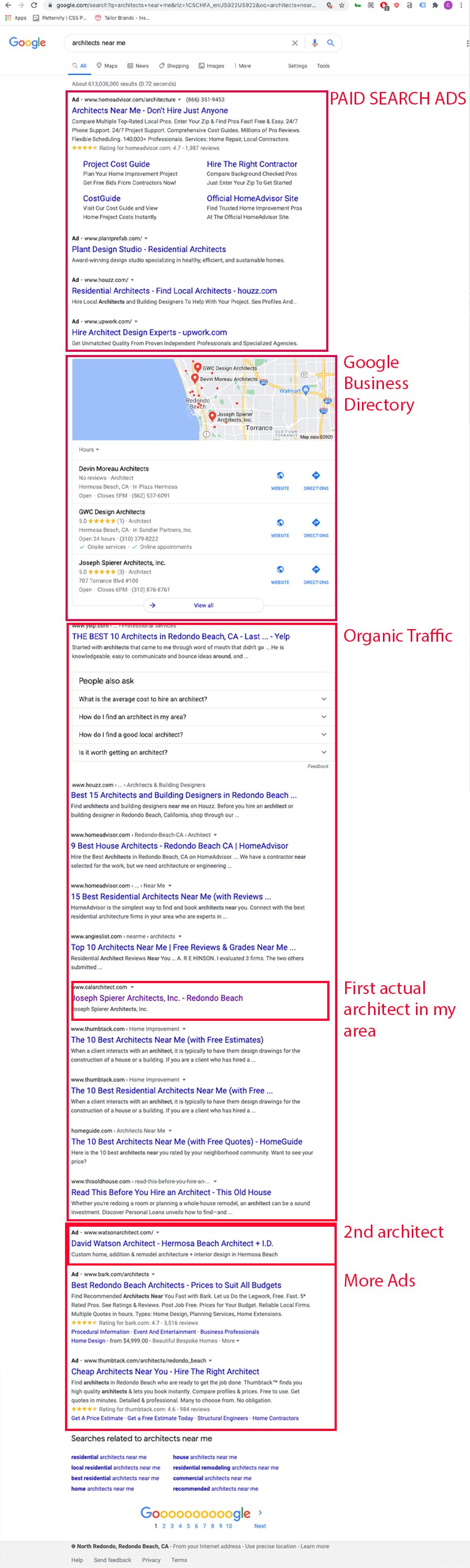
If this image is proof of anything it’s that architects are not taking their websites seriously. In the top ad spots of google you have freelance aggregators. In the organic section of google, you only have one website from my selected area that belongs to an architect.
The problem has to do with how user-oriented the architect’s website is against the query. To take on this issue, websites for architects need to create user-specific landing pages. The best place to start here is to understand your customers. I wrote an article that touches on this called marketing for architects.
A visible advantage for architecture websites
Often the hardest part of designing a website is the lack of great photos and illustrations the company has on hand. Websites for architects rarely lack great photos. Great photography sells clients on a proposal.
Great web design can bring you those clients.
The Form and Functions of Websites for Architects
Websites are not brochures on the internet. They are not business cards. They are interactive, involve motion and can provide entryways to other pages. These features allow the user to have a rich experience with your firm.
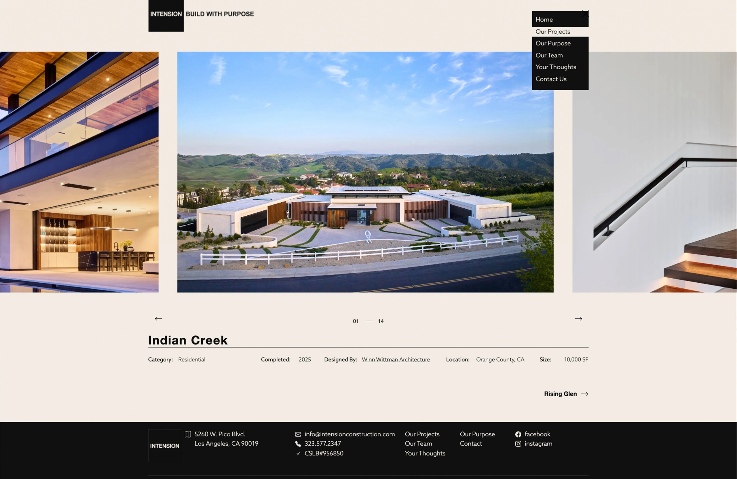
The Portfolio Page
The portfolio page comes in a variety of forms.
One of my favorites are interactive grids. The example from above comes from the MKPL website and has an interactive filter.
The about page is often overlooked. At the time of writing this I’ve overlooked it on my own website. I’ll fix that fairly soon. One of the about pages that I think has a lot of potential is this one:
This page’s services sidebar has the potential to open up so much organic traffic from google. Sadly, none of these pages actually link out to pages. That said, it sure beats the infamous blurb. Which is just a small paragraph about the firm’s beliefs, founding dates and the founder’s education.
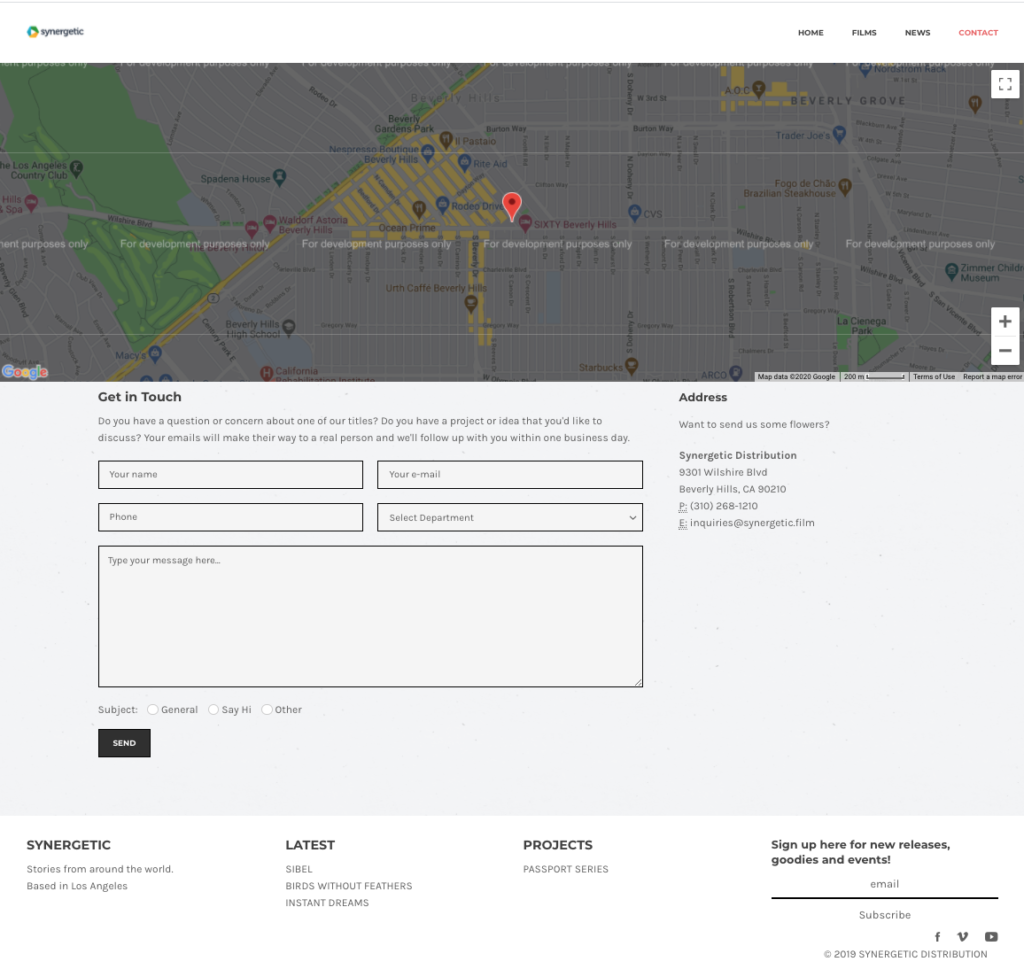
The Contact Page
Here’s a contact page I built a few years ago. It has the added benefit of providing address information for google to put in it’s listing. The bottom buttons allowed the email recepients to organize email types.
Contact Page
With the advent of interactive forms survey like forms that allow you to segment your users through “logical sequencing” of questions.
Opportunities for Architecture Websites
Most architecture websites don’t have a very robust section explaining their services.
I haven’t seen video effectively used in architecture sites.
Only 40% of the architecture websites, I’ve indexed use tracking analytics.
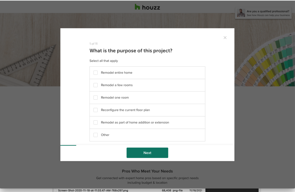
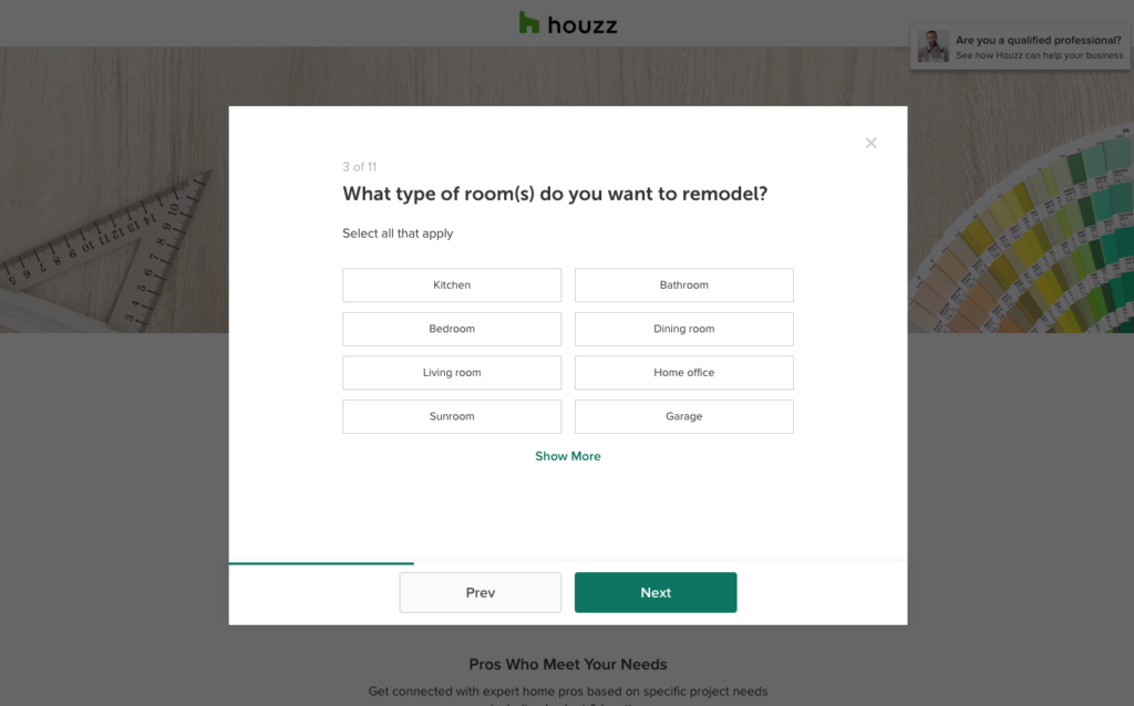
Think of the website as a series of pathways. The homepage is often what is shared with people. Google lists this page as the face of your business.
Houzz does this in order to segment their users and hand the lead over to the contractor or architect.
Houzz splits up their customers by interests like design or construction, different rooms and budgets.
Your homepage should provide the beginning steps into bringing you a phone call. A quick call button on mobile phones is always a bonus.
Users rarely go to a website without an intention.
Here are a couple of user experiences on a hypothetical website:
home page> link to a kitchen remodels page > free quote sign up page for a kitchen remodel
home page> link to a style of architecture > portfolio page of a particular style of architecture > free quote sign up page
In order to create a great user experience, you need to create a robust page. It should inform and sell the reader and then encourage the reader to take action with your film.
If you pair this way of building websites with other marketing strategies like Facebook retargeting and email campaigns you can bring up your visibility quickly.
What’s the point?
You say to yourself, organic is obviously hopeless what is the point of focusing on web design for architects when the user will have to scroll half-way down the page to even know you’re alive.
Well, I believe Yelp and Houzz can be beaten for the top spot on Organic, but more importantly, even if you do ads or business listings your website is still going to be the first thing your clients see.
I had a client who would get upwards of 150 people a week visit to her website and more than 80% of her clients would leave within the minute on the first page. Why? They left because their intentions were not being addressed as soon as the page opened. And that had to be addressed quickly.
Do you know how many people drop off after your first page?
If not, then you should take some time to think about the users experience and obviously hire me to get some analytics and guidance on your digital presence.
Birds Without Feathers won the George Stark’s Spirit of Slamdance Award in 2018. The film’s focus on mental health coupled with its hyper-stylized sets and cinematography landed it a distribution deal.
In order to get a limited theatrical release up and running a media kit and website were put together as the primary assets for B2B and B2C activities, respectively.
The production outfit for Birds Without Feathers had raised money through Kickstarter and along the way had produced a lot of marketing content. The distributor, intent on a limited theatrical release, looked for ways to boost its appeal. Among the changes was new artwork and typography.
This had to be reflected on the website. At the time, the Birds Without Feathers team did have a website. It was built on WIX. After collecting all previous creative and composing the press kit, I moved on to creating a site that could bridge the gap between what Synergetic micro-sites look like and the previous Birds Without Feathers website.
I cut a video background from the film that was reminiscent to the key art from the previous iteration on the homepage. I also added the same green to the website as the bottom-bar and side bar. I replaced the typography with the distributor’s choice and added assets from the key art into the website.
Birds Without Feathers Home Page Pre-theatrical Release
This site had Google and Facebook tracking skills and an email capture. It highlights the arthouse audience with a positive review and has a trailer as a call to action.
How do you ensure that your company lives as an option in the mind of your customer when they need your services?
In my experience, it takes a solid marketing plan and consistency woven into a well designed website and marketing initiatives.
Americans see between 4,000-10,000 ads per day depending on where they live. Ads are so pervasive, they are often referred to as noise, but I like to think of them as “white noise.” After a certain point, people don’t even notice the ads. There are thousands of companies throwing their money away on ads that don’t get noticed. So how do you stay one step ahead? Every month, a new marketing trend emerges to answer that tired question. It’s okay to test these trendy new solutions, but keep your focus on what works. Here are three things you should keep doing to cut through the noise this year.
Keep Building Your Email List
Integrates Text and Bots on your website
Update your Blog Posts
Keep Building Your Email List
Email is one of the least expensive ways to advertise. Often it will only cost you the time to think of a good headline and a solid offer to see a return. And your email list is 100% yours. It doesn’t belong to Facebook or Google. So, my suggestion work on your email list.
are you integrating your email list into your web design and marketing activities?
Build pages that talk to a particular type of customer and create sign up sheets on those pages. This way you have a specific person in mind when you’re writing those emails. I often hear that give-a-ways and gimmicky ads are a way to boost email sign ups. I’ve seen a lot of people go about this the wrong way. This tactic might generate emails, but will it generate the right emails?
There should be at least one sign up form on every page of your site when you design your website.
Integrate Text and Bots on your Website
In my experience younger generations don’t like phone calls. SMS and online messaging are less formal than email. Integrating chat on your website creates a less formal sales approach. People are more comfortable to interact with you in this way.
The statistics on chatbot are incredible. Some key takeaways are:
that over one-third of people have bot something through a chatbot.
The top quarter of companies are using a chatbot.
They often save a ton money in customer service-30%.
Year-in, Year-out, Chatbot popularity has increased over the last 5 years.
Update Your Blog Posts
If you’ve been around a while you might have some blog posts that used to bring in some traffic. Over time that traffic might have dwindled with the entrance of competition. Updating your posts with small edits or additions will help you stay at the top of search results. SEO aside, the nature of your business changes year to year. Your customer will feel comforted to see that you’re on top of that. It positions your company as an expert. It’s also a low-cost way of creating new content. You can post this “new” material in your newsletter and on your social media channels.
Conclusion
Life has a tendency to pull us in many directions at the same time. In business marketing this can be bad for your business. So this year I encourage you to focus on what works: build your email list, integrate chat bots and update your blog posts .