Websites for architects and architectural firms have three main pieces:
All the architecture websites I’ve seen have at least those components. The home page is often just a slider with some very nice images of homes. It’s a bit of a shame because websites for architects can be so much more.
The Problem with websites for architects
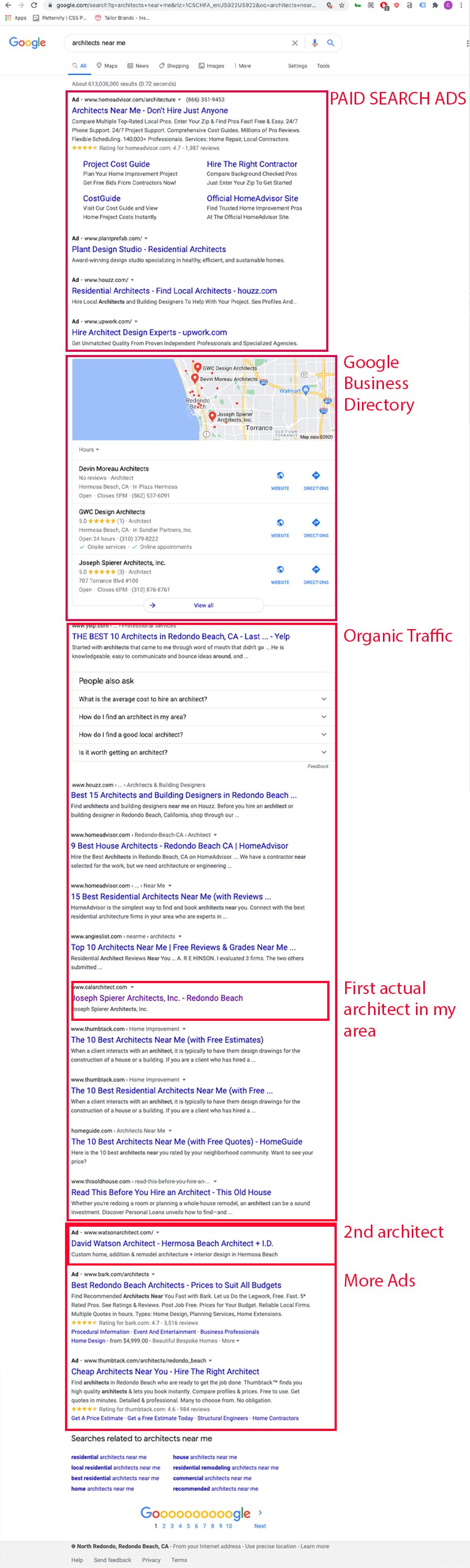
If this image is proof of anything it’s that architects are not taking their websites seriously. In the top ad spots of google you have freelance aggregators. In the organic section of google, you only have one website from my selected area that belongs to an architect.
The problem has to do with how user-oriented the architect’s website is against the query. To take on this issue, websites for architects need to create user-specific landing pages. The best place to start here is to understand your customers. I wrote an article that touches on this called marketing for architects.
A visible advantage for architecture websites
Often the hardest part of designing a website is the lack of great photos and illustrations the company has on hand. Websites for architects rarely lack great photos. Great photography sells clients on a proposal.
Great web design can bring you those clients.
The Form and Functions of Websites for Architects
Websites are not brochures on the internet. They are not business cards. They are interactive, involve motion and can provide entryways to other pages. These features allow the user to have a rich experience with your firm.
The Portfolio Page
The portfolio page comes in a variety of forms.
One of my favorites are interactive grids. The example from above comes from the MKPL website and has an interactive filter.
Here are some other examples:

The About Page
The about page is often overlooked. At the time of writing this I’ve overlooked it on my own website. I’ll fix that fairly soon. One of the about pages that I think has a lot of potential is this one:

This page’s services sidebar has the potential to open up so much organic traffic from google. Sadly, none of these pages actually link out to pages. That said, it sure beats the infamous blurb. Which is just a small paragraph about the firm’s beliefs, founding dates and the founder’s education.
The Contact Page
Here’s a contact page I built a few years ago. It has the added benefit of providing address information for google to put in it’s listing. The bottom buttons allowed the email recepients to organize email types.
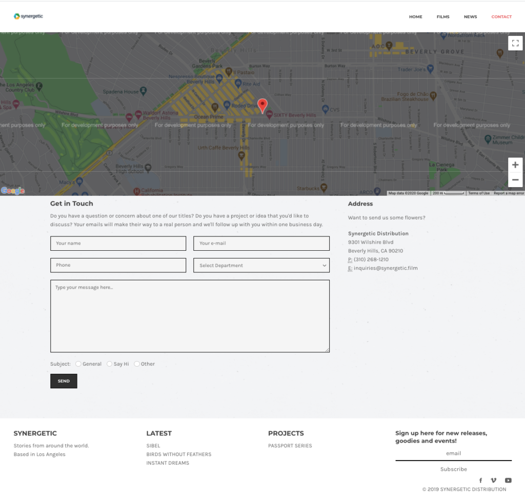
With the advent of interactive forms survey like forms that allow you to segment your users through “logical sequencing” of questions.
Opportunities for Architecture Websites
- Most architecture websites don’t have a very robust section explaining their services.
- I haven’t seen video effectively used in architecture sites.
- Only 40% of the architecture websites, I’ve indexed use tracking analytics.
- Architecture websites don’t create location focused pages.
The User Experience
Think of the website as a series of pathways. The homepage is often what is shared with people. Google lists this page as the face of your business.
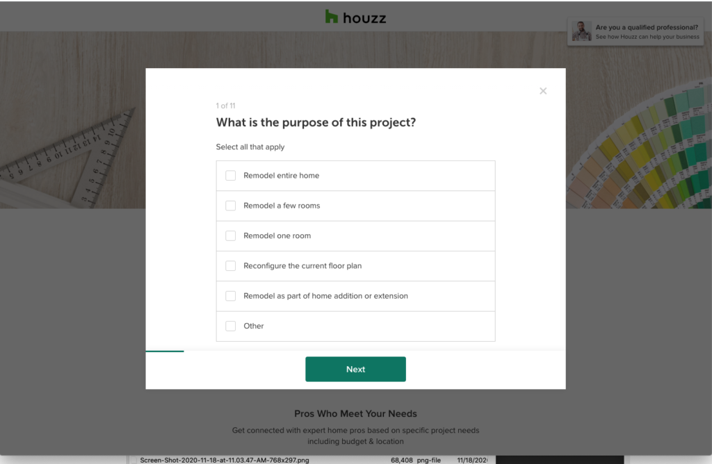
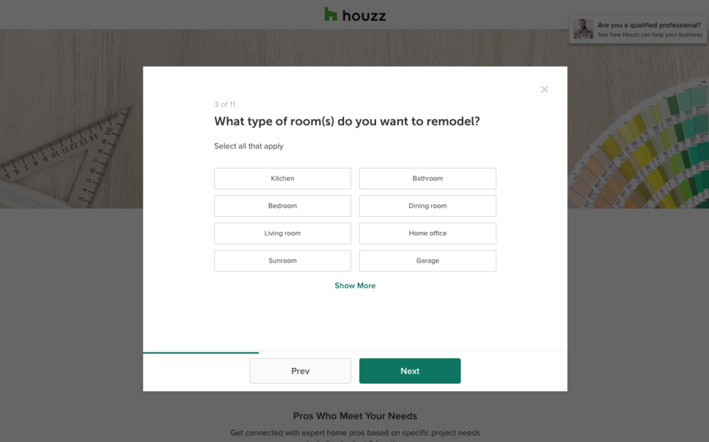
Houzz does this in order to segment their users and hand the lead over to the contractor or architect.

Your homepage should provide the beginning steps into bringing you a phone call. A quick call button on mobile phones is always a bonus.
Users rarely go to a website without an intention.
Here are a couple of user experiences on a hypothetical website:
- home page> link to a kitchen remodels page > free quote sign up page for a kitchen remodel
- home page> link to a style of architecture > portfolio page of a particular style of architecture > free quote sign up page
In order to create a great user experience, you need to create a robust page. It should inform and sell the reader and then encourage the reader to take action with your film.
If you pair this way of building websites with other marketing strategies like Facebook retargeting and email campaigns you can bring up your visibility quickly.
What’s the point?
You say to yourself, organic is obviously hopeless what is the point of focusing on web design for architects when the user will have to scroll half-way down the page to even know you’re alive.
Well, I believe Yelp and Houzz can be beaten for the top spot on Organic, but more importantly, even if you do ads or business listings your website is still going to be the first thing your clients see.

I had a client who would get upwards of 150 people a week visit to her website and more than 80% of her clients would leave within the minute on the first page. Why? They left because their intentions were not being addressed as soon as the page opened. And that had to be addressed quickly.
Do you know how many people drop off after your first page?
If not, then you should take some time to think about the users experience and obviously hire me to get some analytics and guidance on your digital presence.