Every year a top web trends article comes out. It’s mostly bullshit. But it points to something more interesting in design and perhaps everywhere. We want to know what to do and it’d be nice if it were easy. The design trend article is an extension of that, we don’t want to rebuild the wheel ourselves, we want some guy at Figma to give us some pointers. And that’s fine.
So, instead of giving you an article that says NeoBrutalist backgrounds with animated post-structuralist references is the direction the web is going and taking screengrabs from stuff I like on the Webby Awards, I’m going to try to define the standard web experience.
When I started this project, I was trying to build a flexible starter theme for my custom WordPress sites. I wanted to see what the numbers say about a starting point. The process of designing something then becomes a question of how and why we move away from the center. And the questions came at me in rapid fire.
1How big should an H1 be?
2What line height does everyone use?
3Does anyone use clamp()?
4Does anyone use container queries?
5Does anyone touch letter-spacing?
It got technical, so apologies in advance. The jump links at the top are there for skimming.
Over the years, peeking behind the curtains on the sites I like, I found no real consensus on how to make a site. I did develop my own preferences, but by the numbers, what I found is that the adoption of systems, and how easy they are to adopt, is what determines what the web looks like.
A note on the numbers before I start. Everything below comes from 158,294 websites: the homepages in the Tranco top million that were in English, were actually sites, rendered in a real browser, and were not part of one link farm or an adult or gambling site. I call that the clean corpus. Where a table says “sites” it means a share of those 158,294, or of the subset that had the element in question (not every homepage has an H1). Where a table says “stylesheets” it means a share of the 1,734,591 unique CSS files those sites load, counted once each no matter how many sites share them. Those are different populations and they tell different stories, so I say which one every time. How the corpus was built is its own piece.
TRENDY
This is a bit of a reaction to the obnoxious annual listicle of design trends. There are questions here about how ideas diffuse across cultural artifacts in the age of the internet that I’m not qualified to answer. What I can say is that out of the items I can measure looking at the markup and stylesheets of these websites, it’s hard to say that these “trends” are significant. This is just some shit a designer thinks is cool and has seen a couple of times. And that’s fine. The headline is obnoxious and to me that’s less fine.
Now the list. Figma’s “web design trends 2026” names thirteen. I can only measure five of those with the data that I have with any degree of confidence. So here they are:
3D
One homepage in 200 has anything 3D in it
three.js 0.4% of pages, WebGL contexts 0.1%, embedded 3D viewers 0.1%. About one homepage in 200 has anything three-dimensional in its code.
Vibrant color palettes
One site in eight, and it is probably blue
Take each site’s dominant background color: 75.2% of 155,615 sites are neutral, 12.8% are tinted, and 12.0% have a saturated mid-tone background. Nearly every site (95.9%) has at least one saturated color somewhere, because a blue link counts, and of those accent colors blue, azure and cyan are 58.5%. The vibrant-palette web is one site in eight, and even then it’s probably blue.
Bold typography
Bold is the plurality, not a trend
44.8% of H1s are 700 or 800*; 25.8% are 56px or larger*; 10.5% are uppercase*. The light headline (400) is on 21.8%*. Bold is the plurality, not a trend.
Dark mode
One site in eight is dark by default; a toggle is on one in twenty
12.2% of sites render a dark body by default* (gaming 45%*, entertainment 32%). A dark-mode toggle is on 5.4% of pages, a color-scheme meta tag on 1.2%, and prefers-color-scheme appears in 1.4% of stylesheets. Dark-by-default sites are more than twice as common as sites with a toggle.
Motion and micro-interactions
A quarter of stylesheets animate something; the libraries are on 2 to 3% of pages
@keyframes in 23.4% of sheets, animate.css on 8,286 clean sites, scroll-animation libraries on about 3% of pages, GSAP 2%, Lottie 1.2%. prefers-reduced-motion in 5.0% of sheets. Transitions on hover are presumably near-universal but I didn’t count them.
On motion: canvas, WebGL, 3D and animation libraries
From the corrected trends probe on 15,001 clean homepages:
| Library or technique (HTML scan) | Pages | Share |
|---|---|---|
| cookie or consent banner | 4,490 | 29.9% |
| Swiper or Slick carousel | 2,783 | 18.6% |
| mega menu | 1,843 | 12.3% |
| variable font axis range | 879 | 5.9% |
| dark-mode toggle | 817 | 5.4% |
| AOS or ScrollReveal (scroll animation) | 432 | 2.9% |
| GSAP | 305 | 2.0% |
| Lottie | 185 | 1.2% |
| three.js | 56 | 0.4% |
| WebGL canvas context | 19 | 0.1% |
| model-viewer, Sketchfab, Matterport, Spline | 12 | 0.1% |
| Framer Motion | 8 | 0.1% |
15,001 clean homepages, first 400 KB of rendered HTML, tightened patterns (trends_probe2.py).
The most common “motion” on the web is a carousel. Carousels are relatively easy to build by hand and they are easy to make as plugins because of a handful of great JavaScript libraries. What I see in the numbers is that design friction is tied to what we do or don’t see on the web. People do hard things less.
Scroll-triggered animation libraries, GSAP and Lottie together are on about 6% of homepages. Three.js is on four in a thousand. Admittedly these are harder libraries to master and require more assets.
The cookie banner is at 30%, which is six times more common than every animation library combined. This is brought on by necessity, everyone is scared to get sued, people make plugins for that.
Frameworks, themes, stacks, templates
Before we hop into the pixels of it all, I want to put it out there: I like the internet. I like its scaffolding. I’m just trying to wrap my head around the numbers here, and this is the part that explains why things are the way they are.
WordPress comes with most hosting setups as a one-click install. Bootstrap and Tailwind used to be drag and drop, or just pasting a CDN link into your HTML. Now you can spin up either in the terminal with a single line you copy to your clipboard with the click of a button.
IT’S EASY TO START. That’s the point. And then you’re locked into all of their choices. Which is fine…but not really.
| Stack | Clean sites | Share of 158,294 |
|---|---|---|
| Bootstrap (winning CSS framework) | 79,482 | 50.2% |
| No framework detected | 55,257 | 34.9% |
| Tailwind | 23,084 | 14.6% |
| Sites carrying both Tailwind and Bootstrap tags | 73,656 | 46.5% |
| WordPress | 37,933 | 24.0% |
| No CMS detected | 107,558 | 67.9% |
| Shopify | 4,278 | 2.7% |
| Drupal | 3,966 | 2.5% |
| Squarespace | 1,069 | 0.7% |
| Webflow | 752 | 0.5% |
| Wix | 626 | 0.4% |
domain_tags, one winning framework and CMS per site.
Half the clean web is on Bootstrap. Wix, Squarespace and Webflow together are 1.5% of the Tranco top million, which tells you the builders you see advertised are not where the popular web is built; it’s built on WordPress and on hand-rolled Bootstrap. Both of which are FREE. The 73,656 sites tagged with both Tailwind and Bootstrap are a plugin or a component library bringing the second framework along for the ride.
WordPress is a whole other rabbit hole, but as the most popular CMS very popular themes and plugins also shift the definition of the standar web look in the data. I get into what the Tranco database project has to say about WordPress here.
So what does the standard web look like? Mostly it looks like Bootstrap or Tailwind, Google’s font library, and maybe a few of the popular JavaScript libraries. A lot of what a client thinks of as design is inherited choices from open-source projects like these. In the sense that these frameworks make a lot of the choices, we can think of the web as mostly undesigned.
#212529; 5,802
carry its primary blue #0d6efd.
#0000ee.
One site in ten has a link nobody styled.
#333, #212529 and their mixes. Framework
defaults.
domain_css_weight, computed_styles and the palette table, clean corpus. The color “system” is each site’s body background, body text and H1 color taken together.
It gets messy
I did a quick count of how many stylesheets a site actually has going at once. On the homepages of these 158,294 sites the browser is running 22.4 stylesheets on average, 703 KB of CSS. That’s the average; it’s a lot worse on the platforms.
| Platform | Sites | Stylesheets per site | CSS per site |
|---|---|---|---|
| No CMS detected | 106,102 | 16.2 | 583 KB |
| WordPress | 37,922 | 34.1 | 953 KB |
| Shopify | 4,278 | 75.7 | 1,088 KB |
| Wix | 626 | 32.0 | 1,172 KB |
| Squarespace | 1,069 | 27.8 | 1,363 KB |
domain_css_weight joined to domain_tags, clean corpus; external and inline sheets together.
Twenty-two stylesheets is a lot of surface area for rules to conflict, and it’s exactly how you get 17 breakpoints on one page. Not all of them are min, not all of them are max; the default for any one stylesheet can be the opposite of the one next to it, and you can have conflicting rules inside a single sheet. A Shopify store loads 76 of them. My own site loads 11, five files and six inline blocks, and I thought that was a lot.
Modern CSS in general
I empathize with the design pros evangelizing new ways to make things responsive or faster. In the numbers, though, that change is coming slowly, if it’s coming at all.
Share of stylesheets using each feature, from a 60,000-sheet sample scanned for the signals companion. The year is when the feature became available in every major browser (Chrome, Firefox and Safari), the point after which a site could use it without a fallback.
Units from the 1,734,591 unique sheets the clean sites load; rem beats px on 20,859 of 156,880 sites with CSS; custom properties from the 60,000-sheet sample, median seven variables per sheet that has any.
What a standard looks like
The shame of dropping into a rabbit hole, sometimes, is that you come out with very little to show for it. So for me I wanted to come out with a standard, a baseline: a set of CSS rules that make the averagiest site there ever was. The black t-shirt and jeans of the mid-to-late aughts.
So, according to the numbers, it goes something like this:
- Body. 16px Open Sans on a 24px line-height, black on white. Everything below assumes that 16px base, which is also what the numbers say.
- General headings. Roboto, weight 700, line-height 1.2, sentence case. Nothing uppercase.
- Letter-spacing. None. Normal letter-spacing on every element, nothing tightened, nothing opened up.
- H1. 48px, or 3rem, on a 1.2 line-height.
- H2 and H3. In the numbers these two share a font size: both land on 24px most often. So I bumped the H2 up to 32px (2rem) and kept the H3 at 24px (1.5rem), assuming a body, or base, font size of 16px. That gives 48 / 32 / 24 / 16, a straight 1.5 step.
- Button. Square corners, no border, no shadow, 16px, weight 400, sentence case.
- Breakpoint. One, at 768px, min-width.
This is what most of the web looks like
A second-level heading at thirty-two pixels
Sixteen pixel Open Sans on a twenty-four pixel line-height, weight four hundred, no letter-spacing, sentence case. Lorem ipsum dolor sit amet, consectetur adipiscing elit. Sed do eiusmod tempor incididunt ut labore et dolore magna aliqua, quis nostrud exercitation ullamco.
Read more
A third-level heading at twenty-four pixels
Lorem ipsum dolor sit amet, consectetur adipiscing elit. Sed do eiusmod tempor incididunt ut labore et dolore magna aliqua, quis nostrud exercitation ullamco.
| H1 | Roboto · 48px · 700 · line-height 1.2 |
| H2 | Roboto · 32px · 700 · line-height 1.2 |
| H3 | Roboto · 24px · 700 · line-height 1.25 |
| Body | Open Sans · 16px · 400 · line-height 24px |
| Button | Arial · 16px · 400 · radius 0 · no border · no shadow · sentence case · padding 4px 12px · background #efefef, the browser’s own button grey |
| Colors | body background #ffffff (73,744 sites) · body text #000000 (46,090) · H1 shown in black, though the single most common computed H1 color is white (36,878), because so many H1s sit on a dark hero banner |
Each property is the most common value on its own (top font, most common pixel size, top weight, median line-height, most common color). Nobody’s site is exactly this; a lot of sites are within a step of it.
The median site is a little quieter than this: its H2 is 1.79 times the paragraph (about 29px) and its H3 1.33 times (about 21px).
The aggregated numbers are not a design choice that any single person made. It’s the intersection of the defaults, and I think that makes it the perfect starting point for a website. It’s serviceable. If you copied and pasted this CSS into your stylesheet, no one would bat an eye at the site. And as a baseline, it lets you change single elements and see the effect they have on the look and feel of the site.
body {
  font: 400 16px/24px "Open Sans", sans-serif;
  color: #000;
  background: #fff;
}
h1, h2, h3 {
  font-family: Roboto, sans-serif;
  font-weight: 700;
  line-height: 1.2;
  letter-spacing: normal;
  text-transform: none;
}
h1 { font-size: 48px; }   /* 3rem   */
h2 { font-size: 32px; }   /* 2rem   */
h3 { font-size: 24px; }   /* 1.5rem */
button, .btn {
  font: 400 16px/1.5 Arial, sans-serif;
  padding: 4px 12px;
  background: #efefef;
  color: #000;
  border: 0;
  border-radius: 0;
  box-shadow: none;
}
@media (min-width: 768px) {
  /* the one breakpoint everyone agrees on */
}
The standard stylesheet: every value is the most common one in the clean corpus except the H2 size, which is the second most common so that it differs from the H3.
Putting it all together by industry
As this project developed I kept adding more passes over the markup and stylesheets. At some point I realized that I was curious about what the sites actually were, and how all of my design questions would change by just adding an industry label.
At first I ran a script against each site’s title and meta description, scoring them against keyword lists, which left over half of the sites with a “general” industry label. Then we did two model runs through Ollama’s hosted API, first Gemma, then DeepSeek. That gave us 28 industry slices.
And because of that, we were able to extrapolate styling patterns across technology, news, gaming, fashion and beauty, and food and drink.
Technology
32,032 sites
Technology (32,032 sites, a fifth of the corpus) is the baseline the others deviate from: Inter is its H1 (7.8%), half of tech sites use one font, 5.8% uppercase their H1, 14.2% run dark, the Tailwind share is 16.8%, and pages are short (6,163px) and light (579 KB of CSS). What tech has instead is Next.js: 3,025 of the corpus’s 12,000 Next.js sites, though finance uses it at a higher rate (1,287 of 8,512 sites).
Ship the next thing faster
Lorem ipsum dolor sit amet, consectetur adipiscing elit. Sed do eiusmod tempor incididunt ut labore et dolore magna aliqua, quis nostrud exercitation.
Read more| H1 | Inter · 48px · 700 |
| Body | Inter · 16px · 400 · line-height 24px |
| Button | Arial · 16px · 400 · radius 0px |
Inter leads both H1 and body; 23.4% of tech H1s carry negative letter-spacing, the highest tightening rate of any sector, so the H1 here has letter-spacing of -0.02em.
News and media
7,651 sites
News and media (7,651 sites). The most homogeneous sector on the web. Roboto is the H1 on 18.7% of news sites, triple its share anywhere else, with Open Sans at 10.2%; 61.5% load Google Fonts, the highest of any sector; 41.7% run WordPress, the second highest; and news has the smallest body text, with 25.6% of homepages at 14px against 13% in technology. Homepages average 8,679px tall, versus 6,163px in tech. News sites are second only to food in fonts used (27.5% use three or more) because the masthead, the headlines and the body are set separately. This is the newspaper theme market (Newspaper by tagDiv is the fourth most common theme in the whole corpus) doing exactly what it was sold to do.
Council passes budget after midnight vote
Lorem ipsum dolor sit amet, consectetur adipiscing elit. Sed do eiusmod tempor incididunt ut labore et dolore magna aliqua, quis nostrud exercitation.
Read more| H1 | Roboto · 28px · 700 |
| Body | Open Sans · 16px · 400 · line-height 24px |
| Button | Arial · 16px · 400 · radius 0px |
The smallest headlines of the five: the H1 mode is 28px against 48px in tech, and a quarter of news homepages set body text at 14px.
Gaming
7,456 sites
Gaming (7,456 sites). The dark web. 45.1% of gaming homepages render a dark body, against 12.2% overall and 2.7% in fashion. Gaming also has the fewest breakpoints per site (16.2 distinct widths on average, lowest of all sectors), one of the lowest Bootstrap shares (41.1%, with entertainment at 42.8%), and a 56.7% bold H1 rate, the highest. Whatever they’re built on, gaming sites carry fewer layers of CSS, and they look it: dark, heavy headings, fewer breakpoints.
Patch 4.2 is live: new maps, new ranked season
Lorem ipsum dolor sit amet, consectetur adipiscing elit. Sed do eiusmod tempor incididunt ut labore et dolore magna aliqua, quis nostrud exercitation.
Read more| H1 | Open Sans · 32px · 700 |
| Body | Times · 16px · 400 · line-height normal |
| Button | Arial · 16px · 400 · radius 0px |
Shown dark: 45.1% of gaming homepages render a dark body, the sector’s signature, though white is still the single most common background. Most common body font is Times, the browser default, on 503 sites; Roboto is second on 445.
Fashion and beauty
3,713 sites
Fashion and beauty (3,713 sites). The sector that looks most like a template, in a good way. 70.9% of fashion buttons are square, the highest of any sector. Only 31.1% of fashion H1s are bold, the lowest anywhere; the light-weight fashion headline is real. Fashion runs Bootstrap at 66.8%, the top of the table, averages the most breakpoints per site (30.3), and has the highest clamp() share (52.2%) and container-query share (41.1%), none of which is from designers writing modern CSS. It’s the Shopify and WooCommerce stack: e-commerce platforms ship clamp and container queries in their checkout and theme CSS, so the most conservative-looking sector on the web is the one with the most “modern” code in it.
The new season, in twelve silhouettes
Lorem ipsum dolor sit amet, consectetur adipiscing elit. Sed do eiusmod tempor incididunt ut labore et dolore magna aliqua, quis nostrud exercitation.
Read more| H1 | Montserrat (tied with Poppins) · 40px · 400 |
| Body | Poppins · 16px · 400 · line-height 24px |
| Button | Arial · 16px · 400 · radius 0px |
Montserrat and Poppins tie for the H1 at 127 sites each; the H1 weight mode is 400, the only featured sector where the regular-weight headline wins.
Food and drink
3,832 sites
Food and drink (3,832 sites). The loud one. Food has the highest uppercase rate for both H1s (22.6%) and buttons (21.4%), double the web, the largest body text (34.7% of food homepages run body text at 17px or more, against 13.6% in tech), the lowest single-font rate (only 26% use one family; 29.2% use three or more), the highest Tailwind share (23.8%) and the highest WordPress share (43.4%). Restaurants and food blogs are where display type, big text and multiple fonts actually live.
Brunch, served all day
Lorem ipsum dolor sit amet, consectetur adipiscing elit. Sed do eiusmod tempor incididunt ut labore et dolore magna aliqua, quis nostrud exercitation.
Read more| H1 | -apple-system · 48px · 700 |
| Body | -apple-system · 16px · 400 · line-height 24px |
| Button | Arial · 16px · 400 · radius 0px |
Both H1 and body most often resolve to the system stack (-apple-system), so this card is set in your operating system’s font, as 569 food sites are.
Each card is set in the sector’s most common H1 font, size and weight, its most common body font, size and line-height, and its most common button font, size, weight and radius (computed_styles, clean corpus). Headline copy is invented. The small numbers are the sector’s share of sites with that trait. Scroll sideways.
FONTS
I’ve never made a font. I’ve manipulated them in Photoshop and Illustrator, but making one from scratch is a real talent. So when Google or Adobe just collect them by the dozens and make them easy to include in your site, it’s a no-brainer. So, when talking about our English-language Tranco list that doesn’t include porn or gambling, the most popular fonts are five Google fonts and the operating system’s default font.
| First font family on the body | Sites |
|---|---|
| Open Sans | 11,825 |
| Roboto | 9,995 |
| Inter | 9,063 |
| -apple-system (the system stack) | 7,986 |
| Times (unstyled browser default) | 7,812 |
| Arial | 6,467 |
| Poppins | 5,770 |
| Montserrat | 5,071 |
| Helvetica Neue | 4,639 |
| Lato | 4,612 |
Computed body font on 157,837 clean sites that had a body style captured. First family in the resolved font stack.
Open Sans
Lorem ipsum dolor sit amet, consectetur adipiscing elit. Sed do eiusmod tempor incididunt ut labore et dolore magna aliqua, quis nostrud exercitation ullamco.
Roboto
Lorem ipsum dolor sit amet, consectetur adipiscing elit. Sed do eiusmod tempor incididunt ut labore et dolore magna aliqua, quis nostrud exercitation ullamco.
Inter
Lorem ipsum dolor sit amet, consectetur adipiscing elit. Sed do eiusmod tempor incididunt ut labore et dolore magna aliqua, quis nostrud exercitation ullamco.
-apple-system
Lorem ipsum dolor sit amet, consectetur adipiscing elit. Sed do eiusmod tempor incididunt ut labore et dolore magna aliqua, quis nostrud exercitation ullamco.
Times
Lorem ipsum dolor sit amet, consectetur adipiscing elit. Sed do eiusmod tempor incididunt ut labore et dolore magna aliqua, quis nostrud exercitation ullamco.
Arial
Lorem ipsum dolor sit amet, consectetur adipiscing elit. Sed do eiusmod tempor incididunt ut labore et dolore magna aliqua, quis nostrud exercitation ullamco.
Poppins
Lorem ipsum dolor sit amet, consectetur adipiscing elit. Sed do eiusmod tempor incididunt ut labore et dolore magna aliqua, quis nostrud exercitation ullamco.
Montserrat
Lorem ipsum dolor sit amet, consectetur adipiscing elit. Sed do eiusmod tempor incididunt ut labore et dolore magna aliqua, quis nostrud exercitation ullamco.
Helvetica Neue
Lorem ipsum dolor sit amet, consectetur adipiscing elit. Sed do eiusmod tempor incididunt ut labore et dolore magna aliqua, quis nostrud exercitation ullamco.
Lato
Lorem ipsum dolor sit amet, consectetur adipiscing elit. Sed do eiusmod tempor incididunt ut labore et dolore magna aliqua, quis nostrud exercitation ullamco.
The ten most common body font families, each card set in the family itself (Google Fonts loaded for this page; system faces render with whatever your machine has). Scroll sideways.
On headings the order shuffles but the cast doesn’t change: Roboto, Open Sans, Poppins, Inter, Montserrat, in that order, lead the H1 list, followed by the system stack and Arial. Nothing else reaches 3,000 sites.
Free and easy wins the web. So much so that 7,812 sites never set a body font at all. Someone shipped a homepage with the browser default. Awesome, why not?
Where the fonts come from:
| Font source | Sites | Share of 158,294 |
|---|---|---|
| Loads a Google Fonts stylesheet | 75,495 | 47.7% |
| Loads an Adobe Fonts (Typekit) kit | 8,119 | 5.1% |
| Loads Bunny Fonts | 1,048 | 0.7% |
| Body set in a system or generic face (Arial, Helvetica, system-ui, Times, serif…) | 45,932 | 29.1% of 157,837 bodies |
| Every captured role in a system face and no Google Fonts link | 20,426 | 12.9% of 157,838 |
stylesheet_links hrefs and computed_styles, clean corpus.
Just under half the web loads Google Fonts. About one site in eight runs
entirely on fonts the visitor already has, and those are mostly the
Bootstrap and Tailwind default stacks (-apple-system, BlinkMacSystemFont, “Segoe UI”…), not a considered choice of Helvetica.
How many fonts does a site use?
Across seven roles (body, paragraph, H1, H2, H3, button, nav), 44.7% of sites use exactly one family. Another 37.2% use two. Only 3.6% use four or more.
| Distinct font families across 7 roles | Sites | Share |
|---|---|---|
| 1 | 70,545 | 44.7% |
| 2 | 58,775 | 37.2% |
| 3 | 22,836 | 14.5% |
| 4 or more | 5,682 | 3.6% |
157,838 clean sites with computed styles.
Most common pairings
Roboto
Verdana. Lorem ipsum dolor sit amet, consectetur adipiscing elit. Sed do eiusmod tempor incididunt ut labore et dolore magna aliqua, quis nostrud exercitation ullamco.
Montserrat
Open Sans. Lorem ipsum dolor sit amet, consectetur adipiscing elit. Sed do eiusmod tempor incididunt ut labore et dolore magna aliqua, quis nostrud exercitation ullamco.
Poppins
Open Sans. Lorem ipsum dolor sit amet, consectetur adipiscing elit. Sed do eiusmod tempor incididunt ut labore et dolore magna aliqua, quis nostrud exercitation ullamco.
Roboto
Open Sans. Lorem ipsum dolor sit amet, consectetur adipiscing elit. Sed do eiusmod tempor incididunt ut labore et dolore magna aliqua, quis nostrud exercitation ullamco.
Linux Libertine
sans-serif. Lorem ipsum dolor sit amet, consectetur adipiscing elit. Sed do eiusmod tempor incididunt ut labore et dolore magna aliqua, quis nostrud exercitation ullamco.
Poppins
-apple-system. Lorem ipsum dolor sit amet, consectetur adipiscing elit. Sed do eiusmod tempor incididunt ut labore et dolore magna aliqua, quis nostrud exercitation ullamco.
Montserrat
Roboto. Lorem ipsum dolor sit amet, consectetur adipiscing elit. Sed do eiusmod tempor incididunt ut labore et dolore magna aliqua, quis nostrud exercitation ullamco.
Poppins
Roboto. Lorem ipsum dolor sit amet, consectetur adipiscing elit. Sed do eiusmod tempor incididunt ut labore et dolore magna aliqua, quis nostrud exercitation ullamco.
Raleway
Open Sans. Lorem ipsum dolor sit amet, consectetur adipiscing elit. Sed do eiusmod tempor incididunt ut labore et dolore magna aliqua, quis nostrud exercitation ullamco.
Roboto Condensed
Roboto. Lorem ipsum dolor sit amet, consectetur adipiscing elit. Sed do eiusmod tempor incididunt ut labore et dolore magna aliqua, quis nostrud exercitation ullamco.
The ten most common H1-over-body pairings on the clean corpus where the two families differ. Heading set in the H1 family, paragraph in the body family. Linux Libertine over a generic sans is MediaWiki’s default skin (243 of the 246 sites with that pairing are MediaWiki installs or Wikipedia mirrors); it renders here only if you have the font.
Roboto over Verdana
The most common H1-over-body pairing is Roboto over Verdana, on 824 sites. It is not a choice anyone made: 97% of those sites run tagDiv’s Newspaper WordPress theme, which ships with Verdana body text and Roboto headings, and two thirds of Newspaper sites never change them. The theme is well designed and only costs 60 dollars. Envato claims the theme has been sold 160K times.
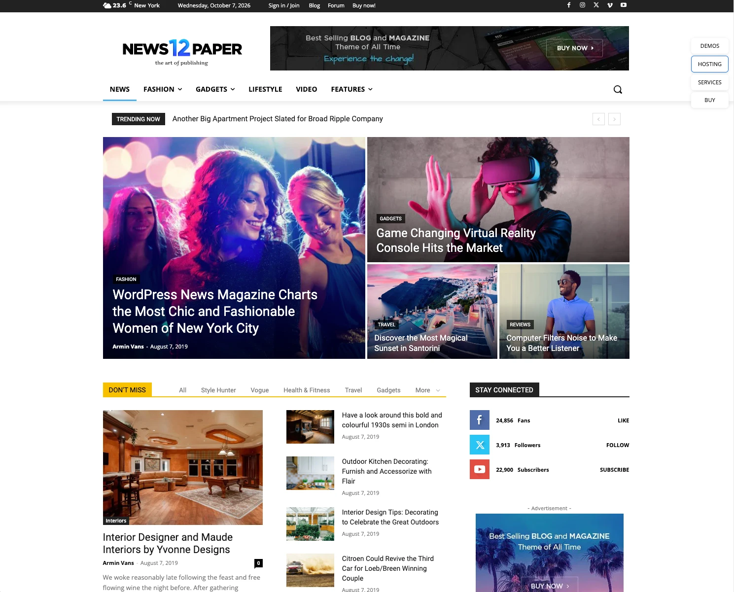
You can see this pattern repeat itself. Third place, Linux Libertine over sans-serif, is MediaWiki’s Vector skin. Like WordPress, you will find MediaWiki among the one-click install options on most hosting services (it used to be called Installatron on cPanel). So even the idea of pairs as a way to distinguish yourself has, for the most part, been left to other designers up the food chain. Long gone are the days of people changing the CSS on their MySpace.
Headings and body, role by role
The same measurements for each role, so you can compare them. The H2 and H3 both land on 24px most often; what separates them on the median site is weight and the ratio to the paragraph, not a step on a scale.
| Role | Sites | Top font | Most common size | Median size ÷ paragraph | Top weight | Median line-height | Uppercase | Tightened letter-spacing |
|---|---|---|---|---|---|---|---|---|
| H1 | 113,043 | Roboto | 48px | 2.43 | 700 | 1.20 | 10.5% | 15.4% |
| H2 | 127,888 | Roboto | 24px | 1.79 | 700 | 1.20 | 12.7% | 12.0% |
| H3 | 111,776 | Roboto | 24px | 1.33 | 700 | 1.25 | 11.4% | 9.2% |
| body | 157,837 | Open Sans | 16px | 1.00 | 400 | 1.50 | 0.0% | 1.2% |
computed_styles, clean corpus, one element per role per site. The tabs below carry the full size bands, fonts, weights, line-height and letter-spacing for each role.
H1113,043 sites
The single most common values are 48px (7,888 sites), 40px (7,600), 32px (7,230), 36px (5,678) and 60px (5,319). So if you want one number, 40 to 48px is the center of gravity, but half the web is outside that band. The 16,242 sites with an H1 under 24px are using the tag as a label, not a headline. That’s a real pattern and it’s not in any trends article.
A better way to think about it is the ratio of the H1 to the paragraph text, because that’s what you actually perceive.
| H1 size divided by paragraph size | Sites | Share |
|---|---|---|
| under 1 (H1 smaller than body copy) | 5,191 | 4.8% |
| 1 to 1.5 | 12,667 | 11.6% |
| 1.5 to 2 | 14,522 | 13.3% |
| 2 to 2.5 | 23,117 | 21.2% |
| 2.5 to 3 | 17,337 | 15.9% |
| 3 to 4 | 21,675 | 19.9% |
| 4 and up | 14,284 | 13.1% |
108,793 clean sites with both an H1 and a paragraph in pixels. Median 2.43, middle half between 1.79 and 3.21.
The median H1 is 2.4 times the paragraph. If your body is 16px that’s about 39px, which matches the size table. The spread is wide enough that “a modular scale of 1.25” or whatever is clearly not what the web does. One site in eight runs the H1 at four times the body or more. One in twenty runs it smaller than the body.
Top families
| Roboto | 6,392 |
| Open Sans | 5,839 |
| Poppins | 5,434 |
| Inter | 5,356 |
| Montserrat | 5,144 |
| -apple-system | 3,188 |
Weights
| 700 | 45,054 | 39.9% |
| 400 | 24,591 | 21.8% |
| 500 | 14,139 | 12.5% |
| 600 | 12,613 | 11.2% |
| 800 | 5,576 | 4.9% |
Weight is the one place headings do agree. The H1 is bold (700) on 45,054 sites and regular (400) on 24,591; 500, 600 and 800 split the rest. The light editorial headline, 300 or below, is too rare to make the top five. Bold or heavier (700 or 800) is 44.8% of H1s. The uppercase H1 is on 10.5% of sites, the uppercase H2 on 12.7%.
The rest
| Most common size | 48px (7,888 sites) |
| Most common size / weight / line-height | 32px · 700 · normal (1,972 sites) |
| Median line-height ratio | 1.2 (default "normal" on 8.8%) |
| Letter-spacing | normal 75.4% · tightened 15.4% · opened 9.2% |
| Uppercase | 10.5% |
| Median size ÷ paragraph | 2.43 (108,793 sites with both) |
Letter-spacing on the H1 is mostly untouched.
| H1 letter-spacing | Sites | Share |
|---|---|---|
| normal or 0 | 85,107 | 75.3% |
| negative (tightened) | 17,369 | 15.4% |
| positive (opened up) | 10,347 | 9.2% |
113,043 clean H1s. The most common non-zero values are -1px (2,013 sites) and 1px (1,675); as a proportion of the font size the most common is -0.02em.
Three quarters of H1s have the default letter-spacing. The tightly spaced display headline that every SaaS template ships, -0.02em or so, is on one site in seven. If you learned “always tighten large type” as a rule, you learned it from the 15%.
H2127,888 sites
The H2 is where the hierarchy starts to blur. The most common size is 24px (11,372 sites), then 32, 30, 36 and 40. A quarter of H2s sit in the 24 to 31px band, but 40px and up is another 27%, so plenty of sites run an H2 at H1 size. The median H2 is 1.79 times the paragraph, about 29px on a 16px page. Bold (700) on 37.7%, regular on 21%. Uppercase on 12.7%, which is more than the H1.
Top families
| Roboto | 6,666 |
| Open Sans | 6,278 |
| Poppins | 6,272 |
| Montserrat | 6,186 |
| Inter | 6,076 |
| -apple-system | 3,720 |
Weights
| 700 | 48,185 | 37.7% |
| 400 | 26,874 | 21.0% |
| 500 | 18,159 | 14.2% |
| 600 | 18,091 | 14.1% |
| 300 | 5,870 | 4.6% |
The rest
| Most common size | 24px (11,372 sites) |
| Most common size / weight / line-height | 24px · 700 · normal (1,748 sites) |
| Median line-height ratio | 1.2 (default "normal" on 7.4%) |
| Letter-spacing | normal 77.9% · tightened 12.1% · opened 10.1% |
| Uppercase | 12.7% |
| Median size ÷ paragraph | 1.79 (123,651 sites with both) |
H3111,776 sites
The H3 is the role with the least agreement, and it leans small. 24px is the most common value (13,141 sites), but 20, 18 and 16 follow, and 16 to 19px is the band on 26% of sites. A quarter of H3s are body size and separated from the paragraph by weight alone. The median H3 is 1.33 times the paragraph, about 21px on a 16px page. Bold (700) on 36.2%, with 600 (18.6%) closer behind than on the H2. This is why the standard page bumps the H2 to 32px: in the raw numbers H2 and H3 share a mode, and something has to give.
Top families
| Roboto | 6,512 |
| Inter | 6,145 |
| Open Sans | 5,773 |
| Poppins | 5,723 |
| Montserrat | 5,374 |
| Lato | 2,916 |
Weights
| 700 | 40,411 | 36.2% |
| 400 | 22,750 | 20.4% |
| 600 | 20,788 | 18.6% |
| 500 | 17,611 | 15.8% |
| 300 | 3,798 | 3.4% |
The rest
| Most common size | 24px (13,141 sites) |
| Most common size / weight / line-height | 28px · 500 · 33.6px (1,305 sites) |
| Median line-height ratio | 1.25 (default "normal" on 7.0%) |
| Letter-spacing | normal 81.0% · tightened 9.2% · opened 9.7% |
| Uppercase | 11.4% |
| Median size ÷ paragraph | 1.33 (108,748 sites with both) |
Body157,837 sites
Body text is the one role with a settled answer: 16px on 84,214 sites (53%), weight 400 on 92%, line-height 1.5. A third of sites still run under 16px, almost all of them at 14 or 15px, and only 3% go 20px or bigger. If every other number in this essay is a distribution, this one is a point.
Body text is the one place the web has fully converged, and the
number is boring: 16px, weight 400, 24px line-height. That exact
triple is on 37,125 sites. The next most common is 16px with the
browser’s default normal line-height on 17,473, and
then 14px on 20px (7,561). Paragraph sizes: 16px on 38,402, 14px
on 21,326, 18px on 16,250, 20px on 10,086. Eighteen and twenty
are more common on food and nonprofit sites (more on that
below), but 16 is the web.
Top families
| Open Sans | 11,825 |
| Roboto | 9,993 |
| Inter | 9,062 |
| -apple-system | 7,986 |
| Times | 7,812 |
| Arial | 6,467 |
Weights
| 400 | 145,245 | 92.0% |
| 300 | 6,762 | 4.3% |
| 500 | 4,393 | 2.8% |
| 600 | 342 | 0.2% |
| 200 | 328 | 0.2% |
The rest
| Most common size | 16px (84,214 sites) |
| Most common size / weight / line-height | 16px · 400 · 24px (37,125 sites) |
| Median line-height ratio | 1.5 (default "normal" on 18.4%) |
| Letter-spacing | normal 95.4% · tightened 1.2% · opened 3.3% |
| Uppercase | 0.0% |
What unit is that 16px set in? Of the 831,292 unique stylesheets that declare a font-size at all, 75.2% use px somewhere, 29.5% em, 29.0% rem, 2.2% clamp() and 2.1% vw. Per site, taking whichever unit a site’s font-size declarations use most: px on 101,651 sites (65.2% of 155,878), rem on 34,856 (22.4%), em on 14,357 (9.2%). A fluid unit (clamp or vw) is the dominant font-size unit on 585 sites. The rem-based type scale that every modern tutorial starts with is on about one site in five.
Fluid type and clamp()
The question of whether anyone uses clamp() is born out of the slight discomfort of having to learn a new style. The answer to the question is much more interesting. 2% of the 1.7 million stylesheets powering the 158K corpus use clamp(). 27% of websites have clamp() on their site. It’s coming from larger organisations’ assets: YouTube’s embedded player, the WordPress block library, app build bundles. Six files explain most of it.
Sheets say no, sites say yes
| clamp() and container queries | Count | Share |
|---|---|---|
| clamp() in unique stylesheets | 34,537 | 2.0% |
| clamp() on sites | 42,852 | 27.3% |
| container queries in unique stylesheets | 10,441 | 0.6% |
| container queries on sites | 18,251 | 11.6% |
Sheets: 1,734,591 unique stylesheets by content hash. Sites: 156,880 clean sites with any CSS captured, 1,414 of the 158,294 had none. A feature that lives in one popular shared sheet scores low on the first and high on the second.
Who put it there
Of the 42,852 sites with clamp() somewhere, most got it from one of six files they never opened. One row per file, host dropped and versions merged, so WordPress’s block library counts once across every site that serves its own copy.
| Stylesheet with clamp() in it | Sites | Share of clamp() sites |
|---|---|---|
inline <style> blocks the site, or its builder | 9,874 | 23.0% |
| YouTube embed, player stylesheet video embed | 7,807 | 18.2% |
| WordPress block library WordPress core | 6,488 | 15.1% |
| Shopify portable-wallets Shopify checkout | 3,614 | 8.4% |
| Shopify checkout-web Shopify checkout | 2,751 | 6.4% |
| Vimeo embed, player stylesheet video embed | 2,251 | 5.3% |
| Next.js build CSS app bundle | 1,370 | 3.2% |
| Shopify checkout button Shopify checkout | 787 | 1.8% |
| LiteSpeed cache bundle WP cache | 703 | 1.6% |
| Kadence theme global.css WP theme | 550 | 1.3% |
42,852 clean sites with clamp() in any stylesheet; a site can appear in several rows. After row ten nothing reaches more than 1.1% of clamp() sites; the tail is WordPress plugins, app bundles and generic file names. The two YouTube player versions alone are the only clamp() on 5,587 sites, which makes an embedded video the single biggest reason a site “uses clamp()”. The inline row is not all hand-written: Wix and most page builders inline their platform CSS, and the Next.js and LiteSpeed rows are bundles, so the share a site’s own designer wrote is somewhere under the 12.9% in row 3 of the ladder below.
The platform talks, the headline doesn’t
Split by platform, the first two numbers swing with whoever ships the CSS. The third one, the share of homepages whose H1 computed to a fractional pixel size like 43.2px, barely moves.
Clean corpus. clamp() anywhere and on font-size: share of each platform’s sites with CSS captured. Fractional H1: share of each platform’s sites with an H1 captured; 14,623 of 113,043 overall (12.9%). A fractional pixel size also comes from a plain rem or em value, so the green bar measures headings sized in anything but hard pixels, not strictly fluid ones. Shopify puts clamp() on font-size on 84.7% of stores and its homepage H1s are no more fluid than anyone else’s.
The same question, seven answers
| Does anyone use clamp()? | Sites | Share | |
|---|---|---|---|
| 1 | in unique stylesheets | 34,537 | 2.0% of sheets |
| 2 | on sites, anywhere | 42,852 | 27.3% |
| 3 | not from a named platform or embed sheet | 20,182 | 12.9% |
| 4 | on font-size, at least once | 16,949 | 10.9% |
| 5 | on font-size, five or more times | 6,682 | 4.3% |
| 6 | as the dominant font-size unit | 308 | 0.2% |
| 7 | H1 at a fractional px (any relative unit) | 14,623 | 12.9% of H1s |
Rows 2 and 3: of 156,880 clean sites with CSS. Rows 4 to 6: of 155,878 with a font-size declaration. Row 7: of 113,043 with an H1. Row 3 drops WordPress core, theme and plugin files, Shopify’s cloud sheets and the Wix, Squarespace and Webflow static hosts, but keeps inline styles and same-origin bundles, so it is a ceiling for hand-written clamp(), not a count.
The silver lining here is that if you make something modern and useful, people use it and you end up having an outsized influence. Not counting inline, the top six clamp() stylesheets reach 20,900 sites, when counting for overlap.
The less gracious reading is that very few independent designers are using clamp(), and that “design progress” is just moving the goalposts by elite tech design cadres. This allows them to maintain their position at the top of the hierarchy based on how well they know the new rules. A design bureaucrat, if you will.
But that is not the argument I’m making at the moment because, obviously, screens have gotten big as hell and there should be a good way to deal with that in browsers.
BUTTONS
Buttons are some of my favorite things to design. With pseudo-classes and basic animations you can get a lot of personality out of plain CSS, and even more if you’ve got some JavaScript under your belt. So the button can tell us a lot about the creativity of the internet.
Buttons were a little tricky to count. In my experience most buttons are actually styled hyperlinks, and I didn’t want header, nav, footer or cookie-bar buttons in the numbers; a newsletter submit and an Accept All are buttons, but nobody designed them for this page. So a button here is anything with a background color and some padding, or a border and some padding, and I took the first visible one between the header and the footer on every site, re-rendered from the stored markup and stylesheets. That found a button on 94,424 of 157,549 sites. The other 63,125 had nothing that qualified: 17,714 had nothing button-like on the page at all, 13,401 had only bare text links wearing a button class, and 15,943 had buttons only in the header, footer or cookie bar. The numbers suggest the button is the most diverse element on the page: the 94,424 buttons fall into 81,979 distinct styles, and 78,417 of those styles exist on exactly one site.
Here are the most repeated buttons found on the corpus between the header and the footer. The most common one is the one nobody styled.
The ten most repeated button styles, by exact computed fill, text color, radius, size, weight, padding, border, case, shadow and letter-spacing (font family not part of the key), each re-rendered with those values on its group’s most common page background. The browser default is the only one above half a percent of the 94,424.
:hover rule of their own; 56.8% a
:focus rule, 53.5% an :active rule.
69.4% have a transition, 0.3s being the favorite. Only 7.6% move
on hover and 1.0% run a keyframe animation.
Designed-button pass over the clean corpus, 94,424 buttons; hover, focus and transition figures from a stylesheet walk that tests each pseudo-class rule’s selector against the chosen button.
Color
| Button color | Buttons | Share of 82,123 fills |
|---|---|---|
| blue (200° to 250°) | 17,719 | 21.6% |
| white, exactly | 12,436 | 15.1% |
| grey and other neutrals | 10,885 | 13.3% |
| red (345° to 15°) | 8,597 | 10.5% |
| orange (15° to 45°) | 8,223 | 10.0% |
| green (70° to 170°) | 8,185 | 10.0% |
| teal and cyan (170° to 200°) | 6,309 | 7.7% |
| yellow (45° to 70°) | 2,812 | 3.4% |
| black, exactly | 2,595 | 3.2% |
| purple, magenta and pink (290° to 345°) | 2,393 | 2.9% |
| indigo and violet (250° to 290°) | 1,969 | 2.4% |
Fill color converted to HSL; anything under 15% saturation that is not pure white or black is a neutral. The 12,301 outline buttons have no fill to classify. Blue is the color of the web’s button; add teal and it is 29.3% of fills, more than red, orange and yellow together.
Padding and font size
| Most common padding | Buttons | Share |
|---|---|---|
| 1px 6px (the browser default) | 5,428 | 5.7% |
| 6px 12px (Bootstrap 3 and 4) | 3,928 | 4.2% |
| 12px 24px | 3,248 | 3.4% |
| 8px 16px | 3,225 | 3.4% |
| 10px 20px | 2,383 | 2.5% |
| 0px 20px | 1,276 | 1.4% |
| Font size | Buttons | Share |
|---|---|---|
| under 12px | 2,562 | 2.7% |
| 12 to 15px | 39,632 | 42.0% |
| 16 to 24px | 50,766 | 53.8% |
| 25px and up | 1,464 | 1.6% |
94,424 designed buttons. Padding as computed; the median is 9.9px vertical and 20px horizontal, and the median button is 45px tall. The single most common font size is 16px (29.0%), then 14px (19.0%) and 18px (10.5%).
So the button of the web is blue or white, 16px, sentence case, about 10px by 20px of padding, with a hover rule that swaps its background color over 0.3 seconds. One in five has no fill at all, or a fill you can’t see. The personality I was hoping to find is there, but it’s rare: fewer than one in twelve buttons moves when you hover it, one in a hundred animates, and the single most repeated button on the web is the one the browser drew because nobody got to it.
WHITE SPACE
I work with architects, and white space is an appealing concept to them. It gets batted around, but usually they’re talking about larger divs having top and bottom padding or margin. We’re going to concern ourselves with text spacing.
Line height
It’s the one spacing value everybody has an opinion on.
| Role | Median line-height ÷ font-size | Middle half | Sites measured |
|---|---|---|---|
| body | 1.50 | 1.43 to 1.55 | 128,826 |
| paragraph | 1.50 | 1.40 to 1.60 | 135,288 |
| H1 | 1.20 | 1.07 to 1.25 | 102,114 |
| H2 | 1.20 | 1.10 to 1.33 | 118,271 |
| button | 1.44 | 1.15 to 1.50 | 109,515 |
Clean sites where both values resolved to pixels. The body line-height
is the browser default normal on another 28,974 sites
(18.4% of bodies), which works out to about 1.2 in most fonts.
So the body is 1.5 and the headings are 1.2, give or take. Both numbers
are exactly what Bootstrap ships (line-height: 1.5 on the
body, 1.2 on headings), and the distribution shows it:
64.5% of bodies sit between 1.4 and 1.6, and the single most common H1
ratio is exactly 1.2 on 24,060 sites, with 1.0 (16,325) and 1.1 (15,827)
behind it. On paragraphs the band is wider: 20% run at 1.6 to 1.8, which
is the “airy blog” setting, and 7.6% of paragraphs run under 1.2, which
is cramped.
Letter spacing
Almost nobody touches it, and the higher up the page you go the more they do.
| Role | Normal or 0 | Tightened | Opened up | Sites |
|---|---|---|---|---|
| H1 | 75.3% | 15.4% | 9.2% | 113,043 |
| H2 | 77.8% | 12.0% | 10.0% | 127,888 |
| H3 | 80.9% | 9.2% | 9.7% | 111,776 |
| paragraph | 87.3% | 3.5% | 9.1% | 146,715 |
| body | 95.4% | 1.2% | 3.3% | 157,837 |
| nav | 93.8% | 1.6% | 4.6% | 112,734 |
| button | 91.1% | 1.2% | 7.6% | 138,363 |
computed_styles letter_spacing per role, clean sites with the element captured. Tightened is any negative pixel value, opened up any positive one.
Letter-spacing is a headline habit. One H1 in seven is tightened, usually by about -0.02em, and the rate falls with every level until body text, where 95% of sites leave it alone. When it is opened up it’s by 1px or less. The nav, which the all-caps, spaced-out portfolio nav would lead you to expect is the element with the most letter-spacing on the page, is one of the least: 93.8% at normal, and only 1.7% of navs are uppercase at all.
BREAKPOINTS
I love it when I’m talking to a prospective client and they raise their eyebrow and ask me if the site is going to be responsive. It’s a can of worms they’re about to open, and it usually ends with their eyes glazed over. For me the easiest way to show it is to change the width of a browser in front of them. I think the backbone of responsive design, at least in a way that is easily explainable, is the breakpoint.
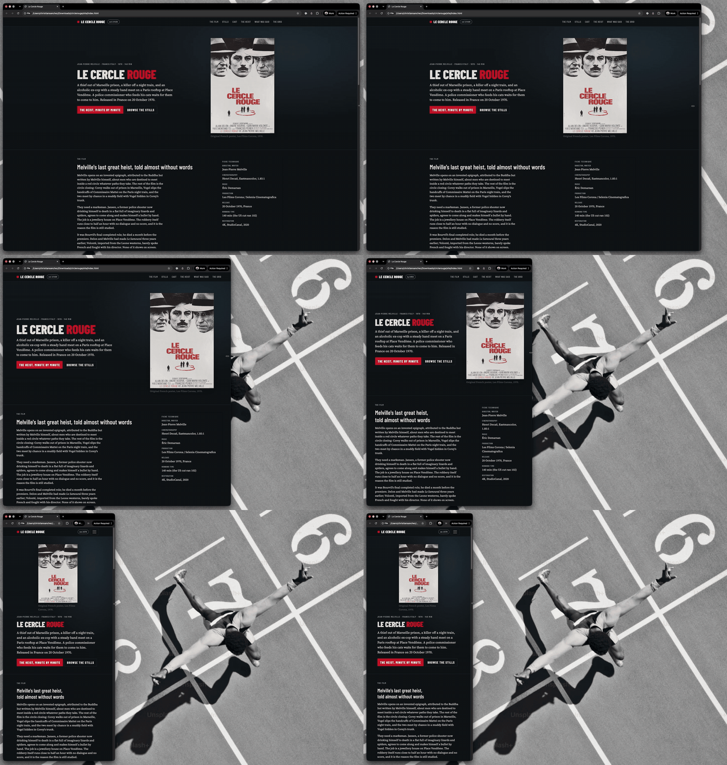
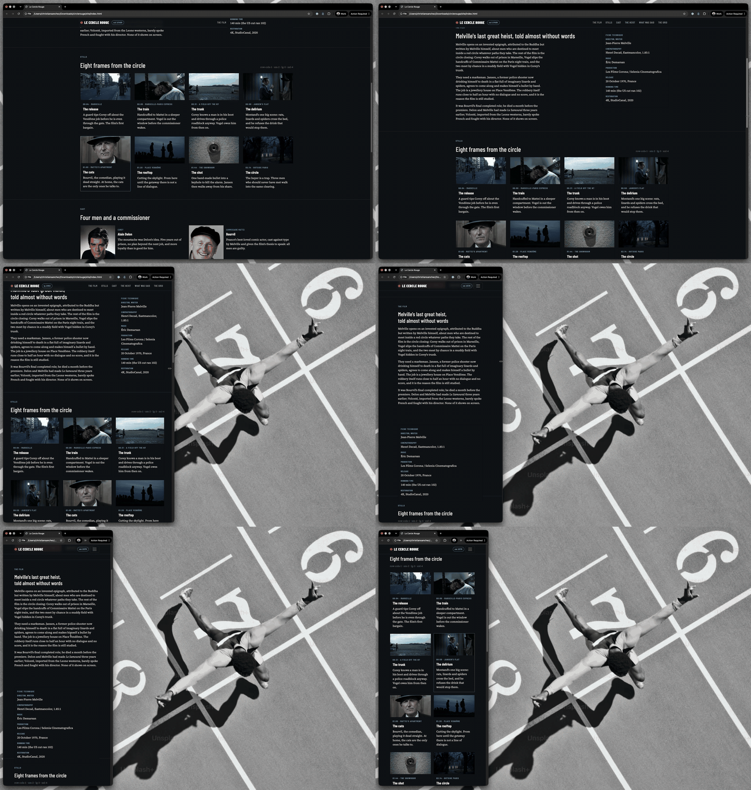

Resizing a browser window across the breakpoints of one site. Scroll sideways for the three widths. I made this little page to show you the way breakpoints work. The movie is Le Cercle Rouge; watch the Melville stuff, this and Army of Shadows are so cool.
I’ve been working on websites since 2014 or so, and the evangelizing class of web design was pushing for mobile-first design even then. Back then I was just picking up Bootstrap templates or modifying the CSS of a WordPress site in the customizer or a child theme’s stylesheet. When you work like that, the defaults are already set and you’ll end up seeing a lot of conflicting style rules. Many of them were born from the fact that multiple stylesheets were being resolved for a single page.
Mobile sites have the easier layouts. Most of it is stacking elements on top of each other. If you are using a grid or display flex, you’re down to two or three columns at most. It took me years to figure out why it was better to have media queries for the wider views and leave the default rules for mobile.
Still, 12 years out, I run into issues caused by other people’s stylesheets and breakpoints. It gets real messy real fast. So then the question becomes: what are the most common breakpoints? If I were to write a complete stylesheet from scratch, where should my breakpoints be?
| Breakpoint | Sites that have it anywhere in their CSS | Share |
|---|---|---|
| 768px (min) or 767px (max) | 129,300 | 87.0% |
| 768px min-width | 115,646 | 77.8% |
| 767px max-width | 100,454 | 67.6% |
| 1200px min-width | 82,964 | 55.8% |
| 992px min-width | 72,653 | 48.9% |
| 600px max-width | 68,258 | 45.9% |
| 480px max-width | 58,904 | 39.6% |
| 1024px (either direction) | 83,909 | 56.5% |
148,616 clean sites whose stylesheets contain at least one width media
query, out of 156,880 with any CSS captured. Counting occurrences
instead of sites, 768px min-width appears 3,479,053 times and 767px
max-width 2,917,948 times across the 1,734,591 unique sheets. One gap:
Tailwind 4 writes its queries in range syntax (width >= 48rem), which the parser does not count, so the Tailwind cluster is
undercounted by however many sites are on version 4.
768 is the iPad’s portrait width from 2010. It’s Bootstrap’s medium breakpoint, and it turns out to be Tailwind’s too, and it is the only breakpoint the two share: Bootstrap runs 576, 768, 992, 1200 and 1400; Tailwind runs 640, 768, 1024, 1280 and 1536 (written in rem, and 48rem is 768px).
That’s why it’s in 87% of sites’ CSS and nothing else comes close: it’s the one width where the two biggest frameworks and the iPad all coincide. The next cluster, 992 and 1200, is Bootstrap’s grid. 640, 1024 and 1280 are Tailwind’s. 1440 shows up in about one site in five and 1920 in one in ten, but neither comes close to the top of the table. Nothing above 1280 is a convention. The web still stops thinking about layout at 1200 pixels.
Then there’s the distinction between min and max, and that’s really
about the default. min-width: 768px means these rules apply
at 768 and wider, so tablet and up, and everything outside the query is
the default, which is mobile. max-width: 767px is the same
boundary from the other side: desktop is the default and the rules
subtract as the screen shrinks, hide the sidebar, collapse the nav,
un-float the columns. Why it matters: with min-width the phone, the
weakest device, applies the least CSS and nothing ever has to undo
anything. With max-width the phone applies the most CSS and most of it
is overrides. And at a width nobody tested, a mobile-first site falls
back to the simple layout and a desktop-first site falls back to the
complex one. That’s also why 767 and 768 are one breakpoint in the table
above: mobile-first authors write 768 min, desktop-first authors write
767 max.
How many breakpoints does a site have? More than you’d think.
| Distinct breakpoint widths per site | Sites | Share |
|---|---|---|
| 1 to 2 | 5,687 | 3.8% |
| 3 to 4 | 6,109 | 4.1% |
| 5 to 6 | 10,984 | 7.4% |
| 7 to 10 | 21,905 | 14.7% |
| 11 to 20 | 43,368 | 29.2% |
| 21 or more | 60,563 | 40.8% |
148,616 clean sites with width media queries. Median 17 distinct widths. Every stylesheet a site loads is counted, including the slider plugin and the cookie banner.
It’s the clearest measure in this whole study of how little of a site’s CSS the site’s “designer” wrote. A lot of it is just handed down by a built-in framework or a vendor’s specific stylesheet. In this sense responsiveness looks and behaves like an obligation put upon website owners, and we just take the easiest way out to solve the problem, time and again. So a site becomes a patchwork of stylesheets, and the designer’s job is to tape the seams, so to speak.
Mobile-first versus desktop-first, measured by whether a site’s media queries are mostly min-width or mostly max-width:
| Direction of a site’s width queries | Sites | Share |
|---|---|---|
| mostly min-width (mobile-first) | 50,884 | 34.2% |
| mostly max-width (desktop-first) | 50,444 | 33.9% |
| mixed, neither dominates | 34,017 | 22.9% |
| max-width only | 7,237 | 4.9% |
| min-width only | 6,034 | 4.1% |
148,616 clean sites. “Mostly” means one direction outnumbers the other by at least 1.5 to 1. Counting raw queries, min-width wins 72,555 sites to 74,112 for max-width, a dead heat.
We’re 15 years out from Web 2.0 and the mobile-first design evangelism, and in that time no real consensus has been reached. Mostly min-width and mostly max-width are about the same. That 23% with both used evenly, those are my favorite. The duct tape warriors. The only thing we can say is that 91% of sites have a mix of breakpoints, and that’s alright. Like I said before, it’s messy out there.
CONCLUSION
I started off this piece being a bit of an asshole to the Figma writer churning out trends pieces for the year. I think it’s wonderful that we have some new interesting sites out there that are getting recognized. So, to reiterate, the collection of all this data isn’t about saying “nuh-uh” to the idea that something is growing in popularity.
There’s this eye roll from deep in my soul that says the internet is stagnant in its design, and that there is a monopoly on the way it looks, and what it is comes from institutions that need ubiquity, like YouTube. And I think that’s a standard thing, if not a hack thing, to say: the internet is boring. It looks the same.
It’s not wrong though; the data supports it. It is in fact very homogenized, because that’s the easiest way to build sites at the speed and scale necessary for running businesses. In doing the research, we can point to interesting open source projects, like Tailwind, and large orgs, like YouTube, building out infrastructure to make themselves easy to apply. These types of projects have a fundamentally deeper effect on what the web looks like at the baseline than the trends article.
Right now the web page is a base 16px font, and we have rules about the relationship between headings, font sizing, letter-spacing and line-height based on the data. Small changes across these attributes distinguish the work. We can map our choices against the industry standard cards we created earlier.
For me, I’m imagining rolling my own underscores theme with the standard page’s measurements, modernized: rem for everything up to 768px, and clamp() for everything above it. Best practices for clamp() have yet to be calculated. Maybe next week.
On the horizon, the most interesting question I’m left with is what LLMs are going to do to the standard page. They’re easier to interact with than frameworks, content management systems and the rest. The barrier to entry to making websites has just dropped significantly. Part of me is excited. I hope more people will stretch in their design choices now that it’s so much easier to get the basics down.
But that sick little voice is telling me that next year, when I run this project back, we’re just going to see a new footprint: the Claude or ChatGPT website footprint. And that’s fine.