Introduction

In the ever-evolving world of digital marketing, user experience (UX) and copywriting are two crucial elements that can make or break a brand’s success. While UX focuses on creating a seamless and enjoyable experience for users, copywriting is responsible for crafting persuasive and engaging content. In the architecture industry, where visuals play a significant role, the fusion of UX and copywriting has become increasingly important in creating a cohesive user experience. In this blog post, we will explore the power of UX and copywriting in architecture and how they work together to enhance user engagement and drive conversion.

User Experience (UX) in Architecture

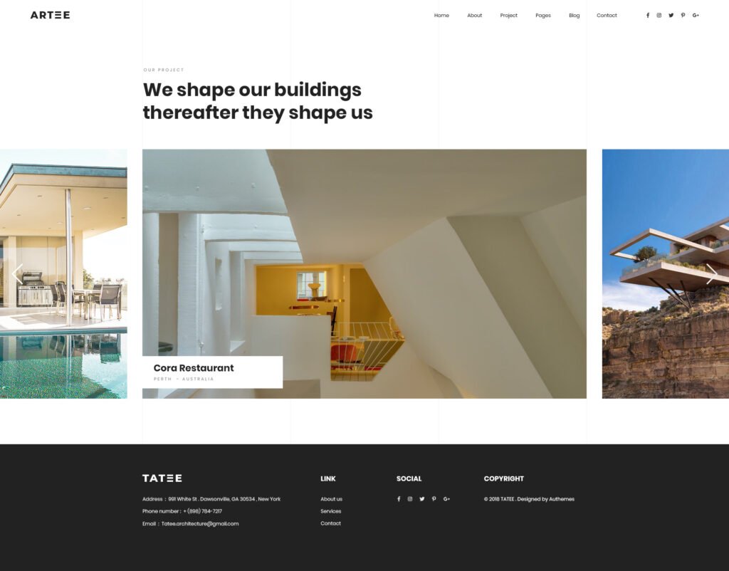
User experience in architecture refers to the overall experience that users have when interacting with a brand’s digital presence. It encompasses everything from navigation and functionality to aesthetics and content layout. The goal of UX in architecture is to create a seamless and intuitive experience for users that will ultimately lead to better engagement and conversion.

To achieve a successful UX in architecture, it is essential to consider the elements that make up a user’s experience. These elements include navigation, functionality, and aesthetics. A well-designed navigation system ensures that users can easily find what they are looking for on a website or app. Functionality refers to the usability and efficiency of a website or app, while aesthetics reflect the visual appeal of a project.

The Role of Copywriting in Architecture

Copywriting in architecture is the process of writing persuasive and engaging content for a brand’s digital presence. It plays a crucial role in capturing the attention of potential clients and influencing their decision-making process. In the architecture industry, copywriting is utilized in various forms, including website copy, marketing materials, and project descriptions.

The importance of copywriting in architecture cannot be overstated. It is the voice of a brand and can make a significant impact on a user’s perception of a project. Well-written copy can not only attract users but also persuade them to take action, ultimately leading to increased conversion rates.

How UX and Copywriting Complement Each Other

While UX and copywriting may seem like two separate entities, they work together to create a cohesive user experience. By combining the strengths of both, brands can effectively communicate their message and connect with their audience.

One way in which UX and copywriting complement each other is by creating a cohesive user experience. Consistency in messaging is crucial in building trust with users and establishing a brand’s identity. By working together, UX and copywriting teams can ensure that the language used throughout a project is consistent and aligned with the brand’s voice. This consistent messaging can help users feel more connected to a project and increase their engagement with it.

In addition, copywriting can also enhance the visual appeal of a project. By using persuasive language and highlighting key features, copywriting can draw attention to the most important aspects of a project and capture the audience’s interest. This, combined with a user-friendly content layout, can make a project more visually appealing and engaging.

Improving User Engagement and Conversion

The ultimate goal of UX and copywriting in architecture is to improve user engagement and drive conversion. To achieve this, it is crucial to understand user behavior and tailor the experience accordingly. This can be done through research and analysis, creating user personas, and conducting user testing.

Crafting effective calls to action (CTAs) is also crucial in improving user engagement and conversion. CTAs serve as prompts for users to take action, whether it is requesting more information or making a purchase. By using persuasive language and placing CTAs strategically, brands can encourage users to take the desired action. A/B testing can also be utilized to optimize CTAs and improve conversion rates.

Case Study: Successful Implementation of UX and Copywriting in Architecture

A successful example of the fusion of UX and copywriting in architecture is the redesign of XYZ Architecture’s website. The project focused on creating a cohesive user experience by improving navigation, functionality, and aesthetics. The copywriting team worked closely with the UX team to ensure that the language used throughout the website was consistent and aligned with the brand’s voice. As a result, the website saw a 25% increase in user engagement and a 15% increase in conversion rates.

Best Practices for Implementing UX and Copywriting in Architecture

To effectively implement UX and copywriting in architecture, collaboration between the two teams is crucial. This ensures that both elements work together seamlessly and create a cohesive experience for users. Additionally, continuous improvement through data analysis is essential in identifying areas for improvement and optimizing the user experience. Staying up-to-date with industry trends is also crucial in remaining relevant and competitive in the market.

Conclusion

In conclusion, the fusion of UX and copywriting in architecture is a powerful tool in creating a cohesive user experience and driving conversion. By understanding the role of each element and how they complement each other, brands can effectively communicate their message and connect with their audience. By implementing best practices and continuously improving, the future of UX and copywriting in architecture looks promising.

Key Takeaways

– UX and copywriting work together to create a cohesive user experience in architecture.
– UX focuses on navigation, functionality, and aesthetics, while copywriting creates persuasive and engaging content.
– Collaboration between the two teams is crucial for success.
– Understanding user behavior and crafting effective CTAs are essential in improving engagement and conversion.
– Continuous improvement through data analysis and staying up-to-date with industry trends is crucial for success.

In today’s data-driven world, businesses are constantly collecting information. From website traffic to customer purchases, every interaction generates valuable insights. But what if this data is scattered across different tools and platforms? This is where analytics integration comes in.

What is Analytics Integration?

Imagine having all your business data – website analytics, CRM data, social media metrics – seamlessly flowing together. This is the power of analytics integration. It breaks down data silos, allowing you to see the bigger picture and gain a holistic understanding of your customers and operations.

Key Benefits of Analytics Integration

🔍 Deeper Customer Insights

Integrating analytics across platforms allows you to build a 360-degree customer profile. You can now correlate a user’s website behavior with their purchase history, email engagement, and support interactions. This helps businesses:

  • Understand buyer intent and behavior patterns
  • Predict future needs and tailor messaging
  • Create more accurate audience segments for retargeting

This depth of insight leads to more effective campaigns, higher lifetime value, and stronger brand loyalty.


🧠 Smarter, Data-Driven Decision Making

When data is consolidated, teams can identify opportunities and challenges in real-time. You’ll no longer have to guess which campaigns are working, or which products are underperforming.

With analytics integration, you can:

  • Monitor performance KPIs across departments
  • A/B test campaigns and pivot quickly
  • Allocate budgets with greater precision
  • Identify bottlenecks in the sales funnel

Your team is no longer operating in the dark — they’re equipped to act with speed and clarity.


⏱️ Improved Operational Efficiency

Manual reporting is a massive time sink. Exporting CSVs, copy-pasting numbers into spreadsheets, and reconciling mismatched data takes hours every week.

Analytics integration:

  • Automates data pulling and syncing
  • Reduces human error
  • Frees your team to spend time analyzing instead of compiling data

This lets your business scale insights, not just workload.


🤝 Better Cross-Team Collaboration

When marketing, sales, customer success, and leadership are all looking at the same dashboards and metrics, alignment improves.

With unified data:

  • Teams can rally around shared KPIs
  • Collaboration becomes proactive instead of reactive
  • Decision-making becomes more transparent and objective

It’s not just about better tools — it’s about building a data-literate, collaborative culture across your organization.

Getting Started with Analytics Integration

Here’s how to begin unlocking the full value of your data:

1. Define Your Business Goals

Before choosing any tools, ask:

  • What are you trying to improve?
  • Which questions do you want your data to answer? Whether it’s boosting conversions, shortening the sales cycle, or increasing customer retention, your goals will shape your analytics roadmap.

2. Map Your Data Sources

Identify all the tools your business currently uses. This might include:

  • Google Analytics / GA4
  • CRM tools like HubSpot or Salesforce
  • Email platforms like Mailchimp or Klaviyo
  • eCommerce platforms like Shopify or WooCommerce
  • Social media analytics (Meta, LinkedIn, etc.)

Understanding the flow of data will help you identify gaps, redundancies, and opportunities for integration.


3. Choose the Right Integration Tools

Popular integration and BI platforms include:

  • Google Looker Studio (formerly Data Studio)
  • Zapier or Make for no-code automation
  • Segment for customer data routing
  • Supermetrics, Funnel.io, or Windsor.ai for marketing-specific data
  • Power BI, Tableau, or Domo for enterprise dashboards

Choose based on:

  • Your team’s technical skill level
  • Your budget
  • Supported platforms
  • Visualization or reporting needs

4. Clean and Standardize Your Data

Bad data = bad decisions.

Before integrating, audit your datasets for:

  • Inconsistent formatting
  • Duplicate records
  • Missing fields
  • Inaccurate tagging

Standardizing naming conventions and ensuring clean imports will improve the quality of insights you extract later on.


5. 

Foster a Data-Driven Culture

Tools alone aren’t enough — your team must value and understand the role of data in their decision-making.

You can do this by:

  • Setting shared KPIs for teams
  • Holding regular insight reviews
  • Creating a “data dictionary” for internal use
  • Providing training on how to read dashboards

When everyone understands the “why” behind the numbers, better decisions follow.

By integrating your analytics, you unlock the true potential of your data. You’ll gain a deeper understanding of your customers, make smarter decisions, and ultimately drive business growth. So, are you ready to unleash the power of your data? contact us today to get started.

the web design process for small to mid-size businesses

the first step is to do an intake and get a feel for each other. We’ll talk about the challenges facing your business and what’s behind the push to redesign or create a website. That brings us to goals and from there we’ll have a framework for the amount and type of pages you’ll need.

My price range is between $2,500 to $6,000 for a website. You can check out our web design pricing. I create a custom theme with your name on it, the design may pick from other sites, but it will be custom coded.

After the initial intake where we trade some information about aesthetics and competitors comes the research. Along with my research this is a perfect time to send me all of your visual and text assets. My goal is take some interesting features from around the web and bring them to our shared project. Here’s an example of a mood board.

video moodboard for a website design

Once I get your feedback. I’ll start on creating a sitemap and some mockups for main pages.

Visual Mock-ups

I usually create mockups in photoshop and illustrator and send them off to you for review, but if you’re a bit tech savvy, I can also send them as Figma files. The goal here is provide an aesthetic representation of the most important pages and collect feedback from you. There is usually around three revisions during this phase.

Web Design

I’ll build out your site on WordPress most like with custom page templates. I’ll create an unindexed site where you can see a copy live and click around.

Do you come off poorly when you present your work to potential clients in person? Probably not.

You probably dress up, put on your nice shoes, spend a little extra time on your hair and face and most importantly bring your portfolio with you. And if you’re looking to land a client cold, that portfolio is looking stellar.

Why should it be any different online? I’ve seen a lot of architecture websites and they’re pretty awful.

the filter option is nice when you have a lot of work of a type of category. Not so much here.

The biggest design pain point for architecture websites is portfolios that don’t change size depending on the screen width.

The other is a lack of function in the portfolio grid. It’s just an equal height and width grid of boxes. The user clicks on it and a gallery slider pops up and displays some images.

It’s impossible to show your work off in a well-designed way with a standard WordPress setup.

What you need is something called a custom post type (CPT) and a way to display the CPT. A custom post type is a collection of data. For architects that means photos of the space, dates about the build, a description, and other information. Explore our WordPress portfolio solutions that enhance the presentation of your architectural projects

Website development layout sketch drawing

If hiring someone to build out a Custom Post Type that blends in seamlessly into your website is outside of your budget finding flexible plugins to manage your portfolio is the next best thing. Here are my top five plugins for Architects.

Cube Portfolio

So, I used Cube Portfolio as a free piece of code on a project I was working on a few years ago. Then, I thought that it looked great. So when it came time to build out my own site, I was gearing up to integrate the code from scratch, and then I found out they had a plugin for WordPress. It’s light and easy to use.

At $19 for the plugin, it’s totally worth the money. The grids it creates are responsive and look good on all screens. So displaying your latest residential or commercial projects will look great on desktop, tablet, and phone.

Cube Portfolio is dynamic on hover and has some of the coolest pop-up displays. It also gives you the option to open a new page when the user clicks on one of your portfolio tiles. Which is very useful when you’re tracking user data.

It’s a very versatile plugin. You can have it display image galleries, videos, and customized layout with descriptions, key information about your project. Cube Portfolio also comes with a lot of documentation. If you choose to hire out a developer, this is a plugin that is very open to professional customization and integration.

WP Portfolio

WP Portfolio comes with 4 different post types: Image, Website, Video and Single Page. If you’re using page builders like Elementor or WP Bakery, WP Portfolio is the right plugin for you. It integrates with these page builders and since you can copy and paste the page builder shortcode, creating a cohesive look for your latest residential and commercial projects will be easy.

Video Player for your portfolio grid can be useful if you film walk-throughs of your work.

This plugin has also been around for a while and comes from a very well-established development company. The support team is very responsive and updates their product often.

WP Portfolio is $39 for the year for its beginner package.

GO Portfolio

GO Portfolio brings the best of Cube Portfolio and makes it more accessible by providing more starter templates and simple color customizations. It is also responsive for mobile, tablet and desktop layouts and has plenty of interactive hover functions.

Unlike WP Portfolio, GO Portfolio doesn’t integrate with as many page builders, but it does integrate with Visual Composer (one of the most popular page builder plugins).

GO Portfolio is only $26

Essential Grid

Essential Grid is a very design heavy and modern plugin and also integrates with Visual Bakery. It offers a wide range of hover functions.

One of the best and unique features of Essential grid is its demo data because of its design focus.

Much like WP Portfolio, the parent company for this plugin is also an established company, with the widely used (although, often misused in my opinion), Revolution Slider under its belt. That means that there is robust documentation on how to set up Essential Grid. It also means you can depend on responsive support staff in case you come across an issue.

The starter package begins at $34 for the year.

WP Softs: GridKit

WP Softs Grid Kit delivers grids in 3 different styles: masonry (that staggered varying heights style), gallery and puzzle. It is also responsive and offers a lot of hovering styles.

It also has some pretty interesting features that aren’t often highlighted in other plugins like share features and google map embeds.

It only costs $26 for a lifetime purchase of the plugin and has everything you need to show off new home projects.

After more than five years of designing and building websites, I’ve come to believe that great web design is about more than visuals—it’s about *intent*. Every site I build is shaped around a clear goal, a real audience, and the path between the two.

Design Backwards from the Destination

Before I write a single line of code, I ask: *What does success look like for this business?* Is it a phone call? A form submission? A sale? And just as importantly—*who* is taking that action?

Once we define your ideal visitor, I map their journey across the site: what questions they’ll have, where they’ll hesitate, and what will move them forward. Then I reverse-engineer the structure and design to serve that journey. Pages aren’t just pages—they’re part of a system designed to convert.

Why Every Site Needs Analytics

One of the first things I install on any new site is Google Analytics and a Facebook Pixel. These tools let us see how visitors behave in real time—what they click, how long they stay, where they drop off. That feedback loop turns your website into a living, evolving asset—not a one-time expense.

Want deeper insights? I also offer Hotjar heatmaps, custom conversion tracking, and event monitoring so we can dial in exactly what’s working (and what’s not).

My Go-To Platform: WordPress

I build most of my websites on WordPress. It’s a powerful, open-source content management system (CMS) that gives my clients full control of their content after launch. It’s flexible, scalable, and endlessly customizable—perfect for businesses that plan to grow and evolve.

I also work in Shopify for clients running product-based businesses, but unless you’re eCommerce-focused, WordPress is usually the right fit.

What Kind of Websites Do I Build?

  • Custom service websites for local businesses and professionals
  • Creative portfolios for studios and agencies who want something truly unique
  • eCommerce sites for merchants launching physical products, merch, or digital goods

Each project is tailored to your needs—whether that means a fast-loading landing page or a fully custom site with animations, custom post types, and advanced tracking.

If you’re seeking custom web design services tailored to your business needs, our team is ready to assist.

The Process: Strategy First, Then Build

Here’s what it looks like to work together:

  1. Discovery: We talk goals, audience, and your existing assets
  2. Wireframes: I map the layout and flow before any design work begins
  3. Mockups: You’ll get a design preview before development starts
  4. Development: I build your site with clean, performant code
  5. Launch & Iterate: We go live, install tracking, and watch the data

Pricing & Packages

I offer three tiers of service, depending on the complexity of the site:

  • Tier 1: Fully custom, animation-rich sites – starting at $5,000
  • Tier 2: Modern WordPress builds with flexible editing – starting at $2,500
  • Tier 3: Simple one-page static sites – starting at $1,000

You can view the full breakdown of our web design pricing, including optional add-ons like eCommerce, extra pages, and ongoing support.

Let’s Talk About Your Project

If you’re planning a new website or want to fix what you’ve got, I’d love to hear about it. Reach out here and let’s schedule a short call. Even if we don’t end up working together, I’m happy to point you in the right direction.

For those delving into content creation for their business, the blank page can be a daunting challenge. So we’re going to simplify the process with “the inverted pyramid.”

inverted pyramid used for writing articles by journalists

The Inverted Pyramid

It sounds like something you would hear about in a curio shop. Actually, the inverted pyramid is a way to format your article. And it is used by journalists to create engaging articles. The writing format was first used by reporters communicating to news outlets via telegraph to convey information over “the wires.” Although its origins are over 100 years old, the inverted pyramid is still an effective way to get across the most essential information first to your audience.

Quick and focused information will free you up for your core business activities and help potential clients with their purchase decisions. The inverted pyramid suggests you start with the 5 W’s. Purdue’s online writing lab for quick information about states the 5 W’s as “who did what, where, when and how.” It’s succinct. The first paragraph should contain all of this information in a clear and compelling way. This is called the lede. And as they say, you don’t want to “bury the lede.”

writers block image, typewriter with pages
Writer’s block concept with typewriter and crumpled paper on work desk

What to write about

For a business, you want to think of questions that your customers ask you over the phone, online and during meetings. Address these questions by creating a compelling lede using the five W’s. After you’ve created a lede, just expand.

The following paragraphs go into more detail about the story. Organize the paragraphs in order of importance. In the news industry, this was useful because editors could instinctively just cut from the bottom if a piece was too long. It also meant the reader could walk away from the piece satisfied in his understanding of the story.

a young woman writing a rough draft using the inverted .

These paragraphs are perfect areas to begin crafting a sales pitch. There are some fairly pronounced differences between professionals and the DIY person. For instance, I have access to software resources for SEO and have already spent time learning the software. In service industries, differences like these abound. Often it is forgotten by customers because of the rise in DIY spirit spurred on by YouTube.

Fill it up with background

As you continue to explore the topic, you can start pulling quotes. Adding industry statistics and providing more granular information. The amount of detail you will go into depends on the question. I’ve created an article that talks about best practices on how to choose which questions to ask in your SEO strategy. Check that out if you’re struggling to find a starting point.

Content creation is a crucial piece of the marketing puzzle for various reasons and the inverted pyramid can really simplify the work. This format gives the writer clarity about the piece. And at the end of the process, you now have a useful article that you can amplify with paid advertising to capture potential clients with FB or Google retargeting campaigns. The Inverted Pyramid structure will also provide longer reading times as the information is chunked in digestible ways this will lead to a better SEO score down the line.

If you’re starting out with a content strategy and decide to take it on yourself, I recommend picking up the associated press style guide, a copy of Strunk and White’s “Element of Style” and every once in a while check out this video:

Websites for architects and architectural firms have three main pieces:

All the architecture websites I’ve seen have at least those components. The home page is often just a slider with some very nice images of homes. It’s a bit of a shame because websites for architects can be so much more.

The Problem with websites for architects

If this image is proof of anything it’s that architects are not taking their websites seriously. In the top ad spots of google you have freelance aggregators. In the organic section of google, you only have one website from my selected area that belongs to an architect.

search engine marketing results for architects

The problem has to do with how user-oriented the architect’s website is against the query. To take on this issue, websites for architects need to create user-specific landing pages. The best place to start here is to understand your customers. I wrote an article that touches on this called marketing for architects.

A visible advantage for architecture websites

Often the hardest part of designing a website is the lack of great photos and illustrations the company has on hand. Websites for architects rarely lack great photos. Great photography sells clients on a proposal.

Great web design can bring you those clients.

The Form and Functions of Websites for Architects

Websites are not brochures on the internet. They are not business cards. They are interactive, involve motion and can provide entryways to other pages. These features allow the user to have a rich experience with your firm.

The Portfolio Page

The portfolio page comes in a variety of forms.

One of my favorites are interactive grids. The example from above comes from the MKPL website and has an interactive filter.

Here are some other examples:

example of well-designed portfolio page for an architect
From Blanchard Fuentes

The About Page

The about page is often overlooked. At the time of writing this I’ve overlooked it on my own website. I’ll fix that fairly soon. One of the about pages that I think has a lot of potential is this one:

example of relevant content on the about page of an architect's website
Oakes Architects

This page’s services sidebar has the potential to open up so much organic traffic from google. Sadly, none of these pages actually link out to pages. That said, it sure beats the infamous blurb. Which is just a small paragraph about the firm’s beliefs, founding dates and the founder’s education.

The Contact Page

Here’s a contact page I built a few years ago. It has the added benefit of providing address information for google to put in it’s listing. The bottom buttons allowed the email recepients to organize email types.

web design example of a contact page with javascript validation on a form that ports right to an email
Contact Page

With the advent of interactive forms survey like forms that allow you to segment your users through “logical sequencing” of questions.

Opportunities for Architecture Websites

  • Most architecture websites don’t have a very robust section explaining their services.
  • I haven’t seen video effectively used in architecture sites.
  • Only 40% of the architecture websites, I’ve indexed use tracking analytics.
  • Architecture websites don’t create location focused pages.

The User Experience

Think of the website as a series of pathways. The homepage is often what is shared with people. Google lists this page as the face of your business.

Houzz does this in order to segment their users and hand the lead over to the contractor or architect.

Your homepage should provide the beginning steps into bringing you a phone call. A quick call button on mobile phones is always a bonus.

Users rarely go to a website without an intention.

Here are a couple of user experiences on a hypothetical website:

  1. home page> link to a kitchen remodels page > free quote sign up page for a kitchen remodel
  2. home page> link to a style of architecture > portfolio page of a particular style of architecture > free quote sign up page

In order to create a great user experience, you need to create a robust page. It should inform and sell the reader and then encourage the reader to take action with your film.

If you pair this way of building websites with other marketing strategies like Facebook retargeting and email campaigns you can bring up your visibility quickly.

Our expertise in architecture website design ensures your firm’s online presence is both functional and visually compelling

What’s the point?

You say to yourself, organic is obviously hopeless what is the point of focusing on web design for architects when the user will have to scroll half-way down the page to even know you’re alive.

Well, I believe Yelp and Houzz can be beaten for the top spot on Organic, but more importantly, even if you do ads or business listings your website is still going to be the first thing your clients see.

an example of behavior flow on google analytics.

I had a client who would get upwards of 150 people a week visit to her website and more than 80% of her clients would leave within the minute on the first page. Why? They left because their intentions were not being addressed as soon as the page opened. And that had to be addressed quickly.

Do you know how many people drop off after your first page?

If not, then you should take some time to think about the users experience and obviously hire me to get some analytics and guidance on your digital presence.

This article focuses on how Architects can market residential services to potential clients. That said the wide range of services offered by architecture firms fit within this model of marketing analysis. The examples and data in this article, however, are geared toward marketing residential architectural services. The key takeaway is that you should know your client like the back of your hand through iterative testing.

a custom redesign by an architect marketing in the residential architectural space

We’ll also cover concrete tactics to bring awareness to your services and testing your offers and messaging.

  1. Customers: Define your customer
  2. Where are your customers?
  3. How do they want to interact with architects?
  4. Entry points for prospective clients
  5. Tell a story
  6. Test Everything
define your persona. Often unknown until you re-iterate with marketing questionss.

Customers: Define your customer, then redefine them.

Often businesses, Architects included, focus the majority of their attention on their products and not nearly enough attention on their customer. Marketing breaks down customers into Customer Segments. Examples of segments include age, gender, ethnicity, marital status, profession and interests.

For an Architect, maybe gender, age and ethnicity aren’t as great of indicators as profession, marital status and interests. Customer segments should always be separated by service.

An example of a clear Value Proposal attached to a customer segment would sound like this:

We are an architecture firm offering zoning analyses to young millionaires who have purchased land in the hills of Malibu.

This, however, is only the beginning. You still have to test this idea. If life were as easy as saying something is true, we’d all be swimming in money.

To evaluate whether this theory is true, you need to talk to these potential clients and find out if it’s true. You can of course cut out a lot of back and forth by looking for research data.

For Architects, the AIA, Census Bureau, municipal community planning and property departments and real estate agents become invaluable sources of information to stay on top of buying trends and reign in possible customer segment hypotheses.

Rocket Mortgage has put some wonderful statistics about home-buyers together that might give you some ideas.

Takeaways:

  • 88% of homes are bought through a real-estate agent
  • Single home-buyers are two times more likely to be women
  • Median home-buying salary is upwards of $70,000
  • 63% of homebuyers are married

Where are your customers?

Ideally, the answer jumps out at you. For example, sports fans are at sports games or fantasy sports-game forums. Housing is not so simple. We can make some assumptions about where to market architectural services.

Finding marketing channels for Architects

Homebuyers are usually of a certain age, marital status and income level. And that should clue us into where to find our customers. We could look for people with job titles attached to salaries that match our median home-buying statistic in areas adjacent to high rental rates and lots of commerce. We could narrow that down to married people and reach out to them online.

There are tons of ways to configure this. We could spend some time to think about physical locations like open houses or certain industry mixers.

Iterative testing of marketing channels for Architects

At this point, you have a hypothesis of who your client is and a sense of where you can reach them. So reach out to them and see if you were right. Maybe once you start asking questions you find out massage therapists don’t want to own a home. Time to adjust your customer hypothesis. It turns out married folks don’t go to mixers. Then it’s time to adjust your marketing channels.

How do they want to interact with Architects?

Marketing for Architects isn’t all that hard at a local level. In Redondo Beach, where I live, most architects have outdated websites. Most of them do however have analytics running.

So one of two things must be true. Websites don’t matter and their analytics have shown them this or they installed analytics and never took it seriously.

When thinking about their customers and the context in which they are present their architectural services, Architects direct how they interact with their customers seemingly without attention to the customer.

To do this right, an Architect should think about what emotional, social, and functional needs the client is looking to get out of the exchange. For instance:

  • saving time
  • reducing stress
  • status
  • guidance

Architects should be asking clients about their favorite way to interact, possible options include:

  • lunches
  • text messages
  • links with helpful information
  • phone calls
  • in-office
  • events or interesting outings

The how question for Architects trying to market effectively also extends to your impersonal interactions like the branding of your invoices, plans and other communications.

Creating entry points for potential clients

Where do your clients get ideas? Your future clients are defined and you can guess where they got their ideas from but you won’t truly know until you’ve done some research and verified the data with good old-fashioned door knocking.

Some possible options include:

  • Real Estate Advertorials and Digital Ads
  • Open Houses
  • Houzz
  • Pinterest
  • Home Advisor
  • Zillow
  • Magazines
  • Blogs/ Online Articles
  • Podcasts

These possibilities need to be tested and measured for their return on investment. Prioritize which activity will bring you the most return or prioritize which one is the least risky and get to work.

I like to put together spreadsheets for this kind of thing.

Storytelling

It’s a bit tiring to say this, but it’s worth mentioning. You need to tell a story. People are moved by their emotions and stories are the perfect vehicle to create emotions.

An architect’s ability to relay a story is in their ability to market themselves on social, newsletters and all other media being directed toward prospective clients.

Each piece of branded media should integrate with the other. For example, your email should have your website, Instagram and other profiles on it and each channel can be thought of as a scene to the potential client.

Create a brainstorm. Imagine you are at your retirement dinner and people are sharing their experiences of working with you. What do you want them to say? How do you exemplify those attributes?

Test Everything

The most important tip when it comes to marketing for Architects is to TEST EVERYTHING! Just like the layouts of a home can receive different reactions from a client, your marketing strategy will also receive different reactions.

So write out each of your theories about your clients and confirm them by reaching out and asking questions about what they think of your services, prices, their biggest hassles, their hopes until you know your customers. Then redefine your value proposition and customer segments with the input you’ve received and retest your hypotheses.

This iterative process will save you time and money. From your conversations with prospective clients, you’ll find out what they want to hear, where they go for information and how to communicate with them. This will save you money. It’s a million times better than going in blind with a marketing budget and no plan.

The Big Leagues

We all hope our reputation precedes us. It makes marketing unnecessary, but that sort of status is earned. And the only way to earn it is with great work and happy clients. First, you have to find those initial clients.

Why do Instagram experiments? There are so many things to try out on social media. One of the largest platforms online is Instagram. Instagram is going to stick around. I did not use Facebook because it pushes Page administrators to purchase ads. Although I think ads are an effective way to push growth, I think Instagram is a more interesting place to grow an audience.

The Experiment Parameters

This experiment will last one year. I’ll be taking information online and putting it to the test via instagram to create a community of film buffs on Instagram.

EDIT: THIS EXPERIMENT LASTED 2 WEEKS!!

Instagram stopped stopped any growth within a week. This is a testimony to how well instagram roots out bot accounts.

Here’s the account from the day it was published:

second day of instagram experiment. Running a follow unfollow strategy of major accounts.
Screenshot taken at August 4th at 11 AM PST

Instagram Experiment #1

How many followers can you get by just following celebrities.

I was in the process of building an instagram bot, when I came across a comment suggesting you could grow a following by liking very popular accounts.

The theory is that if you wanted to pump your numbers, there are bots that follow you if you are following a celebrity. Obviously that isn’t valuable traffic. I want to know just how much traffic you can build up with that technique over the course of 7 days.

Approach: Between 11 am and 12 pm PST, I’ll be liking some of the most popular 20 social media accounts. If I can, I’ll skew towards movies.

Here is a list of very popular accounts: https://en.wikipedia.org/wiki/List_of_most-followed_Instagram_accounts

I searched for actors and actresses, avoiding brands.

A list of the biggest Instagram accounts in 2020
List of popular instagram accounts by category.

I ran out of actors people with that list so I add film professionals from this list: https://thebrandboy.com/directors-to-follow-on-instagram/

The list was kind of limited, so I had to add some more. Here’s what I came up with.

  1. @arianagrande
  2. @therock
  3. @selenagomez
  4. @jlo
  5. @mileycyrus
  6. @ddlovato
  7. @zendaya
  8. @emmawatson
  9. @deepikapadukone
  10. @kevinhart
  11. @vindiesel
  12. @justintimberlake
  13. @Lenadunham
  14. @Thatkevinsmith
  15. @Jonfavreau
  16. @Martinscorsese
  17. @Taikawaititi
  18. @willsmith
  19. @kimkardashian
  20. @kyliejenner

I’m going to follow and unfollow each of these people 2 times everyday. And I’ll post the results next Tuesday and move on to the next experiment. Stay tuned.

EDIT: THIS EXPERIMENT LASTED 2 WEEKS!!

Instagram grew wise on this and stopped any growth within a week.