So, I know what I’m going to keep. Today I had Claude whip up four outlines for my services section. They sound nothing like me, but that’s hardly the point for now. I just need some services page for my home page to link to.
The services I offer are:
Custom WordPress Website Design & Development
SEO Strategy & Search Optimization
Digital Marketing Systems & Automation
Site Optimization & Performance Enhancement
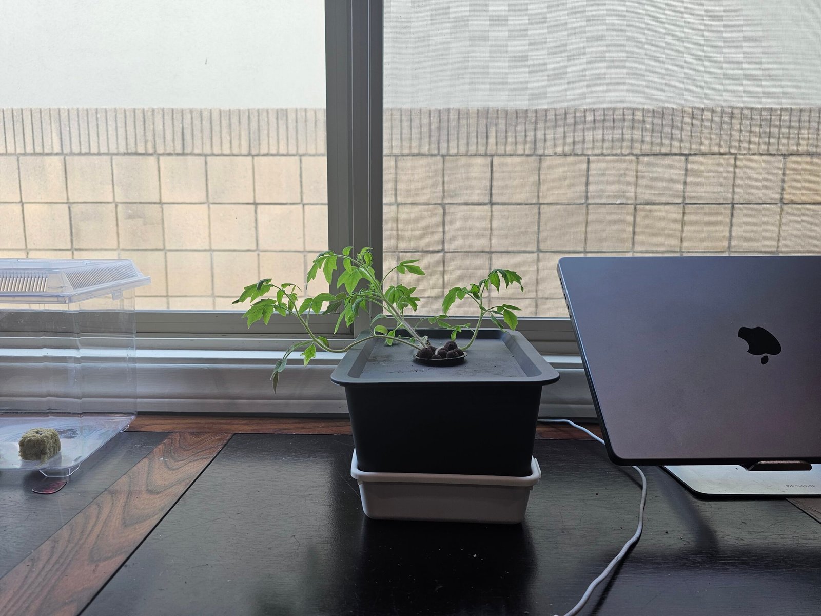
Other thing things I decided on were some fun elements like building a camera feed element to my homepage, I remember 10 years ago there was a company that had a video of their workspace. The camera must have been in the rafters, but I thought it was an interesting idea. I’m not even sure it was live, but the idea of creating a digital panopticon for my workspace seems fascinating. More on that later.
I don’t really like the massive fluid container size. I’m not a fan specifically when it’s free floating text, so I’m not really going to use that, but I do like love that gradient list of links. So I’m definitely goinng to try to incorporate that.
Color! I’ve decided to embrace my inner child on this one. It’s going to be the color scheme of nightwing.
I loved comics as a kid and the grown up robin, aka Nightwing, was my absolute favorite. So, that it the color scheme for clickfoundry 2025, leaning into blacks, greys, with an accent of blue, celtic blue.
Name: Celtic Blue
Hex: #3366CC
RGB: (51, 102, 204)
CMYK: (75, 50, 0, 20)
HSV: 220° 75% 80%
HSL: 220° 60% 50%
RAL: 5012
Pantone: 2726 C
buttons! I really like these button They move a little more than what I would like them to, but I can make those adjustments on my site and maybe incorporate some of my color.
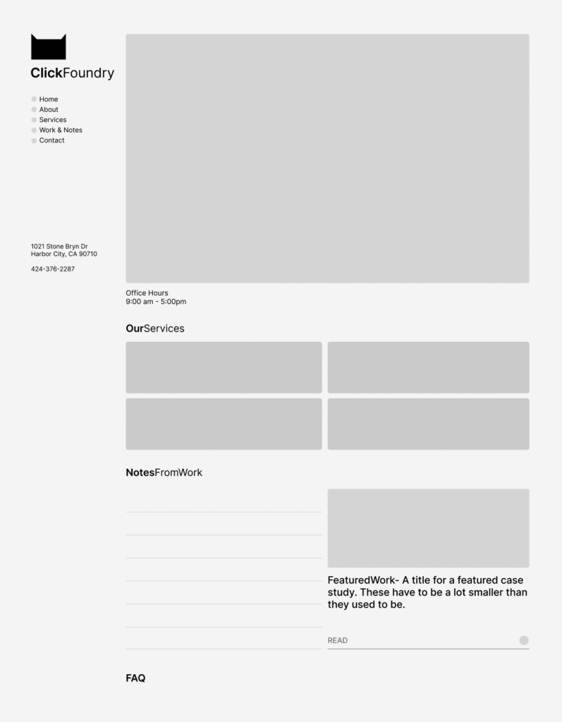
And I’ve sorted out the flow of the homepage
ABOVE THE FOLD
nav, tagline, location data, video feed, office hours, cta buttons,
BELOW THE FOLD
services, featured work (link gradient idea), notes and FAQ
Sidea, which is a sidenote and an idea. what if we made it look like a generative text app. sidebar on the left content in the center, this would force everything into neat cards, while creating visual distinction by not looking like other website.
“Dispelling one trick pony myths, isn’t he?”- earl
I just completed my first WordPress plugin for public release—a free image converter and optimizer that automatically creates WebP and AVIF versions of uploaded JPG and PNG images.
Why This Matters
Image optimization is crucial for site speed. A 1500×1200 JPG that’s 1.4MB becomes just 250KB in WebP and 99KB in AVIF format—that’s a massive performance boost for your website.
The Build Process
Using Claude and ChatGPT, I developed this plugin in about 75% of the time it would have taken manually. The AI tools were particularly helpful for:
Code structure and WordPress best practices
Debugging 50+ errors and warnings from WordPress’ plugin checker
HTML escaping and security standards
The key was being specific about requirements—I knew I wanted to use ImageMagick, which most PHP servers already have enabled, avoiding unnecessary bloat.
What’s Next
The plugin code has been submitted for WordPress marketplace review. It’s completely free (no freemium model) and handles automatic image conversion with adjustable compression settings.
I went through my local backup to see what I had going on. It’s in essence a home, about page, blog archive, a ton of posts (only one ranking), a pricing page (which I wasn’t too fond of), a web design page, and a contact page. Click Foundry had been active since 2020, so these metrics were a real bummer.
According to analytics, it looks like my home page, blog post and contact page were the most viewed. Followed by my pricing page.
So you want barba.js to handle smooth transitions in your custom WordPress theme? Barba.js makes using a website feel like a smooth experience by allowing you to add transition based animations and there are a ton of details (like where in the transition) that allow it to be very powerful. And for a simple html site that you’re coding by hand, I think it’s a really simple library to implement. Integrating Barba.js into WordPress, however, comes with some challenges. I’ll walk you through how to implement barba.js into your WordPress functions, template files.
This will be my third time building a site using barba.js and WordPress. humnlab.com uses barba to control home page to project page animations and a bunch of page specific animations.
Prepping the WordPress canvas for Barba.js
I’m building a fresh theme based on UnderScore. The barba.js WordPress build is my high end client base build, so it’s the starting point for me. I’m a bit old school and still remember all the classes from Bootstrap and am comfortable with their grid, so I’ll be adding bootstrap to the mix as well.
Understanding the Template Structure for WordPress
The fundamentals are important and WordPress has great documentation. So go here for the definitive WordPress template structure document.
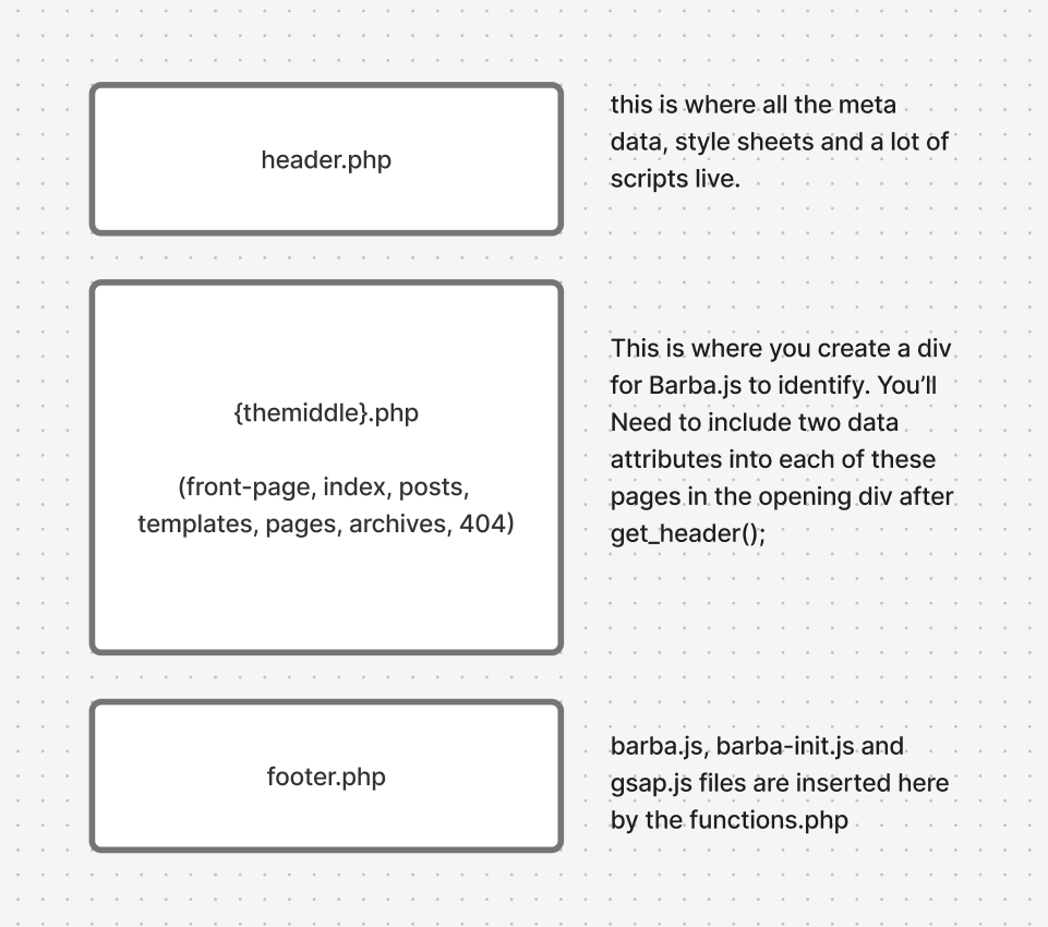
All you really need to know for this, IMO, is that WordPress chunks out a single page experience into 3 files. A top, middle and bottom file. The top and bottom files are always the header.php and footer.php files respectively. Header files are in charge of meta data, style and script files and footer files are usually a bunch of javascript files.
The middle file can change, it can be a template file, post file or a page file and within those you can call on a lot of templates. It will be these middle files where we will incorporate barba.js
Understanding where barba goes in the template structure
Adding Barba.js to the WordPress functions.php file
Before we start adding the wrapper and container barba data attributes, we need to include barba in our theme files. To install you’ll need to know how to use your commandline interpreter and a package manager. That to me, seems like a huge pain in the ass, generally how I feel about package managers. So you can go here an download the barba.js file here and add it to your javascript assets folder.
Create a file called barba-init.js in the same folder. This is where all your barba.js transition rules will live.
For this project, i’m adding GSAP for animations, it’s well established, but new to me, I’ll be using AI to build out simple animation builds for me. I’ve used anime.js, and lottie.js for more complex animations, both great.
Click the get GSAP button in the link above, pull the gsap.min.js file and add it to your js assets.
functions.php code – enqueue scripts for barba and animations in WordPress
barba is a library for single page applications and when used properly it can save apps a lot of time by opting out of loading scripts, navs, style sheets that are loaded sitewide. Most websites share a lot of that code and still reload it with every new page with only some of the content being unique to individual pages.
So, let’s call the parts that are new to each page the container. The part outside of the container, the repeatable information, let’s call that the wrapper.
This is what that would look like in some basic html boiler plate with the Barba.js structure:
The body tag will be found in the header.php file. You don’t have to do it this way, but for me using _s, this works well for me. For most theme files, definitely true for _S, the body tag will be found in the header.php
<?php
/**
 * The header for our theme
 *
 * This is the template that displays all of the <head> section and everything up until <div id="content">
 *
 * @link https://developer.wordpress.org/themes/basics/template-files/#template-partials
 *
 * @package clickfoundryTemplate
 */

?>
<!doctype html>
<html <?php language_attributes(); ?>>
<head>
	<meta charset="<?php bloginfo( 'charset' ); ?>">
	<meta name="viewport" content="width=device-width, initial-scale=1">
	<link rel="profile" href="https://gmpg.org/xfn/11">

	<?php wp_head(); ?>
</head>

<body <?php body_class(); ?> data-barba="wrapper">
<?php wp_body_open(); ?>
WordPress index.php with Barba.js
On to the container portion. Barba needs two data attributes: data-barba and data-barba-namespace. I think technically, you don’t need the second, but your life will be much easier if you include it on template pages, either native ones to the theme or ones that you create.
<?php
/**
 * The main template file
 *
 * This is the most generic template file in a WordPress theme
 * and one of the two required files for a theme (the other being style.css).
 * It is used to display a page when nothing more specific matches a query.
 * E.g., it puts together the home page when no home.php file exists.
 *
 * @link https://developer.wordpress.org/themes/basics/template-hierarchy/
 *
 * @package clickfoundryTemplate
 */

get_header();
?>

<main id="primary" class="site-main container-xxl"  data-barba="container" data-barba-namespace="<?php echo get_post_type(); ?>"> <!--this is where the barba container starts-->
  <div class="row">
    <div class="col-12 col-lg-8">
   <?php
    if ( have_posts() ) :
    if ( is_home() && ! is_front_page() ) :
   ?>
<header>
<h1 class="page-title screen-reader-text"><?php single_post_title(); ?></h1>
</header>
<?php
  endif;
  /* Start the Loop */
  while ( have_posts() ) :
  the_post();

    //Include the Post-Type-specific template for the content.
    get_template_part( 'template-parts/content', get_post_type() );
    endwhile;
      the_posts_navigation();
    else :
      get_template_part( 'template-parts/content', 'none' );
    endif;
    ?>
    </div>
    <div class="col-12 col-lg-4">
      <?php get_sidebar();?>
    </div>
  </div>
</main><!-- #main barba container ends -->

<?php
get_footer();
You can take a look at these sample files in their entirety on my github page.
Big shout out to Fjobeir’s barba post, who helped me understand this my first go around 4 years ago.
Making a transition with Barba on WordPress (barba-init.js)
So, I made this ketchup and mustard transition on my local build to test it out.
There are different stages in the barba transition lifecycle that you can hook into, but for simplicity I chose leave and enter. I used Claude to give me the GSAP animation code, but after looking at GSAP seems really nice. So the opacity of everything in the barba container fades out, the background attribute in the body element goes to red when leaving. When entering, we set the container opacity at 0, the body color to orange than white and then we increase the container opacity to 1. Check it out.
document.addEventListener("DOMContentLoaded", function() {
  barba.init({
    transitions: [{
      name: 'basic-transition',
        leave(data) {
        // Clean up namespace classes
        document.body.className = document.body.className.replace(/\bnamespace-\S+/g, '').trim();

        // Create GSAP timeline for leave animation
        const tl = gsap.timeline();

        // Animate content opacity to 0 and background to red simultaneously
        tl.to(data.current.container, {
          opacity: 0,
          duration: 0.5,
          ease: "power2.inOut"
        })
        .to(document.body, {
          backgroundColor: "#ff0000", // red
          duration: 0.5,
          ease: "power2.inOut"
        }, 0); // Start at the same time as opacity animation

        return tl;
      },

      enter(data) {
        const namespace = data.next.namespace;
        document.body.classList.add(`namespace-${namespace}`);

        // Set initial state for entering content
        gsap.set(data.next.container, { opacity: 0 });

        // Create GSAP timeline for enter animation
        const tl = gsap.timeline();

        // Background color sequence: red → orange → white
        tl.to(document.body, {
          backgroundColor: "#ffa500", // orange
          duration: 0.3,
          ease: "power2.inOut"
        })
        .to(document.body, {
          backgroundColor: "#ffffff", // white
          duration: 0.4,
          ease: "power2.inOut"
        })
        // Then fade in content
        .to(data.next.container, {
          opacity: 1,
          duration: 0.5,
          ease: "power2.inOut"
        });

        return tl;
      }
    }]
  });
});
Now comes the issues with incorporating barba.js with WordPress
The barba.js library and WordPress in a lot of ways are at odds with each other. WordPress is dynamically creating single pages and it’s highly adaptable because of the built in plugin community. Barba.js is dependent on stability in the gap between the wrapper and the container divs and that just isn’t guaranteed without custom development of workarounds.
There is a great group of people working on this library, so if you’re stuck look for their slack channel or discord. I can try and help, if you reach out. Here is my list of issues:
Scripts need to re-initialize, but not double up on page transitions
Sometimes a certain page will have a plugin that no other page does. It’s actually good SEO practice to only have what you want running at any given time, so during page transitions, things can break because the required files aren’t present since those files are in the gap between the wrapper and the container.
You can manage that by tracking namespaces and making sure your loading the scripts that need to be loaded by removing and adding the files, but that gets tedious.
Some devs get clever and track which scripts are already loaded so they only fetch new ones during transitions. Smart in theory—no duplicates, parallel loading—but that skips a critical step: re-initializing scripts that are already in memory but tied to DOM elements you just replaced.
Example: Contact Form 7’s file might be loaded site-wide, but if you click into a page with a form, the form still needs its init() call. If that doesn’t happen, the form looks fine but won’t submit.
I’m just keeping a list of plugins or libraries that have re-init setups and having running a dom script to see if i have to load them by sniffing out plugin/library specific classes.
if (document.querySelector('.wpcf7-form')) {
    // Element exists
    wpcf7.init();
}
Can’t think of other issues, leave some in the comments and maybe I’ll add them here.
the web design process for small to mid-size businesses
the first step is to do an intake and get a feel for each other. We’ll talk about the challenges facing your business and what’s behind the push to redesign or create a website. That brings us to goals and from there we’ll have a framework for the amount and type of pages you’ll need.
My price range is between $2,500 to $6,000 for a website. I create a custom theme with your name on it, the design may pick from other sites, but it will be custom coded.
After the initial intake where we trade some information about aesthetics and competitors comes the research. Along with my research this is a perfect time to send me all of your visual and text assets. My goal is take some interesting features from around the web and bring them to our shared project. Here’s an example of a mood board.
video moodboard for a website design
Once I get your feedback. I’ll start on creating a sitemap and some mockups for main pages.
Visual Mock-ups
I usually create mockups in photoshop and illustrator and send them off to you for review, but if you’re a bit tech savvy, I can also send them as Figma files. The goal here is provide an aesthetic representation of the most important pages and collect feedback from you. There is usually around three revisions during this phase.
Web Design
I’ll build out your site on WordPress most like with custom page templates. I’ll create an unindexed site where you can see a copy live and click around.
Do you come off poorly when you present your work to potential clients in person? Probably not.
You probably dress up, put on your nice shoes, spend a little extra time on your hair and face and most importantly bring your portfolio with you. And if you’re looking to land a client cold, that portfolio is looking stellar.
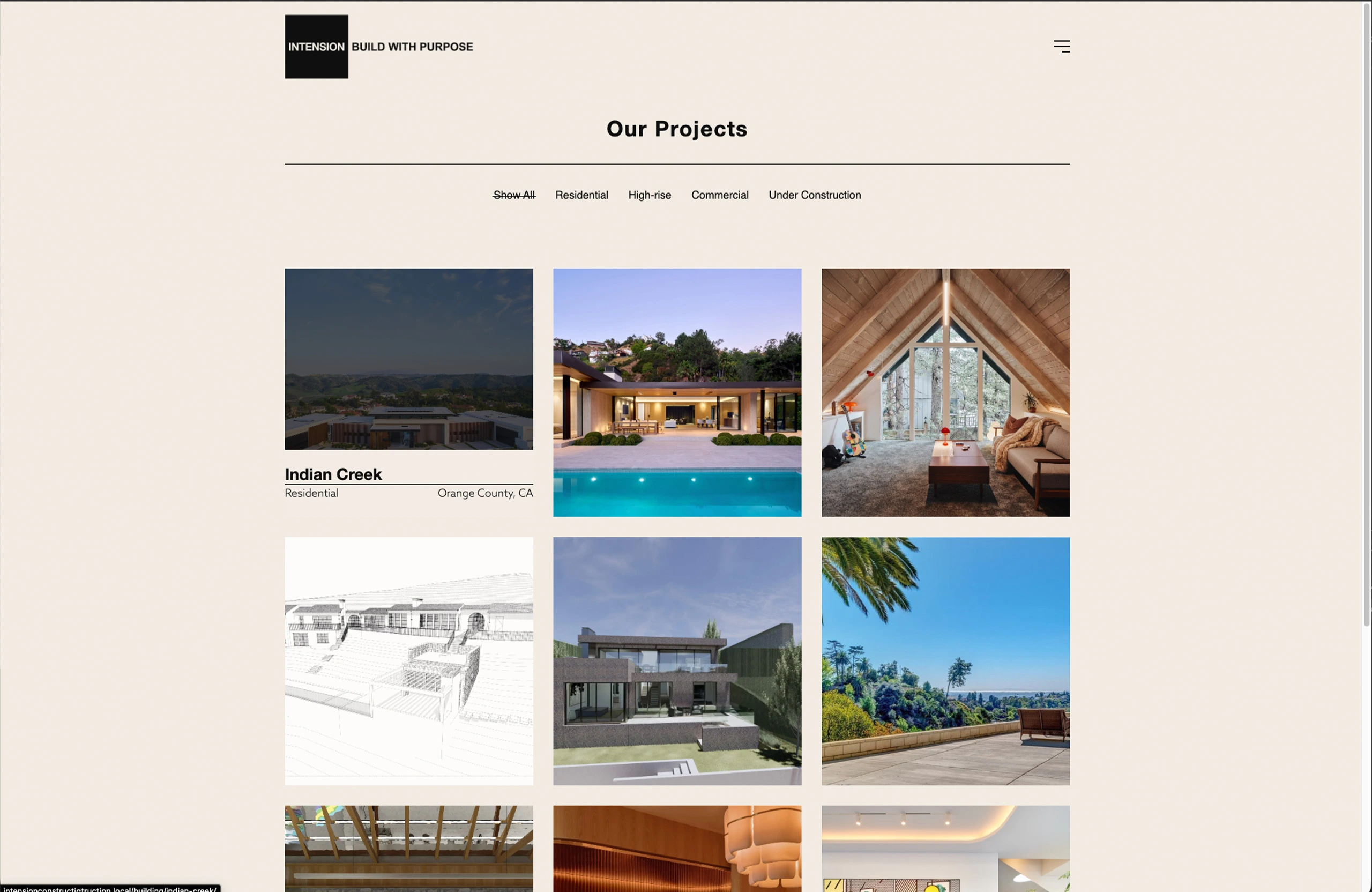
Why should it be any different online? I’ve seen a lot of architecture websites and they’re pretty awful.
the filter option is nice when you have a lot of work of a type of category. Not so much here.
The biggest design pain point for architecture websites is portfolios that don’t change size depending on the screen width.
The other is a lack of function in the portfolio grid. It’s just an equal height and width grid of boxes. The user clicks on it and a gallery slider pops up and displays some images.
It’s impossible to show your work off in a well-designed way with a standard WordPress setup.
What you need is something called a custom post type (CPT) and a way to display the CPT. A custom post type is a collection of data. For architects that means photos of the space, dates about the build, a description, and other information.
Website development layout sketch drawing
If hiring someone to build out a Custom Post Type that blends in seamlessly into your website is outside of your budget finding flexible plugins to manage your portfolio is the next best thing. Here are my top five plugins for Architects.
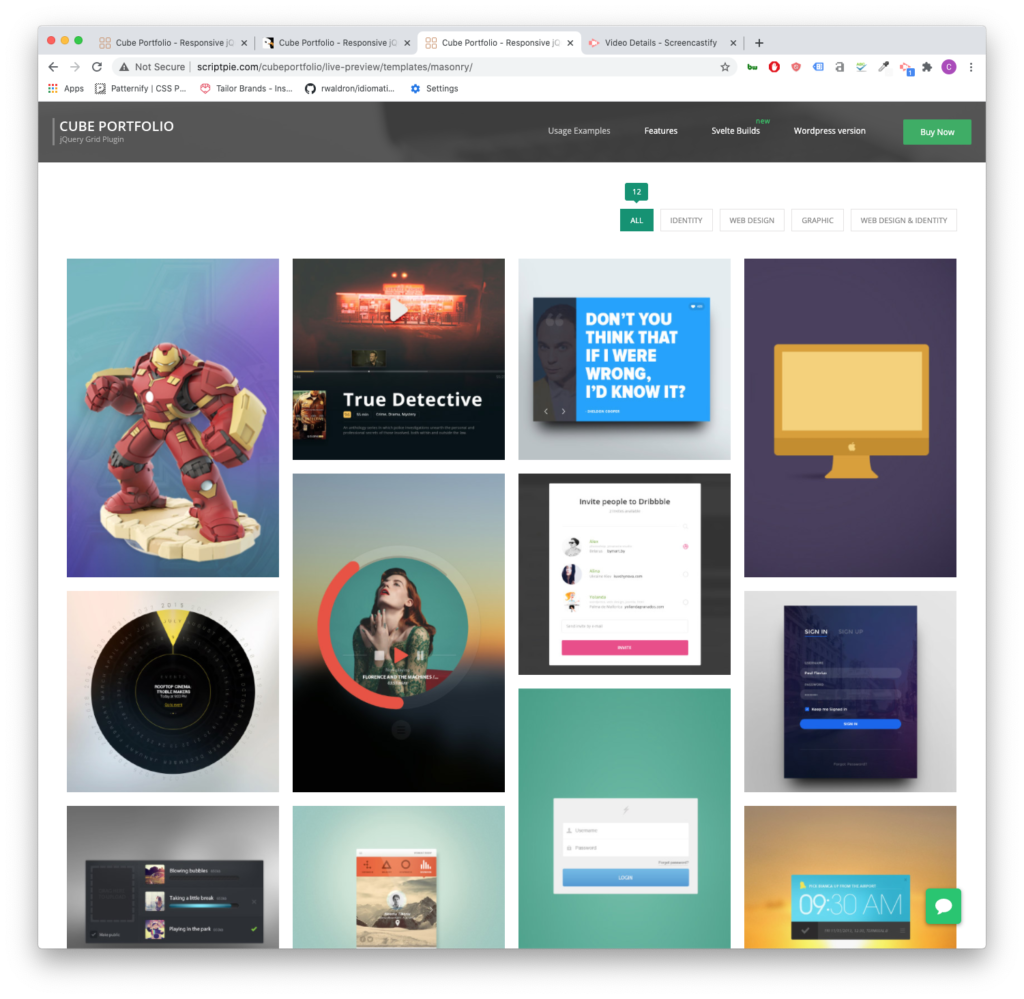
Cube Portfolio
So, I used Cube Portfolio as a free piece of code on a project I was working on a few years ago. Then, I thought that it looked great. So when it came time to build out my own site, I was gearing up to integrate the code from scratch, and then I found out they had a plugin for WordPress. It’s light and easy to use.
At $19 for the plugin, it’s totally worth the money. The grids it creates are responsive and look good on all screens. So displaying your latest residential or commercial projects will look great on desktop, tablet, and phone.
Cube Portfolio is dynamic on hover and has some of the coolest pop-up displays. It also gives you the option to open a new page when the user clicks on one of your portfolio tiles. Which is very useful when you’re tracking user data.
It’s a very versatile plugin. You can have it display image galleries, videos, and customized layout with descriptions, key information about your project. Cube Portfolio also comes with a lot of documentation. If you choose to hire out a developer, this is a plugin that is very open to professional customization and integration.
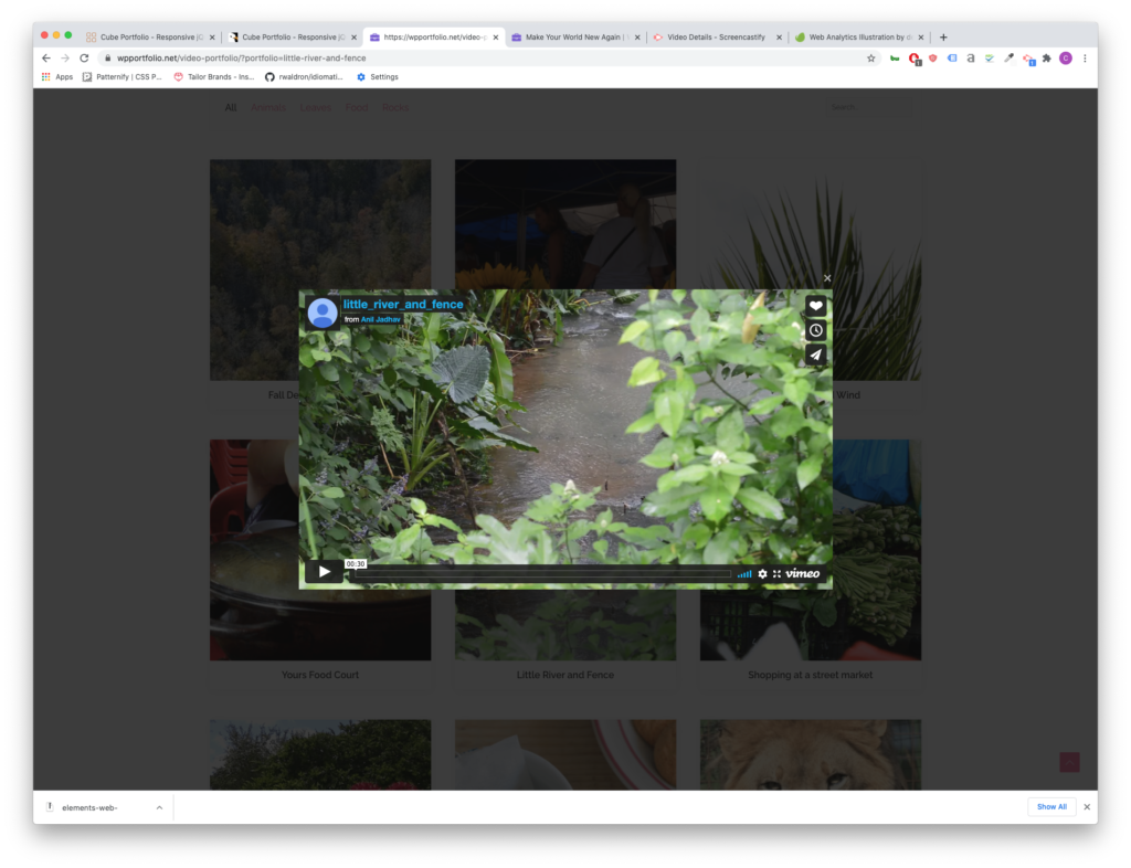
WP Portfolio
WP Portfolio comes with 4 different post types: Image, Website, Video and Single Page. If you’re using page builders like Elementor or WP Bakery, WP Portfolio is the right plugin for you. It integrates with these page builders and since you can copy and paste the page builder shortcode, creating a cohesive look for your latest residential and commercial projects will be easy.
Video Player for your portfolio grid can be useful if you film walk-throughs of your work.
This plugin has also been around for a while and comes from a very well-established development company. The support team is very responsive and updates their product often.
WP Portfolio is $39 for the year for its beginner package.
GO Portfolio
GO Portfolio brings the best of Cube Portfolio and makes it more accessible by providing more starter templates and simple color customizations. It is also responsive for mobile, tablet and desktop layouts and has plenty of interactive hover functions.
Unlike WP Portfolio, GO Portfolio doesn’t integrate with as many page builders, but it does integrate with Visual Composer (one of the most popular page builder plugins).
GO Portfolio is only $26
Essential Grid
Essential Grid is a very design heavy and modern plugin and also integrates with Visual Bakery. It offers a wide range of hover functions.
One of the best and unique features of Essential grid is its demo data because of its design focus.
Much like WP Portfolio, the parent company for this plugin is also an established company, with the widely used (although, often misused in my opinion), Revolution Slider under its belt. That means that there is robust documentation on how to set up Essential Grid. It also means you can depend on responsive support staff in case you come across an issue.
The starter package begins at $34 for the year.
WP Softs: GridKit
WP Softs Grid Kit delivers grids in 3 different styles: masonry (that staggered varying heights style), gallery and puzzle. It is also responsive and offers a lot of hovering styles.
It also has some pretty interesting features that aren’t often highlighted in other plugins like share features and google map embeds.
It only costs $26 for a lifetime purchase of the plugin and has everything you need to show off new home projects.
I’ve been making websites for about 5 years now. For the most part, I create custom landing pages and fix broken websites on WordPress or Shopify. I also create websites from scratch and offer a variety of marketing services.
Websites
When I build something out, I like to figure out how my client’s ideal candidate will use the site. Then I reverse engineer what that client to see to buy.
It’s easier said than done. That’s why I install analytics on all my sites.
For most businesses, I would recommend building websites on top of a “CMS.” CMS is short for “content management system.” It’s a way of saying that there is an area that allows you to edit posts, pages and do some minimal customization. My CMS of preference is WordPress. This website uses WordPress.
If it’s up to me, I’ll build a site with WordPress. It’s free to install. There is a large community of developers that build tools for it. And I’m good at customizing this framework.
WordPress is good for all types of sites, but most clients are a service company or a goods company. WordPress is ideal for either category.
Services
I charge around $3,000 for a simple 5-7 page website built on top of a Content Management System. We’ll have a chat about your ideal audience and previous marketing material. We will also discuss your goals for the year.
We’ll determine the number of pages needed and how to connect them to one another. Linking pages will create a flow for your web visitors. Along this flow, we’ll use imagery, video and words to achieve your goals.
I will also add necessary features to your website to keep it competitive and secure. This includes tracking, analytics, SEO and security software.
Some businesses need booking software or other enhanced features built into the website. Pricing will vary depending on the complexity of the site and its features.
Online Store
Online stores come in a variety of forms. For single item products, I would build out something very simple on WordPress or Shopify. My starting pricing for an online storefront like that would be around $1,500.
Stores with multiple products might need several “landing pages.” Landing Pages are persuasive pages that sell a product. Online stores also need data entry and photography to create a robust website. This will also affect the price. As always, I add necessary software for the site to stay up to date. I also offer retail-specific analytics and tracking options.
Analytics and Tracking
My standard setup is Google Analytics and a Facebook pixel. If you would like to add other tracking scripts like Hot Jar, let me know and I can get it up and running.
For the uninitiated, tracking and analytics are very powerful marketing tools because they can tell you important numbers about your website. For instance, you can find out how many people visit your site and how long people stay on a page on average. This becomes useful when you start marketing.
My favorite use of analytics is monitoring people interacting with a web page. Let’s say that I create a landing page for my web design services. In the middle of the page, I add a link to an article detailing what goes into my custom websites. I can track how many people click on that link. I can also track how long someone stays on the article page.
In this thought exercise, you’ve scrolled to the middle of the page and expressed interest in learning more. Presumably, you’re interested in a custom website. If my analytics tell me that this happens often, then my marketing activities along with my “landing page” are successful. If this doesn’t happen often, then I have to make some adjustments. Outside of analytics, websites with a “tracking script” allow businesses to reach out to visitors. For instance, if you don’t reach out yourself, I can add you to a series of advertisings across social media channels.
This can be powerful for businesses looking to compete online.
For those delving into content creation for their business, the blank page can be a daunting challenge. So we’re going to simplify the process with “the inverted pyramid.”
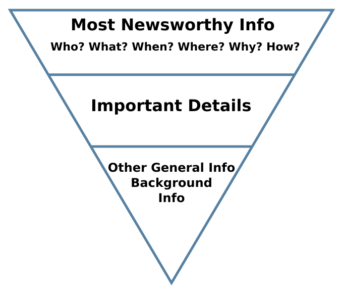
The Inverted Pyramid
It sounds like something you would hear about in a curio shop. Actually, the inverted pyramid is a way to format your article. And it is used by journalists to create engaging articles. The writing format was first used by reporters communicating to news outlets via telegraph to convey information over “the wires.” Although its origins are over 100 years old, the inverted pyramid is still an effective way to get across the most essential information first to your audience.
Quick and focused information will free you up for your core business activities and help potential clients with their purchase decisions. The inverted pyramid suggests you start with the 5 W’s. Purdue’s online writing lab for quick information about states the 5 W’s as “who did what, where, when and how.” It’s succinct. The first paragraph should contain all of this information in a clear and compelling way. This is called the lede. And as they say, you don’t want to “bury the lede.”
Writer’s block concept with typewriter and crumpled paper on work desk
What to write about
For a business, you want to think of questions that your customers ask you over the phone, online and during meetings. Address these questions by creating a compelling lede using the five W’s. After you’ve created a lede, just expand.
The following paragraphs go into more detail about the story. Organize the paragraphs in order of importance. In the news industry, this was useful because editors could instinctively just cut from the bottom if a piece was too long. It also meant the reader could walk away from the piece satisfied in his understanding of the story.
These paragraphs are perfect areas to begin crafting a sales pitch. There are some fairly pronounced differences between professionals and the DIY person. For instance, I have access to software resources for SEO and have already spent time learning the software. In service industries, differences like these abound. Often it is forgotten by customers because of the rise in DIY spirit spurred on by YouTube.
Fill it up with background
As you continue to explore the topic, you can start pulling quotes. Adding industry statistics and providing more granular information. The amount of detail you will go into depends on the question. I’ve created an article that talks about best practices on how to choose which questions to ask in your SEO strategy. Check that out if you’re struggling to find a starting point.
Content creation is a crucial piece of the marketing puzzle for various reasons and the inverted pyramid can really simplify the work. This format gives the writer clarity about the piece. And at the end of the process, you now have a useful article that you can amplify with paid advertising to capture potential clients with FB or Google retargeting campaigns. The Inverted Pyramid structure will also provide longer reading times as the information is chunked in digestible ways this will lead to a better SEO score down the line.
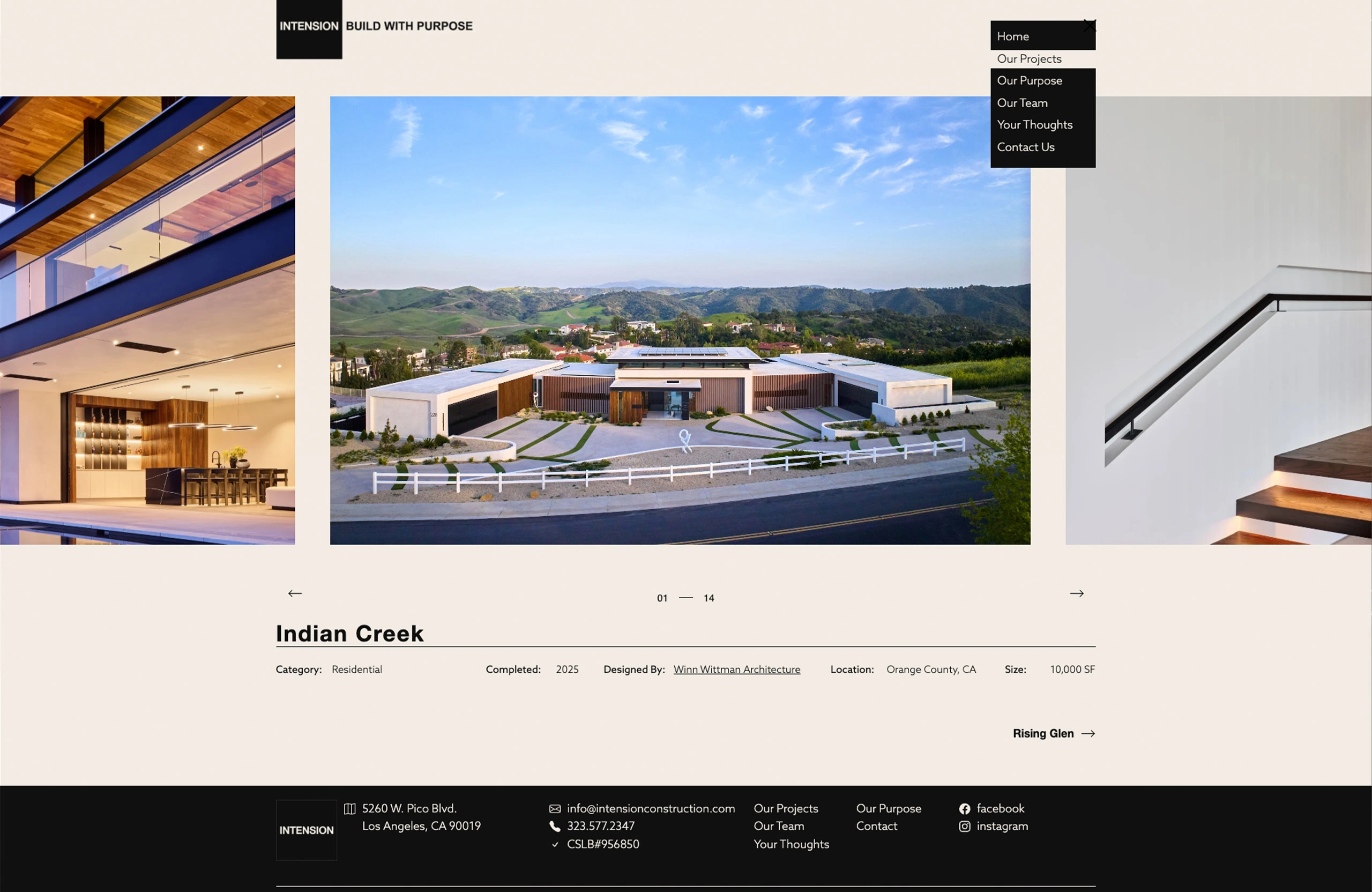
All the architecture websites I’ve seen have at least those components. The home page is often just a slider with some very nice images of homes. It’s a bit of a shame because websites for architects can be so much more.
The Problem with websites for architects
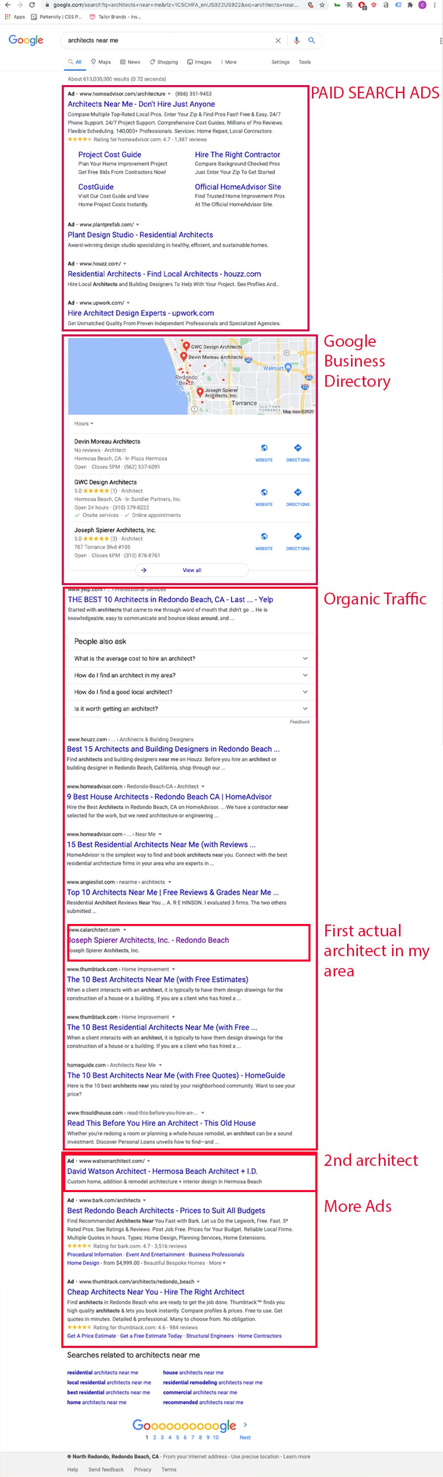
If this image is proof of anything it’s that architects are not taking their websites seriously. In the top ad spots of google you have freelance aggregators. In the organic section of google, you only have one website from my selected area that belongs to an architect.
The problem has to do with how user-oriented the architect’s website is against the query. To take on this issue, websites for architects need to create user-specific landing pages. The best place to start here is to understand your customers. I wrote an article that touches on this called marketing for architects.
A visible advantage for architecture websites
Often the hardest part of designing a website is the lack of great photos and illustrations the company has on hand. Websites for architects rarely lack great photos. Great photography sells clients on a proposal.
Great web design can bring you those clients.
The Form and Functions of Websites for Architects
Websites are not brochures on the internet. They are not business cards. They are interactive, involve motion and can provide entryways to other pages. These features allow the user to have a rich experience with your firm.
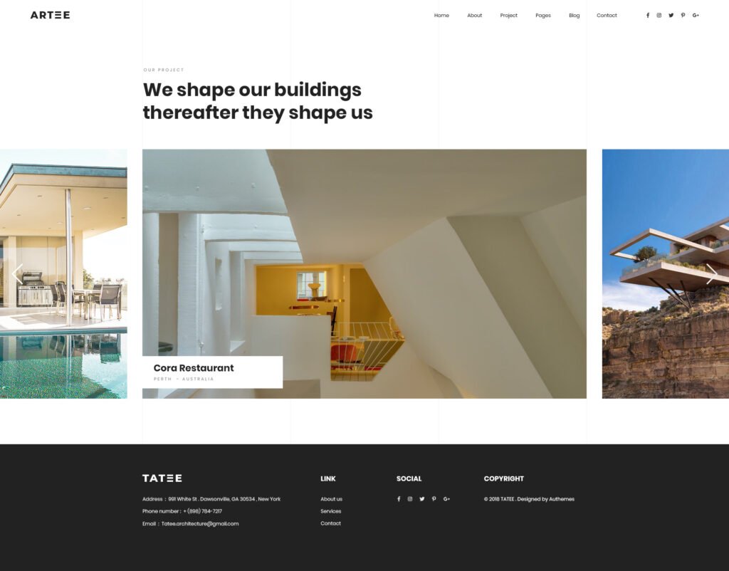
The Portfolio Page
The portfolio page comes in a variety of forms.
One of my favorites are interactive grids. The example from above comes from the MKPL website and has an interactive filter.
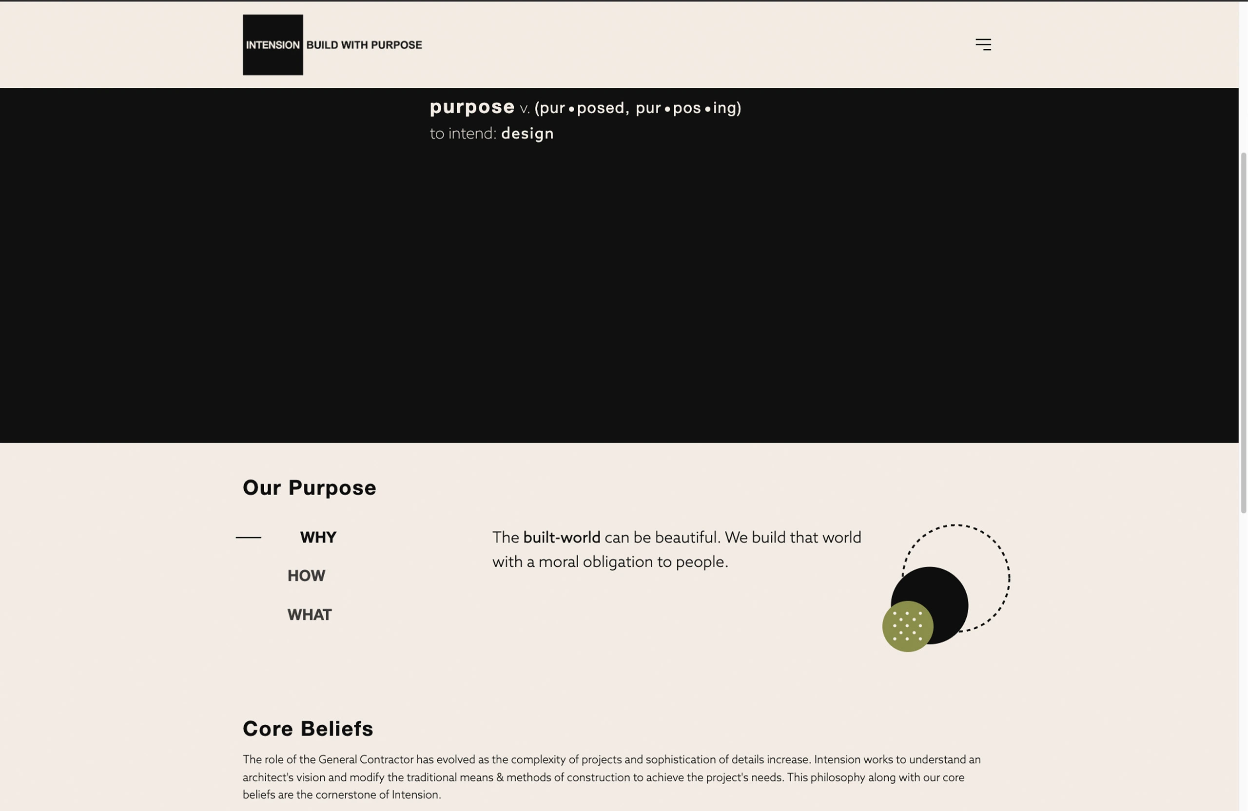
The about page is often overlooked. At the time of writing this I’ve overlooked it on my own website. I’ll fix that fairly soon. One of the about pages that I think has a lot of potential is this one:
This page’s services sidebar has the potential to open up so much organic traffic from google. Sadly, none of these pages actually link out to pages. That said, it sure beats the infamous blurb. Which is just a small paragraph about the firm’s beliefs, founding dates and the founder’s education.
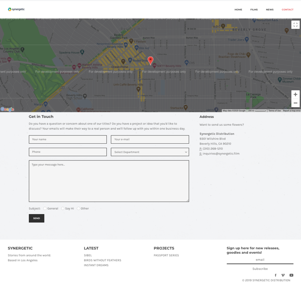
The Contact Page
Here’s a contact page I built a few years ago. It has the added benefit of providing address information for google to put in it’s listing. The bottom buttons allowed the email recepients to organize email types.
Contact Page
With the advent of interactive forms survey like forms that allow you to segment your users through “logical sequencing” of questions.
Opportunities for Architecture Websites
Most architecture websites don’t have a very robust section explaining their services.
I haven’t seen video effectively used in architecture sites.
Only 40% of the architecture websites, I’ve indexed use tracking analytics.
Think of the website as a series of pathways. The homepage is often what is shared with people. Google lists this page as the face of your business.
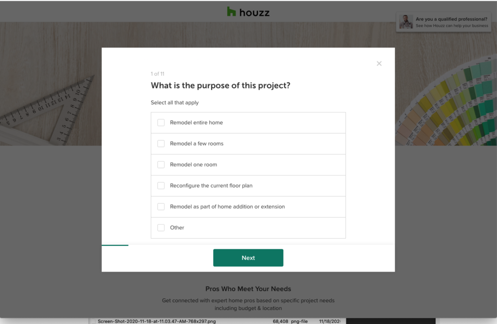
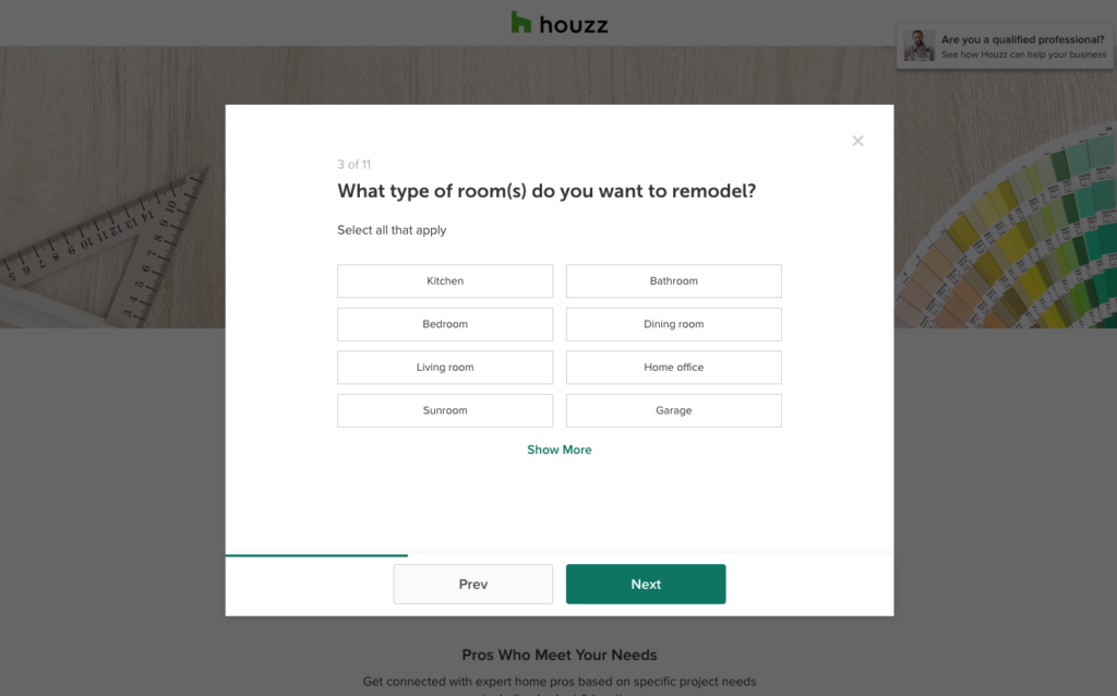
Houzz does this in order to segment their users and hand the lead over to the contractor or architect.
Houzz splits up their customers by interests like design or construction, different rooms and budgets.
Your homepage should provide the beginning steps into bringing you a phone call. A quick call button on mobile phones is always a bonus.
Users rarely go to a website without an intention.
Here are a couple of user experiences on a hypothetical website:
home page> link to a kitchen remodels page > free quote sign up page for a kitchen remodel
home page> link to a style of architecture > portfolio page of a particular style of architecture > free quote sign up page
In order to create a great user experience, you need to create a robust page. It should inform and sell the reader and then encourage the reader to take action with your film.
If you pair this way of building websites with other marketing strategies like Facebook retargeting and email campaigns you can bring up your visibility quickly.
What’s the point?
You say to yourself, organic is obviously hopeless what is the point of focusing on web design for architects when the user will have to scroll half-way down the page to even know you’re alive.
Well, I believe Yelp and Houzz can be beaten for the top spot on Organic, but more importantly, even if you do ads or business listings your website is still going to be the first thing your clients see.
I had a client who would get upwards of 150 people a week visit to her website and more than 80% of her clients would leave within the minute on the first page. Why? They left because their intentions were not being addressed as soon as the page opened. And that had to be addressed quickly.
Do you know how many people drop off after your first page?
If not, then you should take some time to think about the users experience and obviously hire me to get some analytics and guidance on your digital presence.
This article focuses on how Architects can market residential services to potential clients. That said the wide range of services offered by architecture firms fit within this model of marketing analysis. The examples and data in this article, however, are geared toward marketing residential architectural services. The key takeaway is that you should know your client like the back of your hand through iterative testing.
We’ll also cover concrete tactics to bring awareness to your services and testing your offers and messaging.
Customers: Define your customer, then redefine them.
Often businesses, Architects included, focus the majority of their attention on their products and not nearly enough attention on their customer. Marketing breaks down customers into Customer Segments. Examples of segments include age, gender, ethnicity, marital status, profession and interests.
For an Architect, maybe gender, age and ethnicity aren’t as great of indicators as profession, marital status and interests. Customer segments should always be separated by service.
An example of a clear Value Proposal attached to a customer segment would sound like this:
We are an architecture firm offering zoning analyses to young millionaires who have purchased land in the hills of Malibu.
This, however, is only the beginning. You still have to test this idea. If life were as easy as saying something is true, we’d all be swimming in money.
To evaluate whether this theory is true, you need to talk to these potential clients and find out if it’s true. You can of course cut out a lot of back and forth by looking for research data.
For Architects, the AIA, Census Bureau, municipal community planning and property departments and real estate agents become invaluable sources of information to stay on top of buying trends and reign in possible customer segment hypotheses.
88% of homes are bought through a real-estate agent
Single home-buyers are two times more likely to be women
Median home-buying salary is upwards of $70,000
63% of homebuyers are married
Where are your customers?
Ideally, the answer jumps out at you. For example, sports fans are at sports games or fantasy sports-game forums. Housing is not so simple. We can make some assumptions about where to market architectural services.
Finding marketing channels for Architects
Homebuyers are usually of a certain age, marital status and income level. And that should clue us into where to find our customers. We could look for people with job titles attached to salaries that match our median home-buying statistic in areas adjacent to high rental rates and lots of commerce. We could narrow that down to married people and reach out to them online.
There are tons of ways to configure this. We could spend some time to think about physical locations like open houses or certain industry mixers.
Iterative testing of marketing channels for Architects
At this point, you have a hypothesis of who your client is and a sense of where you can reach them. So reach out to them and see if you were right. Maybe once you start asking questions you find out massage therapists don’t want to own a home. Time to adjust your customer hypothesis. It turns out married folks don’t go to mixers. Then it’s time to adjust your marketing channels.
How do they want to interact with Architects?
Marketing for Architects isn’t all that hard at a local level. In Redondo Beach, where I live, most architects have outdated websites. Most of them do however have analytics running.
So one of two things must be true. Websites don’t matter and their analytics have shown them this or they installed analytics and never took it seriously.
When thinking about their customers and the context in which they are present their architectural services, Architects direct how they interact with their customers seemingly without attention to the customer.
To do this right, an Architect should think about what emotional, social, and functional needs the client is looking to get out of the exchange. For instance:
saving time
reducing stress
status
guidance
Architects should be asking clients about their favorite way to interact, possible options include:
lunches
text messages
links with helpful information
phone calls
in-office
events or interesting outings
The how question for Architects trying to market effectively also extends to your impersonal interactions like the branding of your invoices, plans and other communications.
Creating entry points for potential clients
Where do your clients get ideas? Your future clients are defined and you can guess where they got their ideas from but you won’t truly know until you’ve done some research and verified the data with good old-fashioned door knocking.
Some possible options include:
Real Estate Advertorials and Digital Ads
Open Houses
Houzz
Pinterest
Home Advisor
Zillow
Magazines
Blogs/ Online Articles
Podcasts
These possibilities need to be tested and measured for their return on investment. Prioritize which activity will bring you the most return or prioritize which one is the least risky and get to work.
I like to put together spreadsheets for this kind of thing.
Storytelling
It’s a bit tiring to say this, but it’s worth mentioning. You need to tell a story. People are moved by their emotions and stories are the perfect vehicle to create emotions.
An architect’s ability to relay a story is in their ability to market themselves on social, newsletters and all other media being directed toward prospective clients.
Each piece of branded media should integrate with the other. For example, your email should have your website, Instagram and other profiles on it and each channel can be thought of as a scene to the potential client.
Create a brainstorm. Imagine you are at your retirement dinner and people are sharing their experiences of working with you. What do you want them to say? How do you exemplify those attributes?
Test Everything
The most important tip when it comes to marketing for Architects is to TEST EVERYTHING! Just like the layouts of a home can receive different reactions from a client, your marketing strategy will also receive different reactions.
So write out each of your theories about your clients and confirm them by reaching out and asking questions about what they think of your services, prices, their biggest hassles, their hopes until you know your customers. Then redefine your value proposition and customer segments with the input you’ve received and retest your hypotheses.
This iterative process will save you time and money. From your conversations with prospective clients, you’ll find out what they want to hear, where they go for information and how to communicate with them. This will save you money. It’s a million times better than going in blind with a marketing budget and no plan.
The Big Leagues
We all hope our reputation precedes us. It makes marketing unnecessary, but that sort of status is earned. And the only way to earn it is with great work and happy clients. First, you have to find those initial clients.